This A/B test delivered 122% more email addresses, worth £10 million.
You wouldn’t ask lawyers to design the user experience of your website. Yet in post-GDPR life, this is happening.
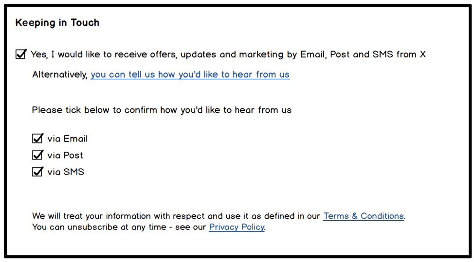
One of our clients, a famous multinational, saw a significant reduction in marketing opt-ins since the lawyer-shaped GDPR redesign went live. They ended up with something like this:

At face value, pretty standard. After all, consumers know exactly how this works by now. If you like the brand and want to “keep in touch”, just tick the box. There’s even a choice of contact options. Ostensibly, the user is in control.
However, just one word seemed to be getting in the way. The statement “I would like to receive offers, updates and marketing by Email, Post and SMS” (our emphasis) was asking for a big commitment. Hit the checkbox, and all options are pre-ticked as shown in the mockup below.

Who loves any brand so much that email marketing messages are simply not enough, and they would also like to be contacted by phone and snail mail?!
In a secondary link, where it is easily missed, hides the less aggressive “Alternatively you can tell us how you’d like to hear from us”. Clicking on it opens the same three checkboxes, but unticked this time so the user can pick their preference from the list of options. A much better user experience.
Hypothesis
Our hypothesis was that our client (to be fair, our client’s lawyer) was overcomplicating what was, in essence, a decent user experience. To test this assumption, we wanted to construct an experiment emphasizing this positive aspect, and toning down the cheeky passive-aggressive bit.
The sentence directly next to the first checkbox is the problematic part. It introduces unnecessary friction, which can be defined as resistance in the mind of the user in response to an element on the page. Daunting forms are typical examples of this. Fortunately, friction is often easy to fix and can show good results for relatively small effort.
Only in this case, it wasn’t as straight forward. Any change in this area would have to be lawyer-friendly. It could take weeks to get approval. To avoid this, we had to reduce friction without changing the lawyer’s wording.
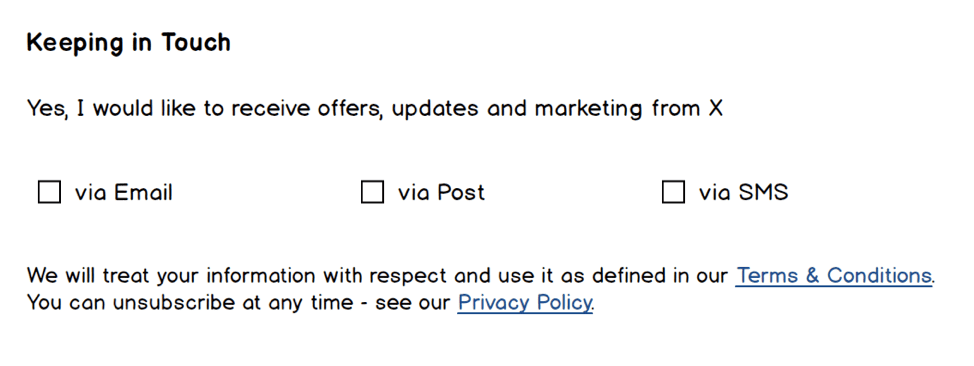
Our variation is shown in the wireframe below. The first checkbox was removed completely. The opening sentence is still there, but its tone softened by stripping out the big scary ask. This effectively removes the friction and goes straight to the friendly alternative. Without changing much, the aggressive onboarding approach is suddenly much kinder: “Which one would you like?”

Results and business impact
The experiment ran for 14 days with more than enough traffic to validate the hypothesis that emphasising the friendly alternative would improve the user experience. Our variation saw a 122% increase in opt-ins to at least one of the marketing options.
And this is where it gets even more interesting.
Seeing that more people were opting in was important, but not the full picture. We wanted to understand how the individual channels were being affected by the change. The split test was integrated with Google Analytics using custom tracking deployed via tag manager. It recorded which box the user ticked, along with the status of all the other ticks at that point, sent to GA as an event. It was also sent as a session level custom dimension, which saved the final status in case the user updated the page.
Post-test analysis made possible in this way revealed that the winning variation produced a strong increase in email sign ups, but a significant decline in postal sign ups. In itself, this had a positive impact on the business. Posting catalogues carries additional costs such as printing, postage and even environmental. Email, on the other hand, is a strategically important channel for this business. The increase in the number of email addresses was calculated to be worth £6 – £10 million over the next year.
It was good to also see order completion rate increase marginally. Whilst not the primary metric in this case, it’s important to get as close as possible to revenue with any experiment in order to assess overall business impact. It’s not worth improving a micro experience, such as opt-in rate, at the expense of the bigger goal like sales. So we weren’t expecting an increase, but we wanted to be sure that there was no drop in revenue.
Conclusion
Like many of our clients, you may have watched your email list shrink as GDPR came into effect. Increasing your marketing opt-in rate might not deliver the same instant revenue uplifts as other tests on your roadmap. In the long run though, it could be one of the most important improvements you make now to ensure future business growth.
Opt-in messages tend to be written with compliance in mind, rather than conversion rates. This is one area where lawyers design the user experience. To restore some balance, ask yourself:
- Are there things you could test without having to involve lawyers? In this case, the message was presented in a slightly friendlier way – without changing the wording.
- How much of a commitment are you asking for; could you ask for less? This does not only apply to opt-in copy.
- If you offer a range of options, do you risk defaulting to less valuable channels at the expense of the overall opt-in rate?
If you’re interested in how AWA digital can help you increase your opt-in rates and want to find out more, see our range of services here.