Welcome to another Landing Page Special!
And my personal favorite if I may add, since, you know, copywriter here.
Landing page copy is a vast and ever-changing topic, on which you can find countless different opinions and advice.
And yes, the market changes, the demand changes and your audience follow (and create) trends.
But, even when it comes to landing page copy, there are some set-in-stone rules that always mean success.
And I’ve gathered them all up here for you so you don’t have to search any longer.
Yes, I know, I’m the best. Now let’s get down to some serious copy business.
Getting started with your landing page copy
Writing copy for your landing page can be pretty exciting. Been there, done that. But as eager as you may be to grab your pen (yes, some of us still use notebooks), there are some things that need to be done first.
And I rarely use the word “need”. Shall we?
The big idea
First things first. What is the purpose of your landing page? Why do you want to create a landing page in the first place?
If you’re struggling to find an answer, there’s a good chance you are not ready for this.
Go back to square one.
Each page you create for your online business serves a purpose. And your landing page is no exception.

Usually, there are two different goals you can set:
- Sell products or services
- Generate leads
Basically, all good landing pages are transactional landing pages. So before opening the designer you must first choose on the kind of transaction.
What’s the bargain
To understand how important this part of your landing page copy is you must realize that landing pages are like art. Better yet, they ARE art.
Let’s say you want to draw a painting for your best friend. What is the purpose of this painting? What do you want to express? Unless you answer these questions you will probably end up with a bunch of colors in your hands and a few abstract lines on your canvas.
That’s exactly the case with your landing pages too. Before starting to create you must make sure you know what your offer is and what you want your visitors to understand with it.
And remember. The user’s attention span is getting shorter and shorter. And so does their time.
While your product or service may be something your visitor truly needs, they might never find out. Why? Because your landing page is not clear enough!
Isn’t that a shame? Losing sales just because you didn’t take the time to think of what your offer exactly is?
Your visitors shouldn’t have to go through your whole page to know what your offer is about.
Anybody vs somebody
In marketing, everything starts and ends with your customers. They are the ones who need your product/service and they also define your marketing strategy.
In other words, creating buyer personas is a step you should never skip. I am not going to explain here the ABC of an effective buyer persona since we’ve covered the topic thoroughly in the past. But let’s do a quick recap here.
A buyer persona is a comprehensive representation of your ideal customer. It’s based on demographics, psychographics, and needs.
Its ultimate purpose is to help you answer questions about your customers so you understand your customers better and create your marketing strategy accordingly. And way more effectively.
Is your product designed for kids? What is your target audience’s budget? Where do your prospects live? There are only so many questions to answer in order to get the full picture of your audience. And this can only happen through the creation of buyer personas.
The Ingredients of Success

Yes, different landing pages need different landing page copy. Industries vary, as well as customers. And they are all created for different marketing goals.
Nevertheless, there are some basic guidelines that every marketer should follow when crafting their landing page copy.
Sit back and relax. It’s going to be a long (and eye-opening) ride.
Headline Landing Page Copy
Let’s start with a pearl of wisdom, just in case you don’t know the importance of a good headline.
“On average, five times as many people read the headline as read the body copy. When you have written your headline, you have spent eighty cents out of your dollar.”
I don’t mean to stress you here or anything but that’s what the “Father of Advertising”, David Ogilvy said on headlines.
Wiser than before, we can now cut to the chase.
I’ve always meant to tell you but it never seemed to be the right moment.
I love headlines. There. I said it. I could surf the Internet endlessly just to admire glorious headlines, get inspired, laugh or think of how I would write them if asked.
This is where your copywriting skills come into play and where your imagination has the absolute freedom to run riot. And it’s where you should always devote the best part of your time.
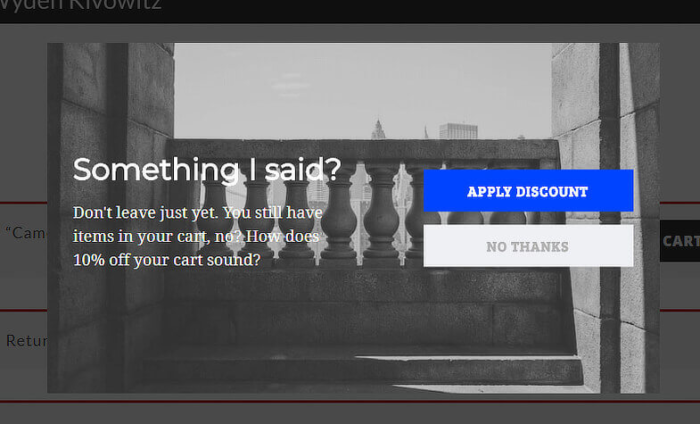
Like this Uber landing page headline here that combines creativity with real benefits.
When it comes to headlines, there are a couple of things you should be:
- Specific
- Concise
- Easy to understand
- Focused on the one (just one) thing you want to offer
And its main goal is to create curiosity, excitement and ultimately make your visitor press the CTA (call-to-action) button.
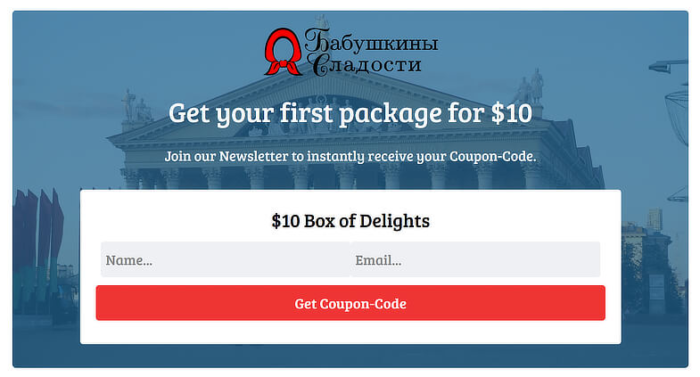
I particularly LOVE this Body & Pole landing page copy. The use of words is so strong and the message describes best what they offer while it is completely relatable to the visitor. Plus, it cleverly enhances the photo of the landing page.
See what they did there?
There’s no perfect headline. Not until you have racked your brain and come up with a few thousands of headlines. (ok, maybe I’m exaggerating here but apparently, some copywriters actually do this, enjoyed the post Copyhackers!)
And let’s get something straight here, once and for all.
Clickbait headlines are not ok!
Simply because it’s 2019 and the majority of your users have seen them (and fallen for them) before. Quite a few times.
I mean…
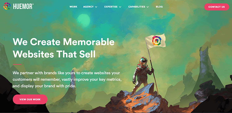
Yes, I might have actually clicked on that. If this was 2010 maybe.
While, as I said before, the goal of your headline is to make the visitor continue with your offer, offering them exactly what you promised them is extremely important.
This is what separates the wheat from the chaff. The trustworthy brands from the mediocre ones. And what makes your customers return to your store or blog, platform or store again and again.
Having said that, let’s see what makes for an ideal landing page headline.
Rule number one is to never forget who you are writing for: your prospects.
Put yourself in their shoes. What makes a landing page copy attractive enough for you so as to stay on it? Some piece of information that really interests you. In other words, something beneficial to you.
Your landing page headline must always speak to a common user pain and address visitor benefits.
You know what to do. Start by writing down the keywords you want to use.
Let’s take this Transferwise page as an example.
Their job is to help you transfer money online. And so they put that on their headline, of course.
Then, they probably did some brainstorming.
Like, consider the needs of their customers and the strong points of their service. And then added some dressing.

Careful here. When I say dressing I don’t mean the misleading kind, like the Chef Salad’s dressing where you think you’re only having vegetables for lunch, only with 1.000 calories. I mean the kind of dressing that strengthens the value of your offer. Which, in this case, is the words “cheap” and “fast”.
There you go. An eye-catching headline, strong and clutter-free.
Moral of the story, start with your keywords. Put them in a simple sentence and then get creative. Use strong words and lookup for synonyms that may convey your message in a better way.
Don’t try to squeeze in your headline as many benefits as possible. It will end up weird and fake. Focus on your key benefits and apply your tricks on them.
Use persuasive language and even try adding some limitation or urgency. It’s always best to keep your headline as short as possible. And remember: headlines that use numbers tend to convert better.
See how the number 30 immediately catches the eye and makes you read the whole sentence on this noom Landing Page.
Last but not least, place the benefit at the beginning or end of your headline, where visitors are most likely to read it.
Don’t underestimate the power of a headline. It might only be a line, but it’s your most precious one when it comes to landing page copy.
Subheader Landing Page Copy
As you may have noticed, not all landing pages use subheaders. Maybe the headline doesn’t need further explaining or maybe the copywriter just got lazy. Before you skip on your subheading too, remember that:
- Not all products/services are the same
- Your subheader is your secret power
A well-crafted subheader is your extra chance to promote the value of your offer. And rumor has it that headlines with subheaders tend to convert better.
Sometimes a subheader may serve as your body copy, while others as a “subtitle” to your headline. Whatever the occasion, it further supports and convinces your visitor on the value of your product.
Like ClickMeeting below, that uses a powerful headline and goes on to further explain their service.
It doesn’t have to be lengthy, as long as it expresses your benefits clearly and complements the headline, offering valuable extra information.
Another trick is to express your value proposition in the headline and use the subheading to discuss the actual offer.
Furthermore, a subheading is also used to encourage visitors to take action. If done successfully, then the CTA game is almost won.
Of course, this requires that your headline is strong enough to entice the visitor to read your subheading. Otherwise, sorry but no.
Body Landing Page Copy
Now, this part depends on the market and the kind of offer you are making. Many landing pages only have a headline and subhead, skipping the introductory paragraph. Or, the body of the landing page is used as a subheading.
The body of your landing page, no matter how you use it, is the heart of your page.
It should always show the benefits of your offer and be:
- Simple
- Informative
- Clear

Look how Copyblogger turns a pretty simple landing page to gold just by using bold and bullets.
The purpose of your body copy is to further explain how the visitors will benefit if they download your content, subscribe to your newsletter, etc.
Remember, it’s your ultimate chance for conversion.
So your content here should be straight to the point and speak directly to the reader. If, for example, you want the visitor to sign up to your email list you should explain what’s in for them, how often they will receive it, what’s the gain and what they should expect. If you are making a sales landing page then you should create a sense of urgency by using the right power words.
And since I would hate to lose you just because you googled “power words” here you go.
The monster list of power words yours to grab!
So, where were we? Ah, yes! Pitch benefits! Remember to emphasize on them and not on the product/service. Customers only care about what good will come out of taking the time to read your landing page.
Forms Landing Page Copy
Simply put, landing page forms are your gateways to conversion.
They are here to help you and your team collect all the essential data you need to grow your email list and convert more (and quality) leads. If optimized, that is.
And when I say “essential”, I mean it. The 7-second legend scaring marketers around the world the last few years is not a legend at all.
Actually, 7 seconds sounds like a lot of time if you think about it.
So imagine you only have 5 seconds to capture your visitor’s attention. And they’ve already spent a few seconds scanning your headline, introductory paragraph, and images. So your form is left with around 2 seconds at best.
Snooping around the internet for interesting landing page statistics I bumped into one that got me rolling my eyes.
It claims that “the average number of fields on lead generation forms is 11”.
Ok, I;m trying to keep my cool here. But seriously, what would you do if you were faced with an 11 or even 10, or 9-field form on a landing page?
I know. I would press the X icon on the right side of my tab.
So long conversion!
And, for the love of marketing, I can’t even think of one business that would actually need 11 data points to sing up for a newsletter or download a content upgrade.
Making prospects type too much information is dead wrong. The more you ask, the less likely they are to complete your form. And don’t forget those using their mobile. We all know how tiring typing on a small screen is.
When creating your fields, determine exactly what information your team needs to qualify the entry as a quality lead. Nothing more. Nothing less.
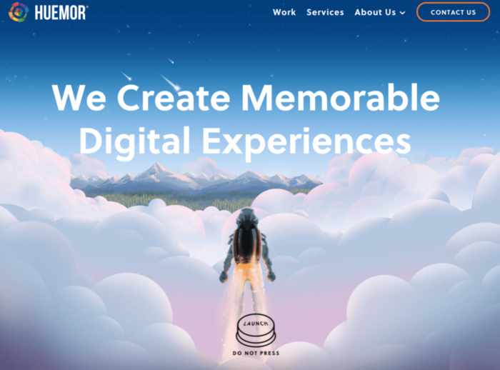
Chartbeat invites you to download their report by asking you to complete a 6-point form. And it is completely understandable since all the information they need is important for them.
Be careful to keep the right balance between your offer and the effort your customers spend to fill out the form.
Simplicity is key here.
For example, if you’re only offering a one-page infographic then asking for their industry, number of clients or their dog’s name is just too much.
Just make sure your copy clarifies inputs for each field.
If your landing page is about a work-related app or platform, then here’s a quick tip for you.
Change the copy from “email address” to “work email address”, as monday.com does.
By asking for a professional address rather than their personal one is a great way to ensure your emails will be opened at work. Right on time for business decisions!
CTA Landing Page Copy
While making your button as visible as possible and placing it on the right spot, the words you use are always the most vital part of it.
A CTA button only wants to be clicked. That’s why, to make the most of it, you must use short, easily-understood action words.
Which reminds me. One of the most popular words used in marketing is “you”. When it comes to your call-to-action though, it’s best to switch to first person. For example, instead of saying “Get your offer now”, go for “get my offer now”.
Keep it brief. Your call should be strong and simple. It’s also a good idea to include a little something that will catch your visitor’s eye and help them make a faster decision. Like this Hotjar CTA that inserts an extra and very important small info on it.

Depending on your offer, you could also add a splash of urgency by calling to arms words like “now”, “today”, “don’t miss out” and more.
Jumping on the testimonial bandwagon
Choosing what others have chosen is an old habit. And a fairly strong one. We can’t help it.
And here is where testimonials come to help. Also known as the bandwagon effect.
Of course, you don’t actually write your testimonials. But there are still some helpful tips that can make them super strong and effective.
What you do with testimonials is collect them. You find your biggest fans, best customers or devoted users and ask them to say a word or two for your product/services.
And here’s the tricky part. Because you can either let them say what they want OR guide them to say what you want.
Which means that you need to make the right questions. Be careful though. This doesn’t mean pushing and patronizing your customers. Only asking them what will prove the most helpful for your landing page.
That is, what your prospects want to read.
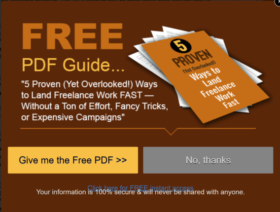
Getting the right answers for your testimonials can prove a total moneymaker for your landing page.
In fact, 66% of consumers stated that online reviews make them trust a brand online.
Testimonials are an integral part of your landing pages, especially if you are new in the game and wish to establish your company’s credibility.
Sometimes they can even become your only copy on a landing page, like Prezi.
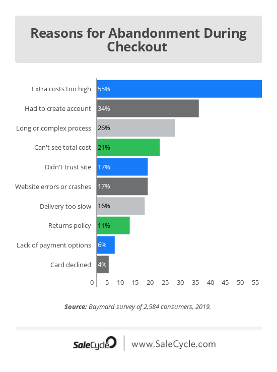
Remember: effective testimonials don’t just point out your brand’s greatness. They tell a story. They inspire and motivate. So, as far as copy is concerned, there is one more thing you should pay attention to: their voice.
Your testimonials must be persuasive. Tuned to your audience’s needs and desires. And you will only achieve this by speaking their language.
Don’t polish the sentences too much and don’t be afraid to use their words. It will sound fake. Or even worse, irrelevant to your visitors.
Keep your testimonials short, direct and authentic and you’ll see your landing pages selling like hotcakes!
Reaching Perfection
Do you think all the above is easy as pie? You are right! Because the truth is that you don’t have to be an experienced copywriter or marketing expert to write good copy for your page. You only need to follow the “rules”. And be aware of a few…secrets all content gurus know.
Does size matter?
This is an all-time classic. Should I go for a short, concise landing page or a long, extensive one?
I’m glad you asked. Because length has a high impact on conversion.
While some may say that it depends on the type of landing page, which makes sense in a few cases, most marketers will tell you that short landing page copy performs better. And I’m on their side.
If we really take into consideration the short attention we’ve talked over and over, then it’s pretty unlikely that a visitor will take time to read a novel-like landing page. On the other hand, if the offer interests them, then they don’t need too many words to proceed to the next step aka hit the CTA button.
And if one plus one makes two, then short copy wins.
Of course, if you want actual facts, there’s nothing like A/B testing your landing pages. And I strongly recommend taking a look at this Crazy Egg blog post for some bright examples on that.
The best advice I can give you though is this: stay above the fold. Above-the-fold in web design is the content that fills your screen to the bottom of the screen.
And this VWO landing page is an excellent example of this.
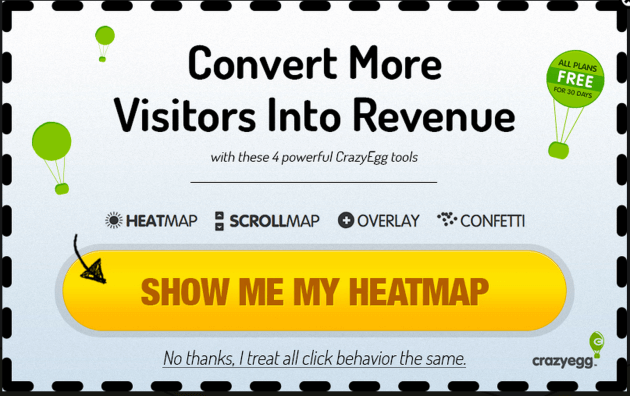
You can add all the information you want. As long as what the reader sees as soon as they land on your page sweeps them off their feet. Promise?
KISS
First, let me say that KISS is the acronym I hate even more than the smell of shrimps. BUT, bad inspiration aside, it is an axiom all marketers live by (or should if you ask me).
And it applies to your landing pages too. Landing pages overloaded with text can only confuse visitors and make them take off before completing the desired action.
Readers shouldn’t need a language degree to understand what your page is all about. They should understand everything in one glance. And spot the benefits.
Don’t you just love this ArchitectNY landing page design? So stylish and simple, yet so relevant.

Of course, it’s hard to convey your message in one single sentence, but that’s what separates the good copywriters from the bad.
Keep your sentences to the point with strong words, focus on one objective and eradicate the fluff.
What’s your number
There’s something magical about numbers. They seem to transform the whole image of a page and people love them. One could say…they count on them.
But (unfortunately) there’s nothing Harry Potter-ish here. Only pure marketing psychology. Numbers offer something specific.
They make reading and processing faster and easier than those written in words.
What’s more, numbers support and illustrate benefit statements.
See what monday.com does here?
Keep in mind that uneven numbers are more credible than even, rounded off numbers.
On the other hand, bigger numbers are best used for selling since visitors feel like they are getting a better deal.
One is never enough
A/B testing is an essential procedure if you want a profitable, high-converting landing page.
And everything in it is testable!
- Headline
- Content
- Length
- CTA
- Testimonials
Just remember: when A/B testing your landing page, make sure you only change one element at a time.
Otherwise, you won’t know what the change that did the trick was!
Come clean
A clean landing page is a good landing page. Make sure you provide all the necessary information needed to guide visitors down the funnel. Not a word more.
Check how Linda has created a minimal landing page that looks like containing only a small amount of copy, yet includes all the important information a visitor might need.
Use easily scannable, short paragraphs and bullet points to explain the benefits of your product or service and highlight the key points of your offer.
You can hurry love
No one likes losing. Be it a cozy jumper, a seminar on half-price or an exclusive beauty box, we hate being left out while everyone else is living the big life (yes, your offer IS the big life).
So to speak, adding a sense of urgency in your landing page can astronomically improve your conversion rates.
There are many ways to do this, from temporary deals to personalized landing pages and the use of power words I mentioned earlier.
My personal favorite though is the countdown timer! All these numbers coming and going, giving you the feeling that your life depends on it make you hit the CTA faster than emptying a Nutella jar with a spoon. (Any similarity with events or characters is purely coincidental.)
And hey, Moosend Landing Pages has the coolest drag & drop countdown timer around, fully customizable to fit your message and brand!
In fact, here’s one quick Landing Page I created while playing around with our editor.
No, I couldn’t resist painting my boxes mint. And yes, it only took me a few seconds to create this timer.
It’s all about them
When writing landing page copy, you must always focus on your readers.
Forget the “we” statements. No one cares about you and your super amazing company (no offense). All your visitors care are their benefits.
Focus on your audience rather than your products to help people relate more without getting the feeling of reading something sale-sy.
Include words and phrases like “your”, “yours”, and use direct sentences that urge the reader to take action such as “sign up today” or “try it for free now”.

See how IZEA uses the second person to make you feel like it’s all about you? And how they care for YOUR brand and YOUR growth?
That’s the right feeling!
Ready, set, copy
Writing effective landing page is not simple. And it should never be. Otherwise, all landing pages would be the same.
Take your time to come up with captivating headlines and customer-oriented paragraphs that highlight the benefits. Collect the right testimonials and make your CTA one with a clear purpose.
You’ re good to go!
And hey, do leave me a comment with your thoughts!
The post Landing Page Copy Mastery: From Beginner to Pro in a Blog Post appeared first on Moosend.
