This is a contributor post written by Brandon Weaver, Director of Content at Instapage, the world’s most customizable and designer-friendly landing page platform. He writes about landing pages and marketing, and has a healthy obsession with the Golden State Warriors. Say “hey” on twitter: @bkweav.
In 2015, MarketingSherpa published a survey revealing that 72 percent of US adults prefer to communicate with companies through email. Many industry experts believe this is the result of targeted email marketing, which helps brands provide customers with even more relevant information.
In order to capture email addresses from customers and prospects who want to hear from you, however, it’s important to leverage dedicated landing pages to convince them to sign up.
Since landing pages use persuasive elements like compelling headlines, benefit-oriented copy and testimonials, people are more motivated to take action. Plus, they can go a long way in helping you make a lasting first impression.
However, simply creating landing pages isn’t enough to convince people to redeem offers. The best conversion results are achieved through landing page optimization techniques. Before we get into the specific elements, let’s cover a few basic principles.
Providing a strong user experience
When it comes to creating a high-converting landing page, a consistent experience is key.
To provide a great landing page experience, it’s important to embrace: a distraction-free zone, white space, readable copy and message-matching. Let’s look at how companies are using these tactics to enhance their user experience for visitors.
A distraction-free zone
Optimized landing pages focus on persuading visitors to take action on a specific offer. If your landing page is focused on a newsletter offer, for example, don’t include links to your homepage, pricing or blog.
This way, you keep your visitor’s focus entirely on the page’s goal.
Take a look at this page from Zendesk in which they use Google AdWords to push prospects here:
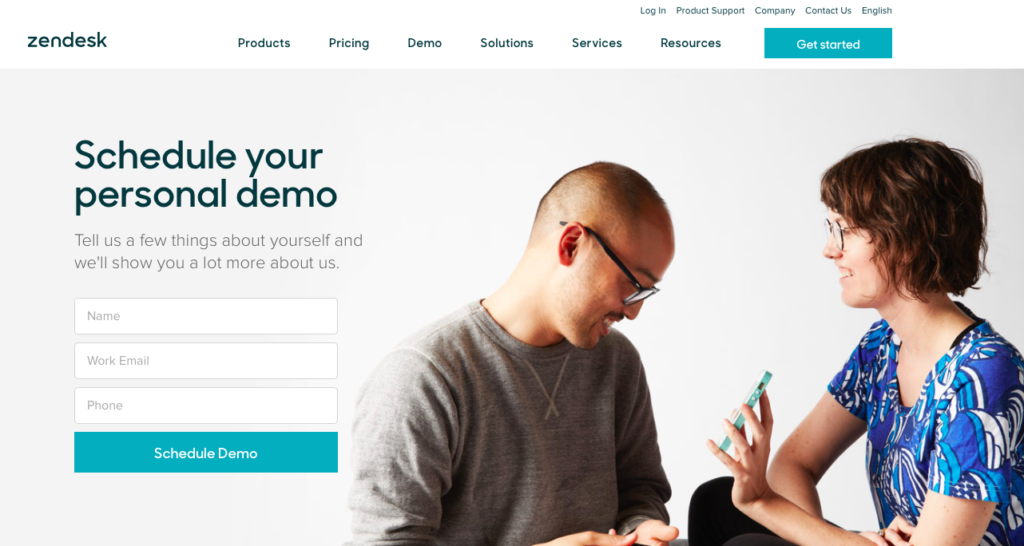
The navigation menu in the header and the links in the footer distract from what could be an otherwise solid landing page, focused on scheduling a demo. Eliminating those links would keep prospects focused on the offer.
Try this: As you look for opportunities to improve conversion rates on your landing pages, try keeping it simple. Test a version that only has one link: your primary call-to-action.
Message-matching
Message-matching is when an ad and its corresponding landing page share specific elements. This consistency can be done through matching images, text or color schemes.
Here’s a Tableau ad that was served on Facebook:
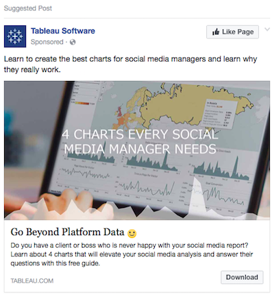
When someone clicks it, the user then goes to the landing page below:
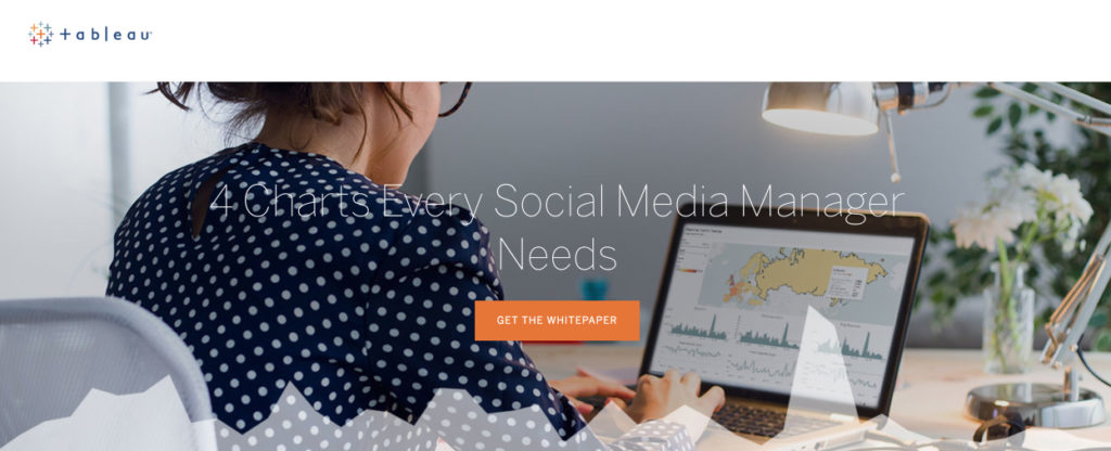
Both the ad and the landing page use the same headline: “4 Charts Every Social Media Manager Needs.” Consistency in the headline increases the prospect’s level of comfort and the odds of conversion.
Readable copy
If your prospects can’t read your copy, they won’t be able to redeem your offer. Resist the urge to use fancy fonts. Instead, use simple, bold fonts that are easily readable. Also embrace contrasting colors to ensure optimum clarity.
Here’s an example from ConnectWise:
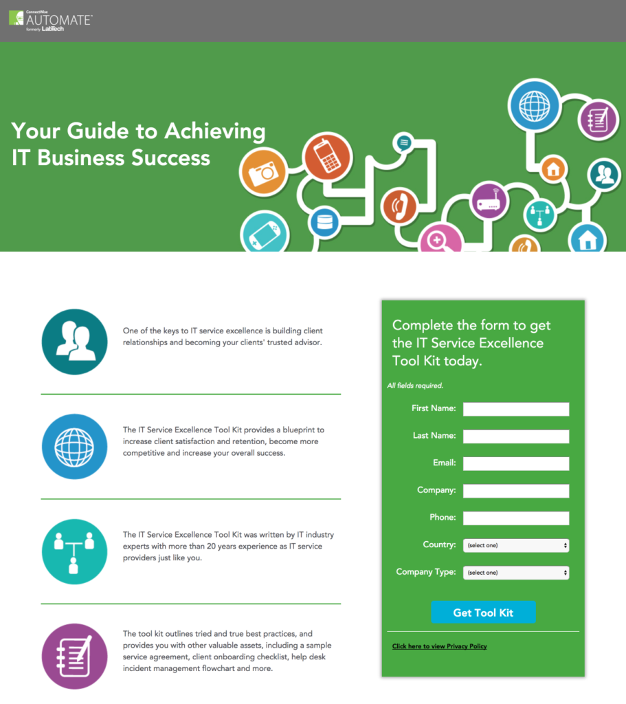
As you can see, the font is clear and legible, which allows prospects to quickly read and understand what’s being offered.
White space
White space is defined as empty space between text, images, forms, videos and other design elements.
When your landing page elements seem cluttered and busy, your visitors might have a difficult time focusing on the offer. Optimized landing pages make good use of white space to make the relationships between elements clear. White space helps the page flow and defines each element.
Five9 uses white space on their “Get a Quote” landing page to isolate their video and CTA button:
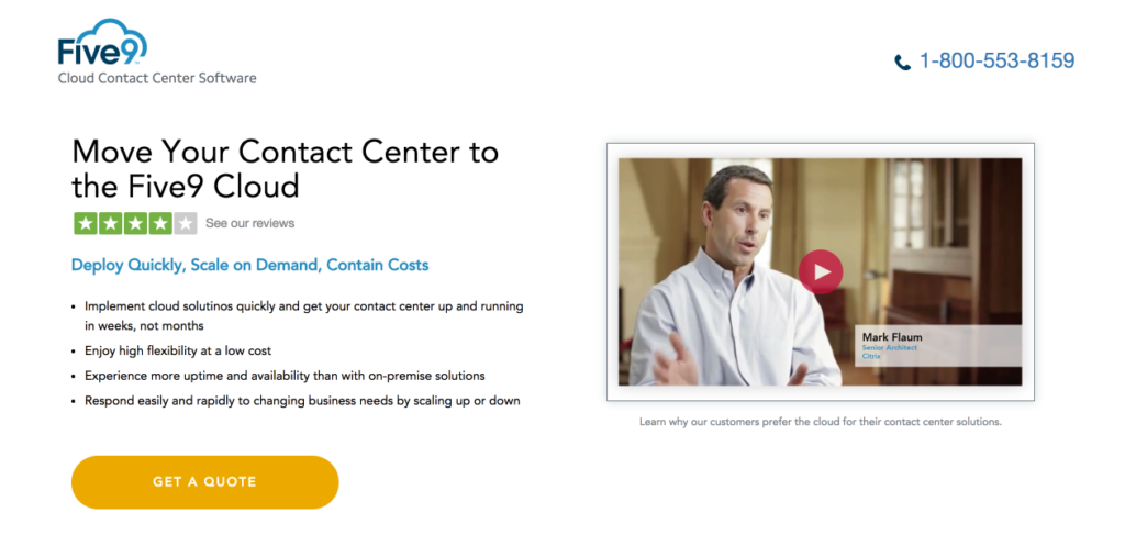
By doing so, they’re able to draw more attention to the action they want visitors to take.
Optimizing your landing pages with the right elements
With those principles as a foundation, we can now discuss which elements are best at persuading visitors to take action.
Headline
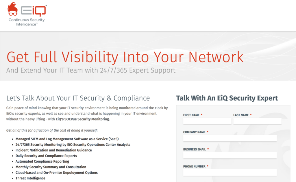
The headline is the first thing that visitors see, so it needs to capture their attention immediately and convey your unique value proposition. If it’s vague or doesn’t convey a benefit, users won’t stick around long enough to convert.
This EiQ landing page pulls visitors in by immediately conveying the benefit being offered:
Image
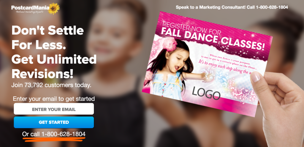
Humanizing your offer can make it more relatable. One of the easiest ways to do this is using a relevant image.
PostcardMania demonstrates the human element as soon as visitors arrive on their page:
Try this: Need a reliable source that provides compelling stock-free images that aren’t cheesy? Check out some of our favorite galleries like Pexels and Unsplash. Test photos of people with different expressions and gazes, such as someone who’s looking directly into the camera versus someone who’s looking off to the side.
Copy
Let’s face it: the average attention span is shorter than ever – eight seconds, to be exact. So when you craft large blocks of text, you risk lower engagement and fewer conversions.
As a result, you want to create copy that’s easily scannable and highlights the most important elements. This way, visitors can quickly determine whether your solution is right for their needs.
One way to highlight critical information is to use bullet points whenever possible.
Bullet points allow you to use minimal text and draw attention because of the way they’re styled (see Five9 and EiQ examples above). And when you combine bullet points with white space, for example, you increase their effectiveness even more. For more examples, see how these 20 companies use persuasive copy and bullet points to convince users to act.
Form & CTA
The golden rules of form optimization are to keep it concise and feature a compelling, unique call-to-action.
If your form is too long, you may scare visitors away because you’re requesting too much information. And if your CTA isn’t personalized or it’s difficult to find, you jeopardize the chances of turning your visitor into a subscriber.
Try this: Treat your sign up form copy the same way you treat your landing page copy. Highlight the main benefits of your emails and address what they could miss out on by not subscribing.
Trust badges
Trust badges include customer logos and security seals, both of which prove the company is a trusted brand.
Customer logos help communicate that you can be trusted since other brands trust you as well.
Security seals help prove to visitors that their personal data will be protected. These are often displayed near forms and typically include privacy protection like Norton or TRUSTe and payment services like PayPal.
As an example, see how NewsCred uses customer logos to showcase which brands are using their service:

Social Proof
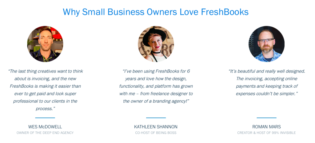
Think of social proof as recommendations from other organizations and how a company’s product or service has benefitted real people. It often comes in the form of testimonials and case study videos. FreshBooks does a great job with social proof in their testimonials because they show a headshot, the quote, name and title:
Try this: If you don’t currently have customer testimonials, send out a survey asking for feedback! If there are any you’d like to feature on your landing page, reach out to them for approval.
Keeping your prospects engaged once they subscribe to your list
As you optimize your landing page, be sure to reflect on what’s working and what isn’t. Then test new ideas and tactics to continue improving your conversion rates.
And remember – once your prospects sign up for your product, service, or email list, the work isn’t over yet. It’s time to keep them engaged by sending related content offers, freebies and more through email.
What persuasive elements will you use on your landing pages? Let us know in the comment section!
