LinkedIn unveiled an update to its branding which features a slightly different logo, a new color palette, and a custom font.
The company says its updated branding is designed to convey warmth, humanity, and inclusion:
“Our illustration, typography, and colors convey our brand’s warmth, humanity, and community. We’ve updated our logo. And we’re on a journey to make sure our design is accessible and inclusive to all our members and customers.”
Currently, the new branding can only be seen on LinkedIn’s new ‘brand’ subdomain.
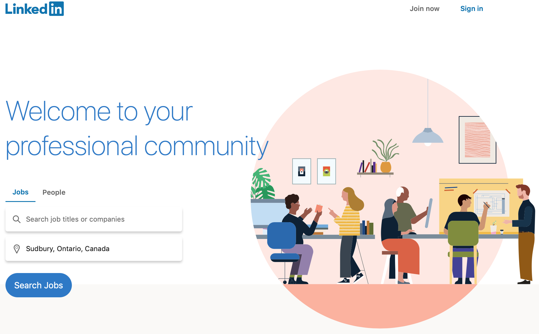
It’s also shown on the welcome page for users who are signed out:

In a writeup of the changes, LinkedIn identifies all the new elements of its branding:
- Logo: The logo is now just one color instead of three.
- Colors: LinkedIn describes its new color palette as warmer and more approachable.
- Illustrations: Custom illustration shows people connecting in the workplace.
- Shapes: Circles and rectangles are featured throughout, which are inspired by the ‘i’s in LinkedIn.
- Font: The new font is custom typeface called ‘Community.’ LinkedIn says it incorporates elements of handwriting and rounded, more organic letterforms.
A report from Adweek says LinkedIn’s brand refresh was two years in the making.
The updated branding will roll out incrementally throughout the platform.