Each year, we see new design trends shaping digital marketing—from the use of color and imagery to typography trends, interactivity, and more. In our “Trending in Email Design” series, we look at the hottest digital design trends—and dive into how they translate into email marketing.
Remember a few weeks ago when we chatted about organic shapes taking over the inbox? This might make you ask, how is geometry a trend at the same time? What looks like a contradiction on the surface only shows that what’s true in fashion rings true in email design, too: Where there’s a trend, there’s always a countertrend.
This isn’t only a phenomenon we see in the choice of shapes. While some brands embrace dark styles, others opt for bright and bold colors. We see a move towards illustrations in our inboxes, while other brands go a different route and dominate their designs with 3D photography.
And while, yes, a growing number of brands rely on organic shapes to level up their email designs, it’s clear that geometric shapes have their place too.
Why geometric shapes are powerful email design elements
Shapes are an integral design element. They can be used to layout content, create a journey by directing the eye from one element to the next, represent a concept, or add movement. Designers draw upon 3 types of shapes:
- Organic shapes: fluid and irregular, often taking influence from nature
- Abstract shapes: representations of familiar objects
- Geometric shapes: recognizable, structured shapes such as triangles, squares and circles
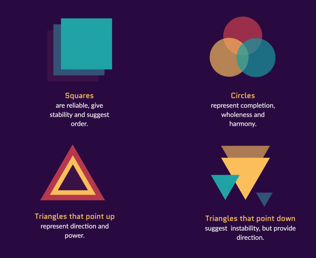
The human eye is drawn to the power and symmetry of geometric shapes—and that’s no surprise. Geometric shapes have been familiar to us since our infant years and they’re around us constantly. Used consciously, the meanings geometric shapes hold can strengthen and elevate a message. Circles represent eternity and wholeness, squares offer equality and security, and triangles show movement and direction.
Curious how designers use the power of geometric shapes in their email designs? Here are some beautiful examples from our inboxes.
ASOS
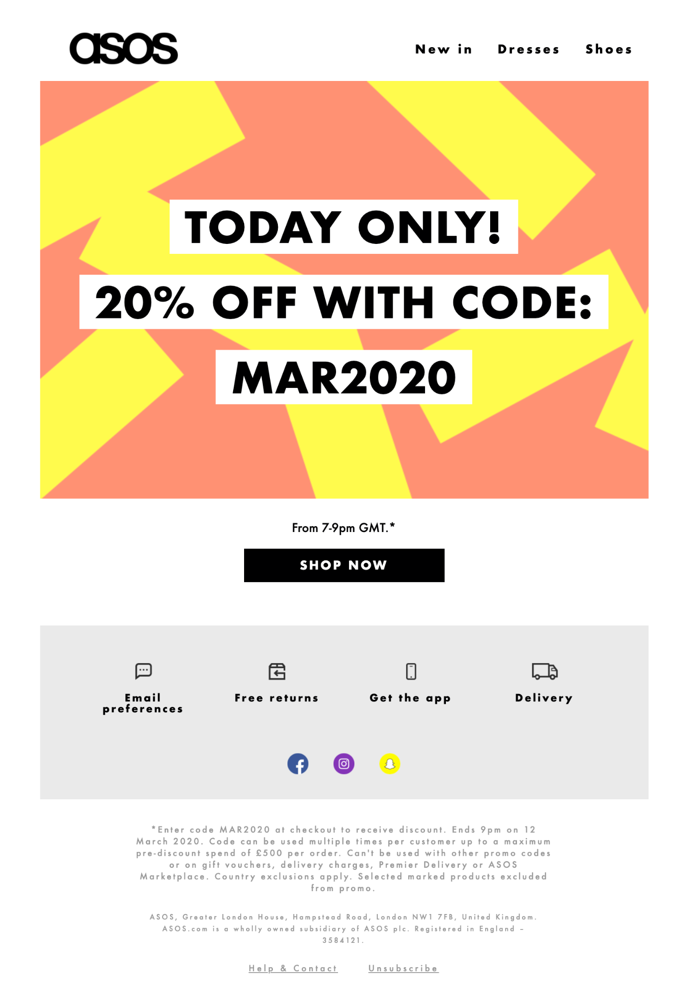
Fashion retailer ASOS combines rectangles with bold colors to put their time-sensitive offer in the spotlight. This minimal design makes its message clear by loading everything important into the hero area; some finer details can be found in the footer. This approach helps the recipient quickly digest the message and take action.
Packlane
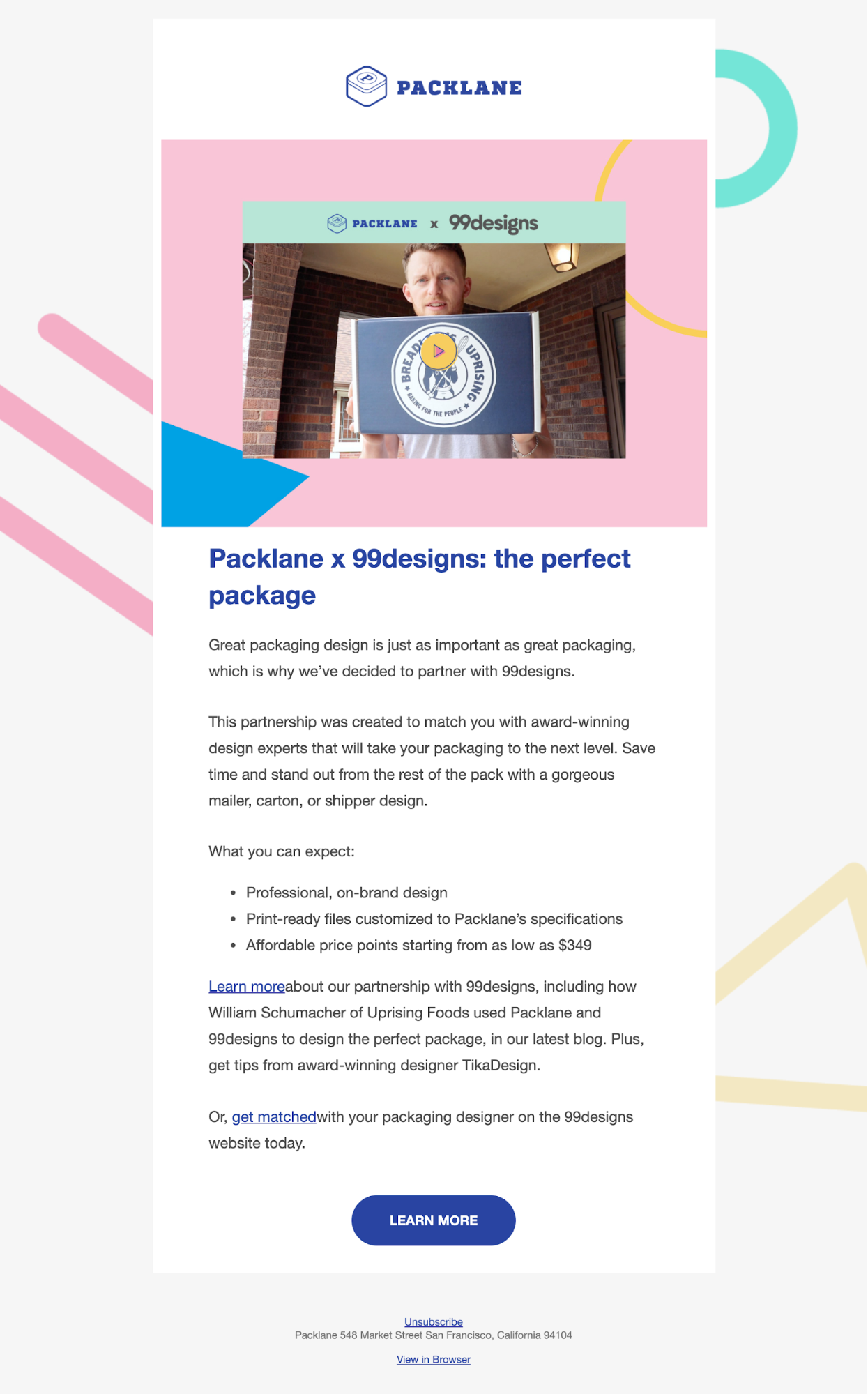
Packaging manufacturer Packlane uses recognizable shapes and straight lines outside the body of this email to lead the eye down, helping readers engage with an exciting announcement about their collaboration with 99designs.
Zajno
The shapes we come across most often in design are squares and rectangles. Think about it: most content blocks we use in email day in and day out are basically just rectangles. Therefore, we may not pay as much attention to them—but don’t fall into that trap. When used creatively, squares and rectangles can be just as eye catching as any organic or abstract shape.
This beautiful email from design studio Zajno is the proof. They’ve created an exciting journey through the content of their newsletter, using multiple squares, rectangles, and straight lines in a well-considered, off-grid composition.

New American History
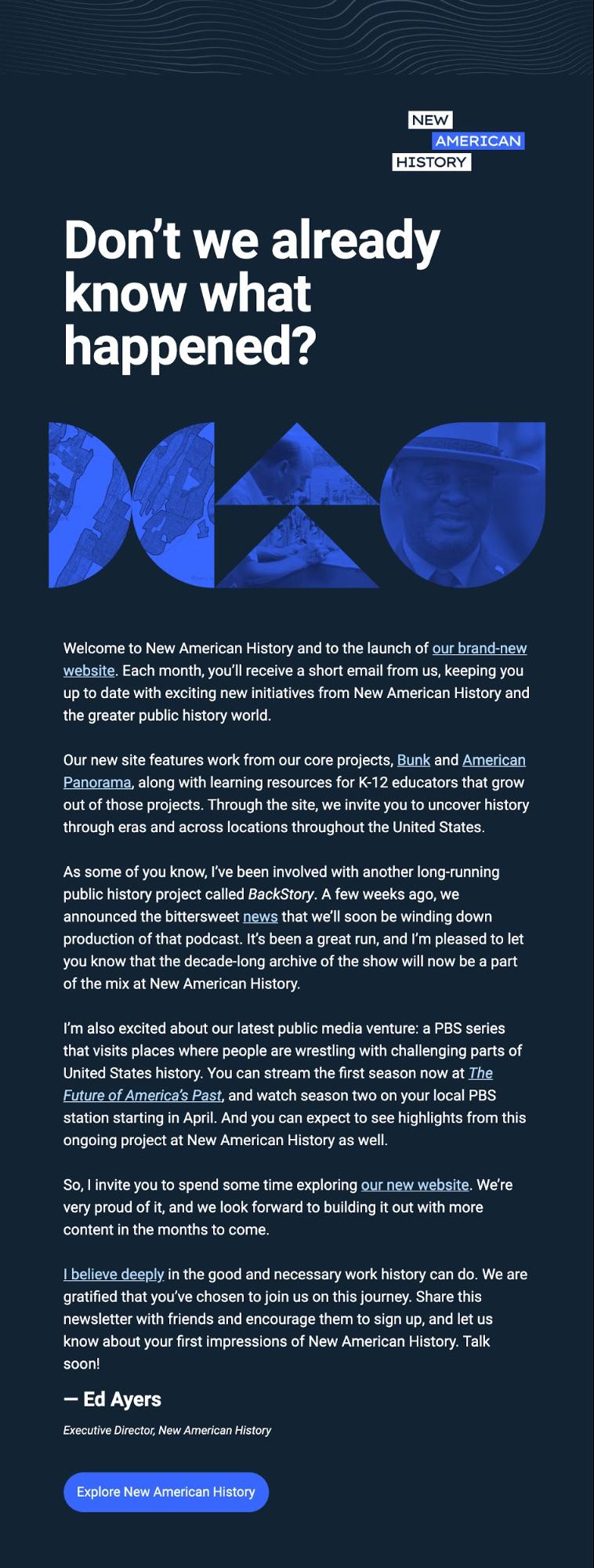
Educational resource provider New American History uses geometric shapes to mask photography in the hero of this welcome email, making a highly engaging graphic representative of the Bauhaus art movement.
Mailchimp
Mailchimp takes geometry to another level. Geometric shapes form the headline typography of this newsletter, and slick animation further draws the eye to the bold hero area. Throughout the email, square blocks of color accompany the body copy—and the haphazard placement of these shapes generates intrigue, guiding the reader down the email.

Starbucks
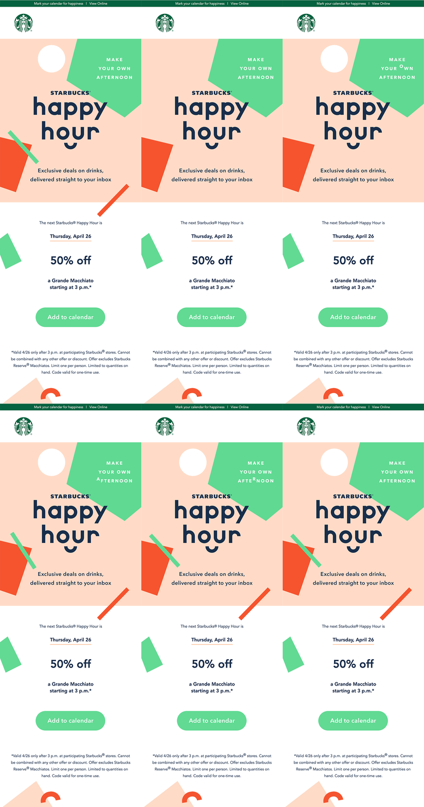
Taking a similar approach, Starbucks uses animated geometric shapes to make an impact on open. By animating the length of the hero area, they encourage readers to scroll and reach the all-important offer details and call-to-action.
