If you work in tech, it’s likely that you’ve heard of UX writing:
“A UX writer is someone who writes for user experience…[and uses] the words we read or hear when we use a digital product. Their goal is to help and guide the user.”
With companies like Google, Spotify and Airbnb spearheading the trend, UX writers are increasingly recognized as an indispensable member of product and design teams. And though this specialized job title is new, the importance of writing for the user experience isn’t. Digital products have always required UX copy to educate and guide users.
Imagine your favorite digital product without any words to clarify its functionalities:

Huh, what are we supposed to do with this?

Ohhhhh.
In this post, we dive deeper into what UX writers do, the value that UX writing brings to digital products, and how to craft UX copy that brings your product to life.
What Does a UX Writer Do, Anyway?
Simply put, UX writers help users achieve their goals when they use a product. They do this by writing the text that guides users as they navigate and interact with digital products, including calls-to-action, help content, onboarding flows, menu taxonomy, and more. Essentially, functional copy that is tied to the digital product experience.
As Dropbox UX writer John Saito puts it, the goal of UX writing “is to not have your words be noticed, so it becomes a seamless experience.”
Sounds easy enough, right? Though UX copy appears simple on the surface, it actually requires knowledge of design principles, technical skills, a deep understanding of user needs, and lots of cross-functional collaboration.
Marina Pozniak’s journey to rewrite the “search empty state” copy in Spotify illustrates the complex nature of a UX writer’s job. With seven examples of what you can search for, the “Before” text below is far too wordy and unclear, while her “After” text feels like a natural part of the product. It’s simple, clear and focuses on the benefit to the user.

Though the “After” text — “Find music you love. You can search for songs, artists and albums” — is deceptively straightforward and simple, Marina conducted extensive user tests and worked with multiple team members before deciding on these words.
In her portfolio, Marina explains the process. First, she worked with designers and product managers to identify the problem they were trying to solve with proposed copy changes. They also set goals for the outcomes they sought to achieve. Though she does not elaborate on the specifics of this step, it could include anything from conducting user research (to unearth pain points in Spotify’s search experience) to defining the metrics that represent success.
Marina then drafted several different versions of copy and tested each one in user research sessions. The final product is the result of this careful work.
As you can see, UX writing is a highly cross-functional role that encompasses more than meets the eye. Anyone can jot down some words, but UX writers actually bring products and experiences to life.
Dive Deeper:
Examples of How UX Writing Adds Value
People use products for many different reasons. Maybe it has the potential to solve a problem and make their lives easier. Maybe they simply want a more delightful way to pass the time. Whatever the reason, in order for them to achieve their goal, users must first learn their away around a new product. Have you ever opened up a product for the first time and had no idea how to proceed? That’s a sign that UX writing needs work.
To add another layer of complexity, user retention is notoriously difficult. Products have a very short grace period to impress users and ensure that they stick around, and UX copy plays a critical role in a person’s first moments with a new product by setting the tone for their experience. When it comes to engaging customers in the long-run, UX writing can clarify more advanced functionalities or explain newly rolled out features.
With this in mind, here’s how UX copy can enhance the user experience and your business as a whole:
UX Writing Clarifies Uncertainties during the Product Experience
New products come with a learning curve, and even long-term users need some guidance at times. In these situations, UX writing acts as a helping hand, making the product experience clear and intuitive.
Airbnb leverages excellent UX writing to mitigate a common fear that users may experience during the booking flow. When booking accommodations online (or when buying anything online, really), people like to have a holistic view of pricing and other details before committing to payment.
Knowing that there are unanswered questions at this early stage of their booking flow, Airbnb makes it a point to let users know that “You won’t be charged yet” when they press the “Book” button:
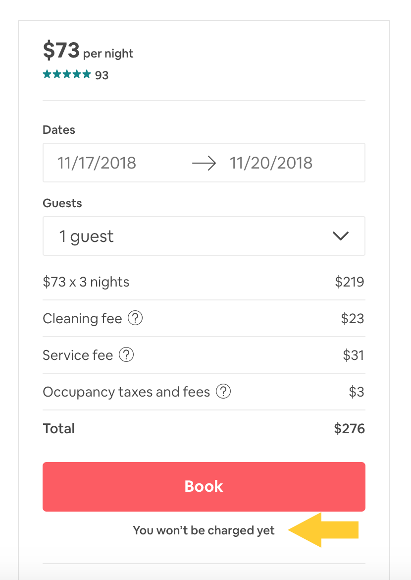
This small bit of text alleviates the fear that people have about being prematurely charged and allows them to comfortably move on to the next step in the booking process.
UX Writing Empathizes with Users During Every Step
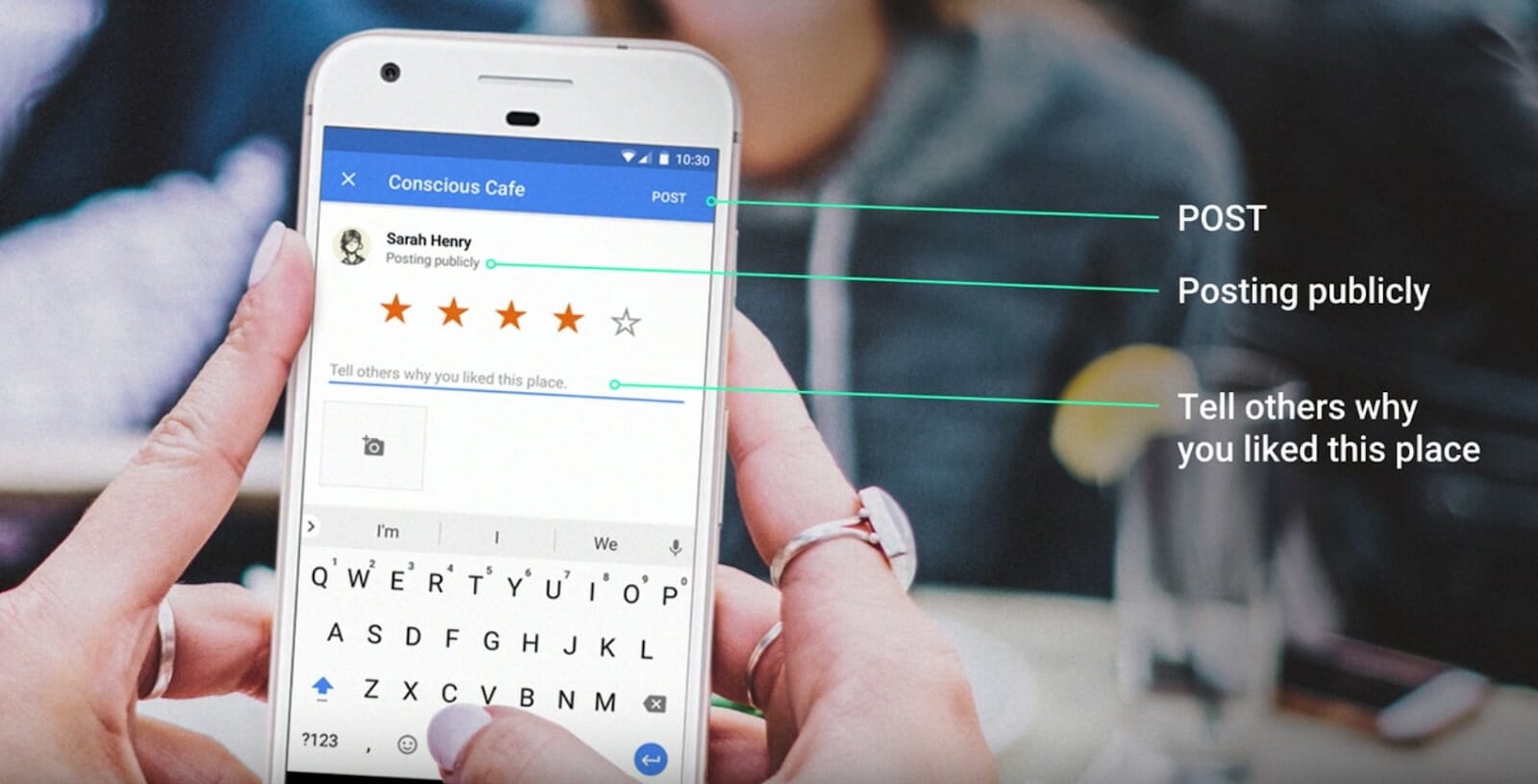
When done well, UX writing displays an intuitive understanding of a user’s in-the-moment emotions, intent and needs. Here’s how Google exemplifies this when users write a review on Google Maps.
Google lets users know that their review will be posted publicly in an effort to build trust. They also offer a helpful prompt in the review text field: “Tell others why you liked this place.” This copy effectively predicts the uncertainty that users may feel about what to write, enabling them to quickly get started. It is thoughtful, empathetic UX copy in action.
By the way, check out Google’s full 35-minute video How Words Can Make Your Product Stand Out.
Dive Deeper:
UX Writing Humanizes Your Product
UX writing breathes life into your product, gives it personality, and differentiates it from a sea of competitors. To see this principle in action, look no further than Slack, a company that is well-known for its relatable branding and voice.
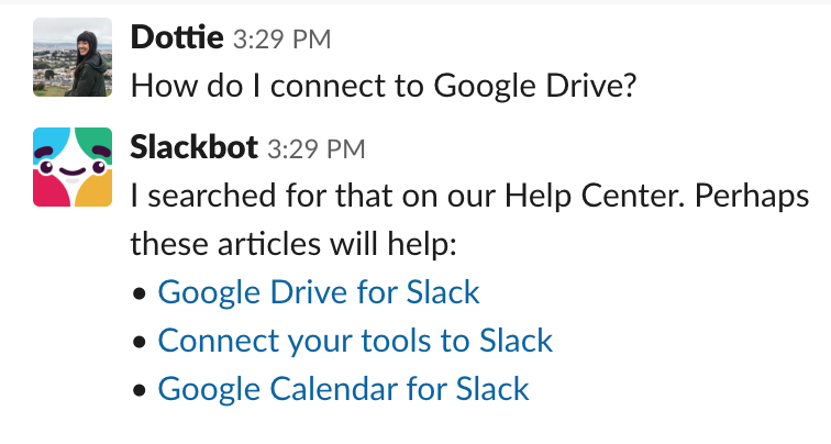
Whenever someone joins a new Slack workspace, their first interaction is often with Slackbot, a chatbot that acts as a live support agent as they learn how to navigate the interface. Through Slackbot, Slack is personified as a product.
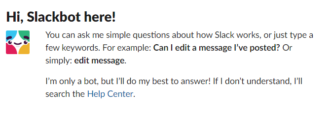 Slackbot’s casual, friendly voices makes the support experience feel highly interactive — like you are reaching out to a friend who knows all the answers. This is far more delightful than the usual tedium of scrolling through support articles to find what you need, and helps users build an emotional connection with Slack’s product.
UX Writing Drives Engagement and Increases Your Bottom Line
Language can have a huge impact on your business. At Google I/O ’17 conference, Maggie Stanphill, UX Director at Google, showed us how changing two words in Google’s hotel search product significantly improved user engagement.
Previously, there was a label that prompted users to “Book a Room.” After extensive research, Maggie’s team found that the phrase was much too committal in this early stage of the user’s decision-making process.
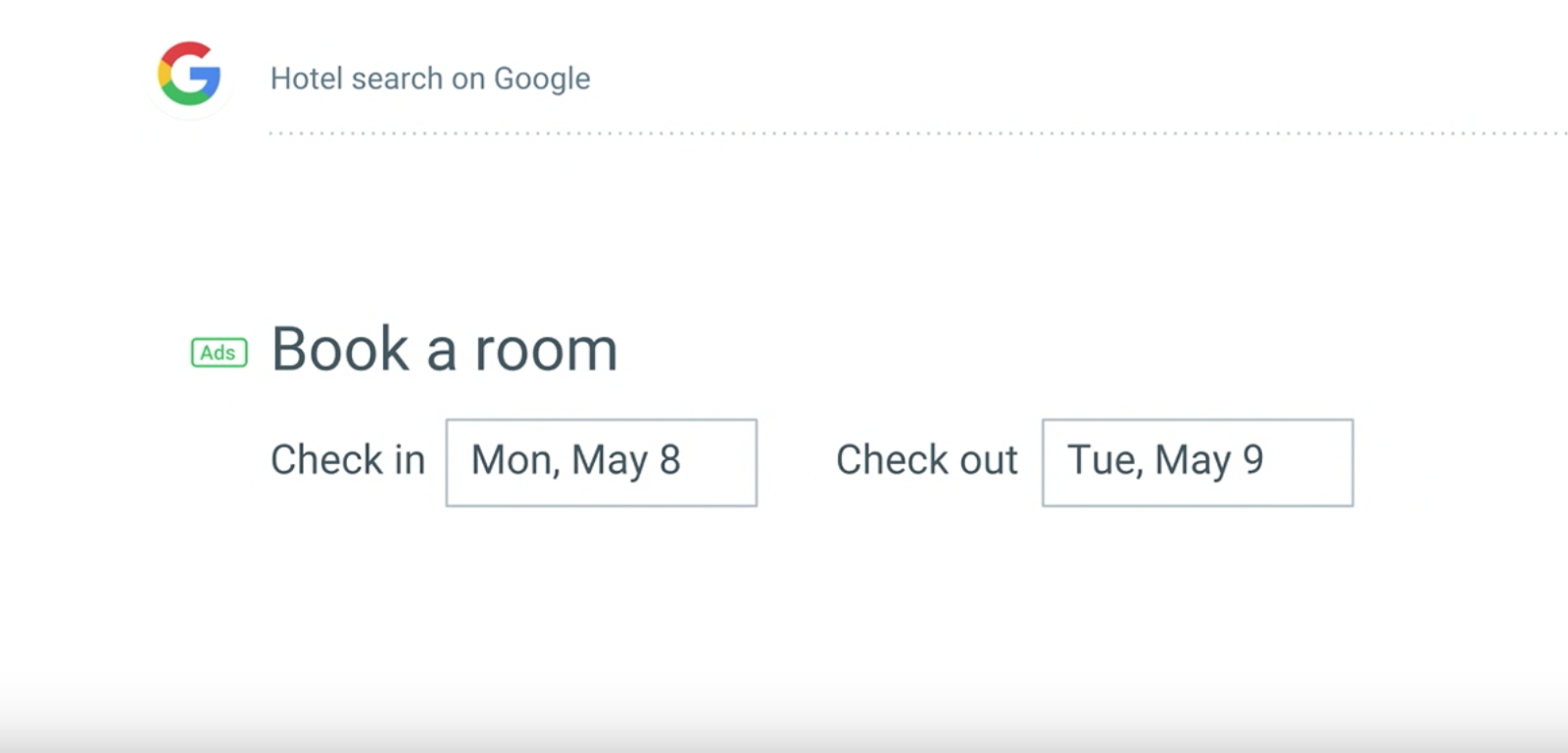
After switching “Book a Room” to “Check Availability” — a phrase that matched the mindset of users in this stage — the team saw a 17% increase in engagement:
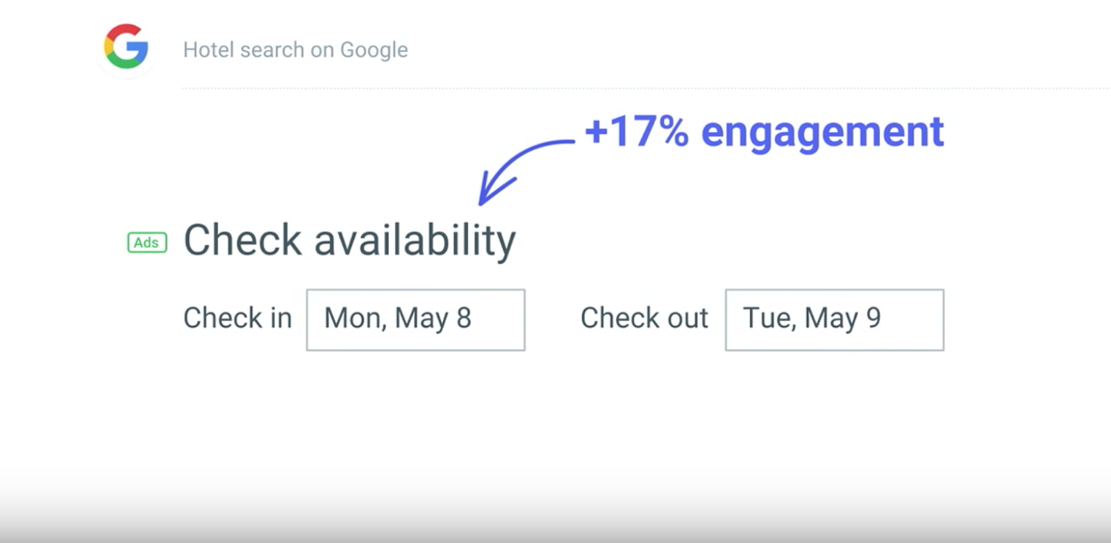
This goes to show that UX writing — when executed well — has the potential to boost revenue and increase your bottom line.
Dive Deeper:
Practical Tips for Great UX Writing
Now that we’ve covered the value that UX writing brings to your product or service, it’s time to up your game. To make a product really sing, it’s important to first understand some foundational UX writing principles that will help users understand — and even love — your product.
Great UX Writing Is Simple and Clear
A good rule of thumb when writing for the user experience is to ask yourself the following question: “Will users understand everything that this copy is trying to convey the first time they read it?” If not, people may get confused and abandon your product.
To craft UX copy that is simple and clear, try employing the following tips:
- Avoid Jargon and Highly Technical Terms. UX copy must resonate with a large and varied audience. Avoid jargon, obscure words or highly technical terminology and, instead, stick with language that is easy to understand for everyone:

- Be Conversational. As a core part of the user experience, you want your UX copy to be human and authentic. This makes your product a little more approachable and reflects the personality of the people behind the words. Aim to make your writing feel like a conversation that users are having with someone they know.
- Offer Enough Context. UX writing should offer enough context to support and shape the user experience. Why must a specific action be taken? Where does clicking a button lead to? What should be written in a form field? What is the best way to navigate an app? UX copy should answer these questions so users can make sense of a product — or even spill all their existential ponderings here….

Great UX Writing Is Efficient and Useful
Your product exists to solve a problem. The copy within your product needs to aid this goal. Here’s how to do that:
Give Each Word a Job
Each word of UX copy should serve a specific purpose — to educate, guide or motivate action. Marketing copy can afford to be punchy or ornate, but when it comes to UX copy, it gets in the way of user experience. Additionally, there are usually strict limitations to the number of characters you can use. If your words don’t contribute to a goal, leave them out.
Make Content Scannable
A Nielsen study on how people read on the web came to the following conclusion:
“They don’t. People rarely read Web pages word by word; instead, they scan the page, picking out individual words and sentences.”
Though that study was done many years ago, this finding is still relevant today because of the proliferation of digital content and information. To meet users where they are, UX writers must craft copy that can be quickly consumed and understood. In other words, they must write for scanning.
LinkedIn provides a private dashboard on the profile page of each user that includes personal stats like profile views as well as information about LinkedIn’s career services. Knowing that users won’t painstakingly read each word, LinkedIn draws attention to personal stats by enlarging numbers and bolding the headline of each career service section. This way, even if users only take a quick glance, they get a clear gist of what the dashboard offers them.
 Get Right to the Value Proposition
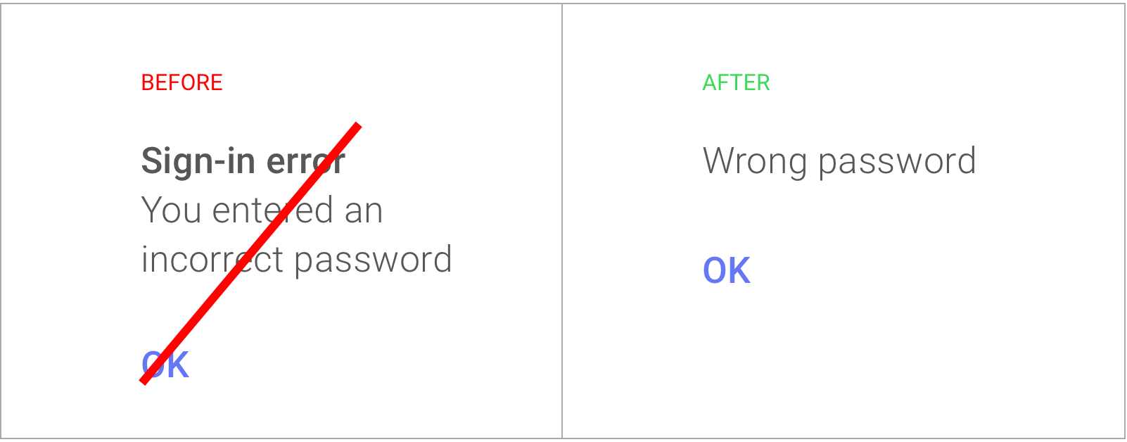
UX writers must craft copy that allows users to take efficient and accurate actions. To achieve this, always lead with the most essential pieces of information to reduce confusion about what you want the user to do. This practice is called frontloading and is used by tech giants like Google, as in this example:
Dive Deeper:
Great UX Writing Reflects Your Brand Voice
UX copy is an opportunity to let your brand’s unique personality shine through your product. When executed correctly, this adds delight to the user experience, sets your product apart from competition, and creates loyal customers. However, the way you do this must be consistent with other areas of your brand. If your brand voice is usually serious and formal, for example, throwing colloquialisms into your UX copy just makes for a jarring user experience.
Mailchimp’s marketing efforts are an inspiration for anyone looking to build a brand that stands out. In all their collateral, channels and content, they use a fun, quirky brand voice that their audience loves.
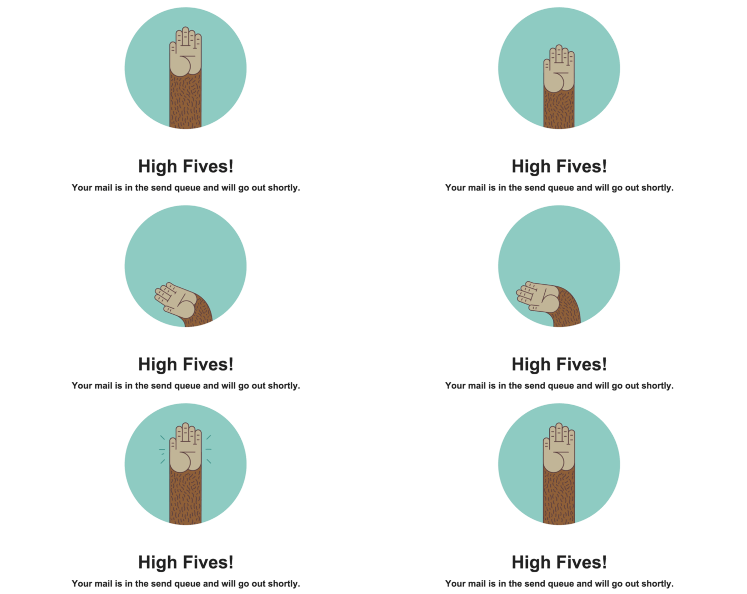
Their UX copy is no different. The below example is the confirmation that Mailchimp displays to users after they schedule an email campaign. It shows Freddie — the Mailchimp mascot — offering a high five, and reinforces a feeling of accomplishment. This playful message is in line with their overall brand voice, and makes the product experience really pop.
UX Writing Is Here To Stay
As some of the leading companies in the world have shown, UX writing is key to an excellent product experience. For those looking to create UX copy that resonates with users, remember to prioritize simplicity, clarity, efficiency and always stay true to your brand voice. Keep your users in mind in everything you do and build empathy by using the right language. After all, your ultimate goal is to help users figure out how to successfully use your product.


 Get Right to the Value Proposition