More than 50 percent of Google’s global search results are served from its mobile-first index, according to an announcement from the search giant.
The news is important for those who maintain separate mobile and desktop sites. It means that roughly half of the results your potential customers see when they search Google are mobile pages — regardless of whether the prospects search from a desktop computer or a mobile device and regardless of how well the desktop version of that page might be optimized.
In July, Google started shifting to a mobile-first index from the traditional method of indexing and ranking desktop-friendly pages. Why the change? For the last couple of years, Google has delivered more search results to smartphones than to desktop computers. Mobile is the future, and Google is determined to get there.
How to Check
There are several methods to determine if your site is included in the mobile-first index.
First, Google has pledged to send an email message to site owners via Search Console when their site is switched to the mobile index. This is just one more reason to verify your site in Google Search Console. (Google has fallen behind in sending the email notifications, however, according to published reports.)
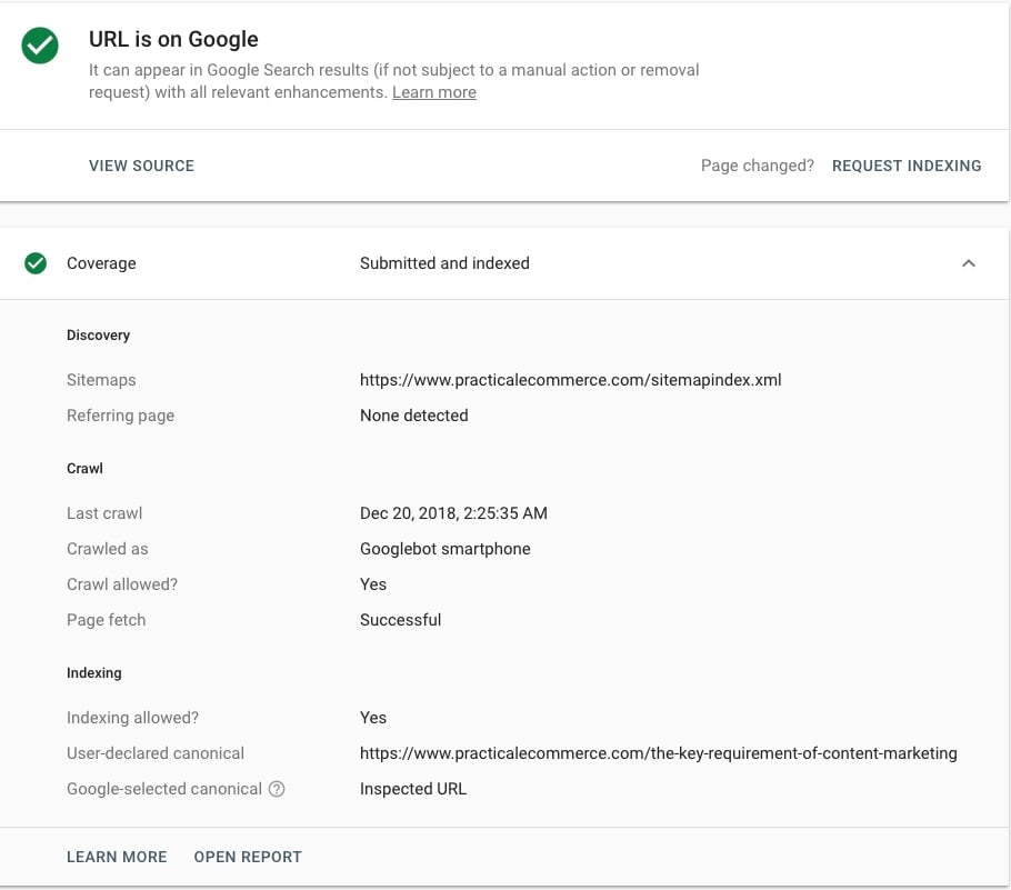
Another way to check is to use the URL Inspection tool in the new version of Search Console. It gives details on specific URLs, such as whether the page is indexed, listed in the sitemap, and has a canonical tag. But it also shows the last time Google crawled the URL, and which user agent crawled it. If you see that “Googlebot smartphone” was successful at fetching the page, it’s in the mobile index.
The last way to check, if you don’t want to sign up for Google Search Console, is to analyze your site’s server logs to look for crawling instances of Googlebot smartphone. However, server logs are usually much harder to access and analyze than registering for Search Console.

The URL Inspection tool provides details such as whether the page is indexed, listed in the sitemap, and has a canonical tag. It also shows the last time that URL was crawled, and which user agent crawled it. This example tested a URL from Practical Ecommerce. Click image to enlarge.
Impact
Eventually, all web pages that Google knows about will be in its mobile index.
For sites that have no mobile alternative, Googlebot smartphone will continue to crawl and index the desktop-only site. In fact, these sites moved to the new index first. However, desktop-only sites have a lesser chance of ranking for mobile searchers based on the poor experience they would likely have on a smartphone.
Google moved responsive sites to the mobile index next because they posed little challenge. Responsive sites serve the same code and content to mobile and desktop users, so there’s no real change in how the site would rank.
It’s important to note that responsiveness and mobile-friendliness aren’t required, according to the Google Webmaster Twitter account:
On requirements: Neither mobile-friendliness nor a mobile-responsive layout are requirements for mobile-first indexing. Pages without mobile versions still work on mobile and are usable for indexing. That said, it’s about time to move from desktop-only and embrace mobile 🙂
Next, Google said it would tackle the sites where the content on an m-dot version is the same as desktop in all ways but the URL. Only the mobile version of the page will be indexed, but desktop searchers will continue to be served the desktop version of the page. The presence of accurate, relative canonical tags would make this fairly easy for Google to decipher. Sites without accurate mobile tagging may have some issues, however.
Websites that pose a challenge to Google, and therefore may lose organic search traffic, have different content on their mobile and desktop versions. This typically means the mobile site has less content. These sites have ranked based on the full desktop content. When Google swaps them to rank for lesser-content mobile versions, contextual relevance, internal link authority, and even the number of pages available to index will change. All will likely cause problems with ranking and driving traffic to your site.
What to Do?
I’ve seen no furor over performance drops from mobile-first indexing. But we don’t know where Google is in the rollout process. Serving 50 percent of search results from the mobile index is not the same as indexing 50 percent of the sites on the web. There are presumably millions of sites yet to be indexed.
It’s possible that the most challenging aspects of the update are forthcoming. If so, companies with different desktop and mobile sites will be the most impacted. Creating a new site responsive is the easiest solution. Facilitating the mobile-first index is not the only reason to do it, but it’s an excellent benefit.
In the meantime, companies with different mobile and desktop sites should review the content on each. Consider moving more of the desktop content onto mobile so that the pages are closer to matching. The relevance and link authority would become more similar between the two versions, which would ease the performance hit once the site enters the mobile index.