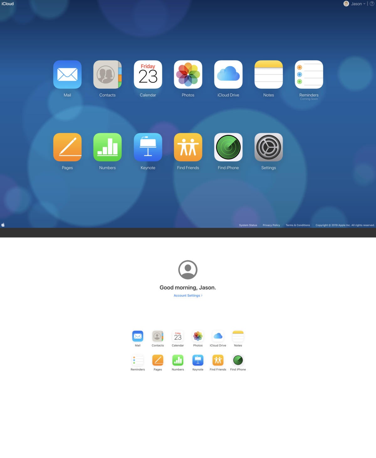
Apple’s iCloud.com web interface has a design that feels a little dated, frankly, and the pending release of iOS 13, along with its completely redesigned Reminders app, is the perfect opportunity to freshen things up a bit. (The iCloud web interface doesn’t even have a Reminders app, it’s listed as “coming soon.”)
Apple is testing out a new iCloud.com beta web interface, featuring a new landing page with a simple white background and smaller icons.
 IDG
IDGThe iCloud.com beta site (bottom) features smaller icons, a clean white background, and a Reminders app.
The apps themselves remain largely unchanged, for now. In particular, you’ll notice that Find Friends and Find iPhone are still two separate apps, though they are combined into a single Find My app in both iOS 13 and macOS Catalina. Perhaps this will change when those operating systems are released in the next month or so.
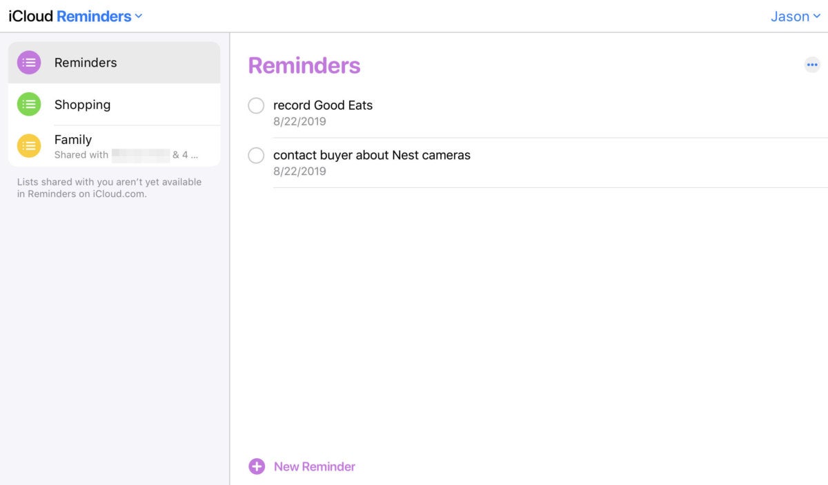
The one exception is the Reminders app, which now actually exists. The current live iCloud.com site simply shows the Reminders app icon with a “Coming Soon” notice. The new beta site has a fully-functioning Reminders app, though it doesn’t yet have all the advanced features you’ll find in Reminders on iOS 13.
 IDG
IDGThe new iCloud site will finally have a Reminders app.
Apple hasn’t announced a release date for the new iCloud.com site, but we suspect it will exit beta when iOS 13 and macOS Catalina are released (likely in about a month). Users can access the beta site now by heading to beta.icloud.com.