On June 26, 2019, Google announced minor updates to its Search Console, adding a few mobile-first index features and reminding site owners and managers about the impact of mobile-first indexing on new and existing websites.
The changes to Google’s Search Console made it easier to identify whether a site was primarily indexed based on mobile or desktop content and identified which crawler (Googlebot Smartphone or Googlebot Desktop) was primary on a given report or chart.
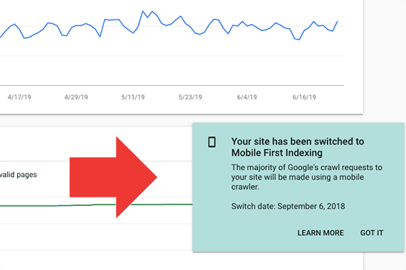
If your website is primarily being indexed based on the content displayed on mobile devices, you may see a notification the next time you log into Search Console. This notification will also state when your site was switched to the mobile-first index. This information had not previously been displayed, although many sites have been on the mobile index for some time.

The next time you log into Google’s Search Console you may see a notification stating your site has been switched to mobile-first indexing.
Your site’s indexing crawler will also be listed on the Search Console “Settings” page. You can refer to this page at any time to see which user agent (crawler) is being employed on your site.

The user agent is also displayed on the Search Console “Settings” page.
Finally, as mentioned above, Search Console also shows which crawler is primary and when it became primary.

Two new indicators in Search Console state (1) the primary crawler used for specific reports, and (2) chart annotation showing when your site was switched to mobile-first indexing.
One Index
It is worth mentioning that Google is not maintaining a separate mobile index. The term “mobile-first index” means that Google is indexing the content it finds on the mobile version of a particular website.
The Googlebot Smartphone user agent visits your site pretending, essentially, to be a mobile device. It looks at the content provided, indexing each page based on what it finds. Presumably, ranking factors (including page speed) will be based on this mobile version.
For many sites, the content displayed on a mobile device is identical to a desktop. In these cases, it may not matter which crawler indexes your site. However, if your site uses a separate mobile URL, offers versions with and without accelerated mobile pages, or dynamically serves a different page based on the visitor’s device, Google will favor the mobile-friendly content.
Mobile-first Impacts
This table below comes from Google’s developer documentation. It describes how the mobile-first index will impact a site in each of six mobile scenarios.
| Desktop only: Your site is desktop only and doesn’t have a mobile-friendly version. | No change. The mobile version is the same as the desktop version. |
| Responsive web design: Your site adjusts for screen size. | No change. The mobile version is the same as the desktop version. |
| Canonical AMP: All your web pages are created in AMP HTML. | No change. The mobile version is the same as the desktop version. |
| Separate URLs: Each desktop URL has an equivalent (and different) URL that serves mobile-optimized content, which is sometimes called an m-dot site. | Google will use the mobile URL to index and ultimately rank the page. |
| Dynamic serving: Your site serves different content based on the user’s device. Users only see one URL. | Google will use the mobile-optimized content to index the site. |
| AMP and non-AMP: Your site has both AMP and non-AMP versions of a page. Users see two different URLs. | Google prefers the mobile version of the non-AMP URL for indexing. |
New Sites
“Starting July 1, 2019, mobile-first indexing is enabled by default for all new websites (new to the web or previously unknown to Google Search). For older or existing websites, we continue to monitor and evaluate pages based on the best practices,” Google reported in the aforementioned developer documentation.
This means that if you are launching a site after July 1, 2019, it will likely be mobile first. It may even be a best practice to employ AMP and progressive web applications for any new project.
Finally, it is time to ditch the separate mobile URL or any service that generates different content or a different page based on a visitor’s device. This includes some accessibility services; instead, build accessibility directly into your mobile-optimized site.
As Google developer advocate John Mueller put it:
While we continue to support responsive web design, dynamic serving, and separate mobile URLs for mobile websites, we recommend responsive web design for new websites. Because of issues and confusion we’ve seen from separate mobile URLs over the years, both from search engines and users, we recommend using a single URL for both desktop and mobile websites.
Existing Sites
Mobile-first should also be the goal with any updates to existing sites. Mueller wrote:
Our guidance on making all websites work well for mobile-first indexing continues to be relevant, for new and existing sites. For existing websites, we determine their readiness for mobile-first indexing based on parity of content (including text, images, videos, links), structured data, and other meta-data (for example, titles and descriptions, robots meta tags). We recommend double-checking these factors when a website is launched or significantly redesigned.
In short, Mueller’s comments confirm that optimizing a site for search engines is now closely related to mobile optimization and content marketing. Thus, when updating your current website, consider a mobile-first approach, making certain that all content appears on the mobile version. Ultimately, the goal remains to create good and relevant content for all visitors.