 What can your brand do to improve engagement on social media?
Think more visually.
Sure, you already use images. But are you selecting the best ones to engage your audience based on what’s shown to be successful overall and each platform’s unique factors? (Hint: Not all social media platforms have the same best practices when it comes to successful visuals.)
Not all #socialmedia platforms have same best practices when it comes to #visuals, says @Manish_Analyst. Click To Tweet
Read on for research-based tips and examples that may make you rethink your brand’s social media image selection process.
Create bite-sized visuals for Facebook sharing
On social platforms, visual media performs better than text. For example, images earn 2.3 times more engagement on Facebook than text posts, according to BuzzSumo research.
#Images earn 2.3 times more engagement on #Facebook than text posts via @BuzzSumo #research. Click To Tweet
To promote your longer-form content on social, piggyback it with an image that attracts attention on social media. Create an image post that relates to your blog content and cite that content in the text field to extend your reach further than simply sharing the text.
Social media images should be easily consumable, conveying an emotionally impactful and simple message quickly. Here is what the research tells us about what types of images get shared:
- Show a body part such as a hand or ankle preferred. Research by Convince & Convert shows brand images get the most engagement when they show a part of a person, typically a hand, interacting with an object. These partial body images performed 29% better than images with a full person and 10% better than images without a person. The suggestion behind the research is consumers are better able to imagine themselves interacting with the product when they see a part of someone else physically interacting with it. Seeing a person’s face takes the viewer out of the “picture.” Interestingly, though, images without a person or body part received the most comments.
Partial body images from brands perform better than full person or no person via @Convince & Convert. Click To Tweet
- Go bright, clear, lively, and original. Research presented at the 2018 International Conference on Information Management found images heavily liked on Facebook tended to display four qualities: brightness, clarity, liveliness, and ingenuity. From a technical perspective, your brand image posts should be well lit and easy to interpret. They also should feature something playful and creative. Stock product images aren’t necessarily going to get the job done.
Don’t forget to look for visual hints in your Facebook feed – what you see in your feed is an example of what is getting shared.
Example: Clothing brand Shein is one of the fastest growing brands on Facebook, according to SocialBakers. One of its most-shared recent posts had 112 shares:
Clothing brand @SheIn_official is one of the fastest growing brands on #Facebook via @socialbakers. Click To Tweet

While this post has three shares:
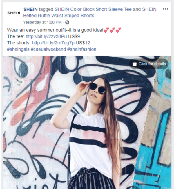
Why? The first likely is shared more because it endears the audience. It’s relatable, cute, and well, the kind of thing you expect to see in your Facebook feed, which is why people share it in their feeds. The second post is sales focused (and includes a face), which doesn’t prompt viewers to click “share.”
HANDPICKED RELATED CONTENT:
Know the visual secrets for Instagram
Images that do well on Pinterest and Instagram differ from the types of images that do well on Facebook. According to Curalate research, successful Instagram posts tend to have the following properties:
Don’t assume images that do well on #Facebook to do well on #Instagram. They usually don’t. @Manish_Analyst Click To Tweet
- Brighter images
- Images with a lot of white space or background space
- Colors toward the blue end of the spectrum
- Single dominant color
- Low saturation images, with relatively gray, faded, or pastel colors
- Images with a lot of texture
Examples: Consider this post by fashion brand Everlane.
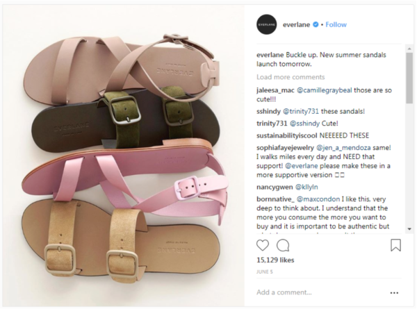
This product image has picked up 15,100 “likes”, a solid proportion of its audience of 521,000 followers. The image hits a lot of the beats in the earlier detailed research – a fair amount of white space, low saturation, bright lighting, plenty of texture, and arguably a single dominant color theme.
This Instagram post by activewear brand Lorna Jane exemplifies the power of good old “instructographics.” It’s picked up about 8,200 “likes”, while most of its brand posts are in the 2,000 to 4,000 range. A simple image conveying useful information is always bound to do well.
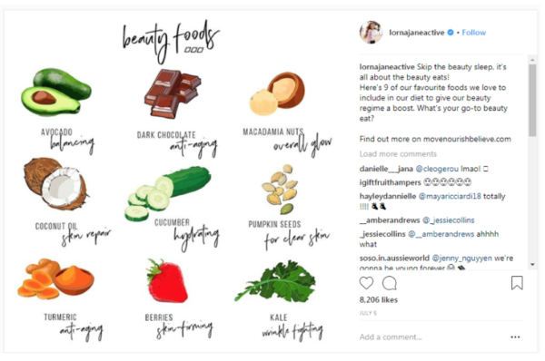
TIP: In contrast to the research about faces on Facebook, faces on Instagram earn more “likes” than images without faces, according to research from Georgia Tech.
Faces on #Instagram earn more likes than #images without faces via @GeorgiaTech #research. Click To Tweet
Visualize your data
Speaking of simple images conveying useful information, data visualization can be a powerful way to earn attention on social media. Informative images tend to attract more eyeball attention than text only and are three times more likely to get shared on social media than documents.
Clare McDermott has discussed this in depth. Here are some of her takeaways regarding how best to create data visualizations for content:
- Don’t get too clever with your data visualization. Use forms people recognize like pie charts and bar graphs, not novel representations that could be too creative for your audience.
- Don’t visualize everything. Focus on the most actionable or interesting results.
- Use subtle design methods to draw the user’s attention to the most important points.
- Use color with purpose, not for decoration. Use it to separate categories or to draw attention to a point. Never use it just to spruce up your image.
- Don’t use a method that ends up looking cluttered. For example, pie charts aren’t the best format if you’re conveying a large number of categories.
Great data visualization isn’t fussy or ornate, says @clare_mcd. #dataviz Click To Tweet
Data visualization is best paired with original research and as a lead-in to a lead magnet like an e-book or white paper. Leverage your data in a way that allows your brand to comment usefully on trending topics in your industry or the public at large. That entices your target audience to share your content and possibly their contact information in exchange for the in-depth content.
Create a call to action that brings a reaction
Content that gets shared and liked doesn’t necessarily send traffic to your site, and content that entices high click-through rates doesn’t necessarily get shared enough. The key is to strike the right balance with engagement and CTR goals. And the call to action should match the post’s goal.
Match your CTA to the #socialmedia post (image and text), advises @Manish_Analyst. Click To Tweet
Example: Forever 21 published these two Instagram posts, both ultimately designed to sell product.
At 40,000 “likes”, this image incorporates a person (a high factor in engagement). Forever 21 makes it easy to find the product by providing a search code and reminding the audience of the shop link in the bio. The call to action is logical because if you like the image, odds are you are interested in the outfit.
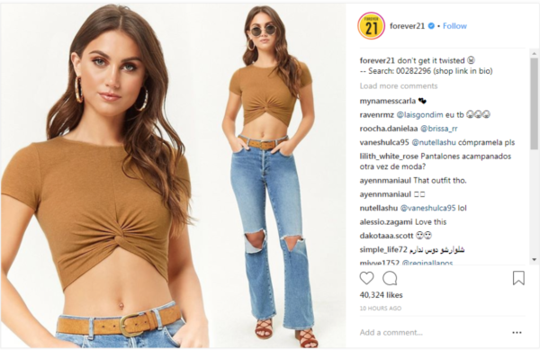
Now compare that to this other Forever21 post:

This image conveys the sale clearly, but it’s not the kind of image Instagrammers are looking for. The relatively low number of “likes” (two-thirds of the twisted shirt post even though it was online 50% longer than the product display post) means fewer people will see the post, and ultimately it could mean fewer referrals to the website than the post above.
If you want to expand the reach of your calls to action, feature your products in a way that makes sense for the platform. Instagrammers are looking for something artful. Facebook users are looking for something relatable. Tweeters are looking for something newsworthy, and so on.
Conclusion
Social media users are voracious for visual content, and it is one of the most powerful tools in your arsenal for expanding your reach and driving conversions. Invest in unique visual content, take a step beyond stock product images, and pay attention to platform standards to succeed in the short and long term.
Want weekday help to expand your content marketing toolbox? Sign up for the free CMI newsletter.
Cover image by Joseph Kalinowski/Content Marketing Institute