There are many reasons why a customer might stop engaging with a brand’s emails.
Whether it is due to a change of email address or a shift in loyalty (and a better deal elsewhere) – inactive or ‘lapsed’ customers are often just let go.
However, attempting to re-capture these customers could be massively worthwhile. Despite the fact that the majority of companies focus on acquisition strategies, it can actually cost up to five times more to acquire new customers than to retain existing ones. What’s more, increasing customer retention rates by 5% can reportedly increase profits by 25% to 95%.
So, what do companies need to do to regain customers’ attention? Here’s a run-down of six effective elements of a win-back email campaign.
1. Humour and wit
Lapsed customers are often disengaged with a brand and its messaging rather than completely alienated – they’re neither here nor there. This means there is still a big opportunity for brands to win favour, and a humorous approach could be the key to doing so.
Of course, not all brands should dive head first into humour if it doesn’t align with the rest of their communication style. The most effective examples tend to come from brands that already partake in conversational or amusing online marketing, or have an audience that would particularly appreciate it.
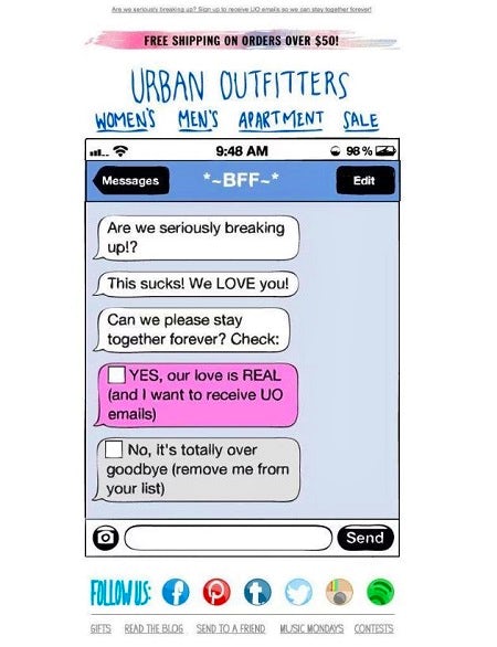
This example from Urban Outfitters uses relatable humour, targeting its millennial audience with a funny message and stand-out design.
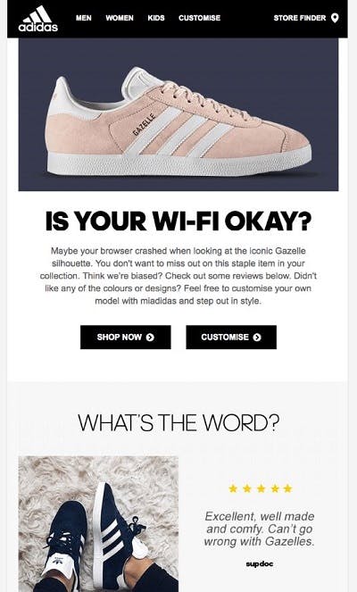
Then again, a witty and attention-grabbing headline can be effective enough if executed correctly. Adidas goes bold with its sarcastic ‘is your wifi okay?’ header, which is great for unexpectedly grabbing the user’s attention.
2. A tangible incentive
Of course, not all customers will be tempted back by mere humour – some will need a bigger incentive, usually an exclusive offer. For retailers, this could also be free delivery, or a certain amount of money off a product.
Another tactic is to use urgency, such as informing the user that a product is selling out, or that an offer will only be available for a certain amount of time.
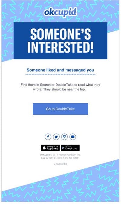
Intrigue can also be enough to get a customer to click through. This example from dating app OkCupid is simple but effective.
3. Emotion
Blatancy can work well for companies that are involved in corporate responsibility schemes or charity.
Directly asking customers to donate their time or money, particularly when there is an emotional element, is a good way to bring a brand back into consumer awareness.
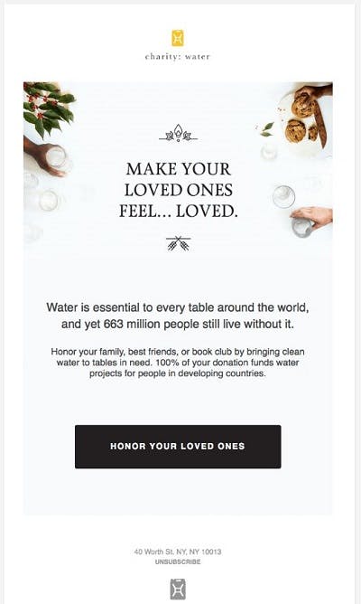
Charity: Water draws on the recipient’s emotions in this reactivation email, asking them to ‘honour family and friends’ and donate to a good cause at the same time.
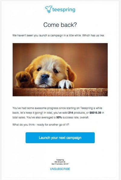
The below example from t-shirt retailer Teespring is also simple but effective, blatantly (but also amusingly) drawing on emotions to grab attention.
The use of customer data is also what’s likely to appeal, with personalised elements making the user feel seen and appreciated.
4. Personalised content
Win-back emails can be formulaic, with retailers merely focusing on the fact that customers have stopped engaging with them. However, a standard ‘we miss you’ message won’t do much to reassure or re-engage customers who have potentially found something better elsewhere.
Consequently, it’s far more effective to find out why customers have lapsed (rather than the simple fact they have), and to remind them of the benefits of coming back.
Delving into data will uncover specific user behaviour – such as the last purchase a customer has made or the product they added to their cart and subsequently abandoned – which can then be used to tailor content.
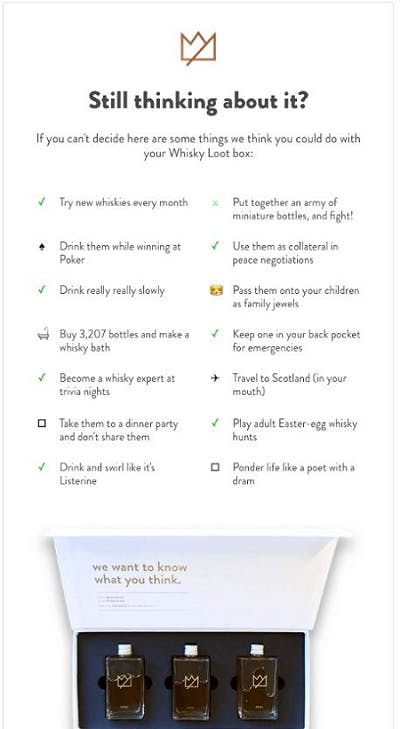
This example from subscription brand Whisky Loot (sourced via Really Good Emails) targets a customer that has abandoned their cart, using a combination of humour and reassurance to tempt them back into the path to purchase.
Emails that highlight previous browsing behaviour are an effective way to win back customers in the early stages of abandonment, and could help to prevent customers from lapsing entirely.
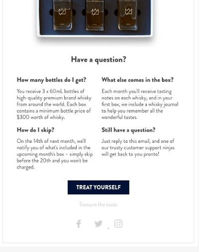
As well as listing the benefits of the product itself, the email also includes a lot of valuable information about the service and its features – effectively combating the reasons why the customer might have abandoned in the first place.
5. Seamless UX
Design is a hugely important element of any email campaign, but arguably more so when it comes to win-back emails. This is because it needs to be as easy as possible for customers to re-engage, with clear CTAs.
In contrast, convoluted or overly-wordy emails are likely to be sent straight to the trash, or even worse, could lead to unsubscribes.
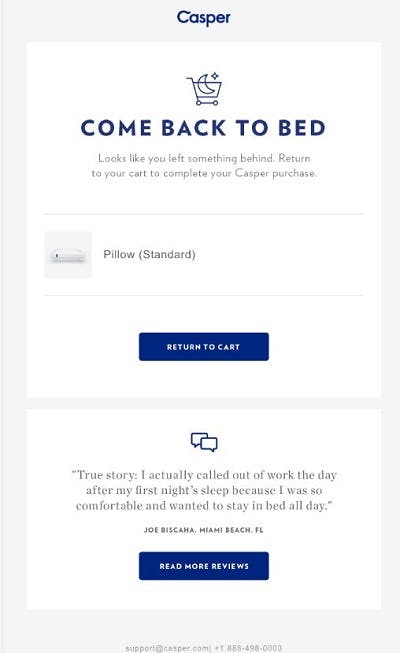
This example from Casper highlights how simplicity in design can be most effective. Reminding the customer what they’ve abandoned – and giving them a slice of social proof – the CTA of ‘return to cart’ is hard to ignore.
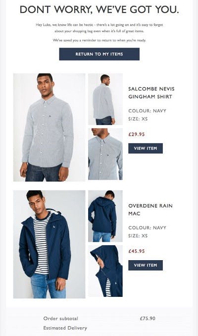
Similarly, Jack Wills increases the chances of customers clicking by including multiple buttons in this abandonment email. By including the total price (including free delivery), it also ensures transparency and ease, nudging people back into the path to purchase.
6. A final decision
Finally, if customers have failed to re-engage from multiple win-back emails, it could be time to ask them directly to opt-in or out.
Asking whether someone still wants to hear from you could result in a surprising amount of re-activation, but at the same time, it could save you time and resources reaching out to entirely disengaged subscribers (which could be put into finding new customers).
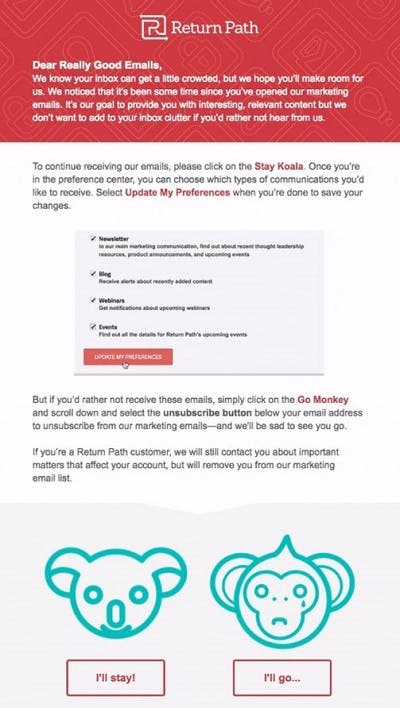
Again, that doesn’t mean you shouldn’t include elements such as personalisation or clever design into final re-permission emails. This example from Return Path includes persuasive copy and clear CTA buttons to cajole users into making a final decision.
