Web design is forever advancing as technology, standards and tastes change.
As January comes to a close, it’s time for a round up of web design trends we’re likely to see a lot more of as 2019 progresses.
Expect even more video content, bold colour palettes and a little bit of rule-breaking thrown in for good measure.
Without further ado, let’s take a look at six of these trends set to make a splash this year (and don’t forget to check out Econsultancy’s User Experience and Interaction Design Guide for Mobile and Web).
1. Shapes filled with colourful gradients
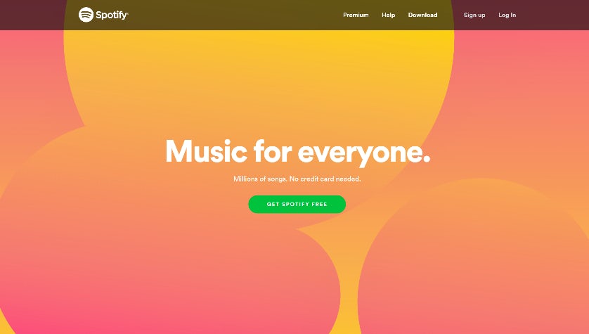
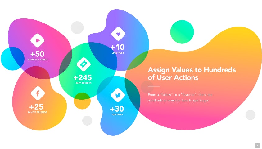
This might sound weirdly specific, but bear with me. Whilst flat design is still hanging on for now, brands are beginning to warm to gradients – in particular, gradients inside abstract shapes.
Music streaming service Spotify now uses fluid shapes and colourful gradients in most of its marketing campaigns, as well as on its website and app(s):
 Social action marketplace Sweet has an incredibly engaging website that features a number of organic, colourful shapes that highlight information about the brand:
2. Colourful geometry
In contrast, sharp, angular elements are also coming to the fore and can be found in bright colours across landing pages in multiple industries. Unconventional diagonal lines help to break up the age-old grid and add a fresh energy to any website.
Perhaps unsurprisingly, Stripe – the payment processing service – is using stripes! Its bold use of green, blue and purple is both striking and on brand, and helps to break up the otherwise flat, white background:
Deliveroo’s brand voice remains dynamic and confident by including bright geometric banners at the top of its landing pages:
Discount beauty retailer FeelUnique draws attention to its sale with the clever placement of angular shapes that pull the eye towards the centre of the webpage: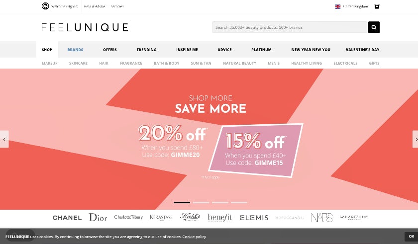
3. Big, experimental typography
The typography trend is getting pushed to its limits in 2019. Brands are starting to experiment with unconventional text formatting, such as warping, over-sizing and bleeding beyond page boundaries.
Design studio Pentagram boldly showcases its work:
French shoemaker Arche provides an immersive full-screen navigation menu for its retro collection ‘Arche68’:
US-based branding consultancy LPK invites users to scroll through a selection of large navigation buttons which carousel across the page:
4. Dark backdrops
Despite the ongoing debate regarding the use of dark backgrounds on webpages, they appear to be making a steady comeback. It can often be difficult to pull off, but the below examples demonstrate that, when applied well, a website can have a lasting and memorable impact.
Tech giant Apple, arguably the masters of white space and minimalism in advertising, have swapped white for a luxurious black for the new backdrop of the iPhone X:
Creative agency Impero maintains a simple yet slick colour palette throughout its website; black, white and pops of vibrant colour:
High-end speaker company Devialet uses a mostly greyscale/muted theme, with particularly dark areas highlighting navigation buttons and beautiful product photography:
5. Full screen video
We mentioned video as one of the top web design trends of 2018, and there’s no sign of it letting up anytime soon. With video now dominating social media platforms, it seems only right that web design would follow suit. Keep looking out for embedded full screen video content during the year ahead.
Global agency Jellyfish displays video content on their landing page containing locations and landmarks found near their global offices. Whatever your thoughts about load time and scaling for mobile, you can’t deny the results has a certain scale:
Driven by design, Beats by Dre focuses on form and function with a simple, yet slick video showcasing its latest product offering:
10 brands that use illustration to stand out online
6. Pastel shades
With the continued popularity of ‘millennial pink’ and the announcement of Pantone’s 2019 colour of the year (‘living coral’), pastels still heavily influence design trends both on and offline. Ice cream shades are no longer limited to scandi furniture brands – we’re seeing them all over the internet.
Trustpilot reviews have chosen a lovely shade of pink for their UK landing page:
Printing company moo.com have used a pale turquoise platform to demonstrate a variety of printed business cards: 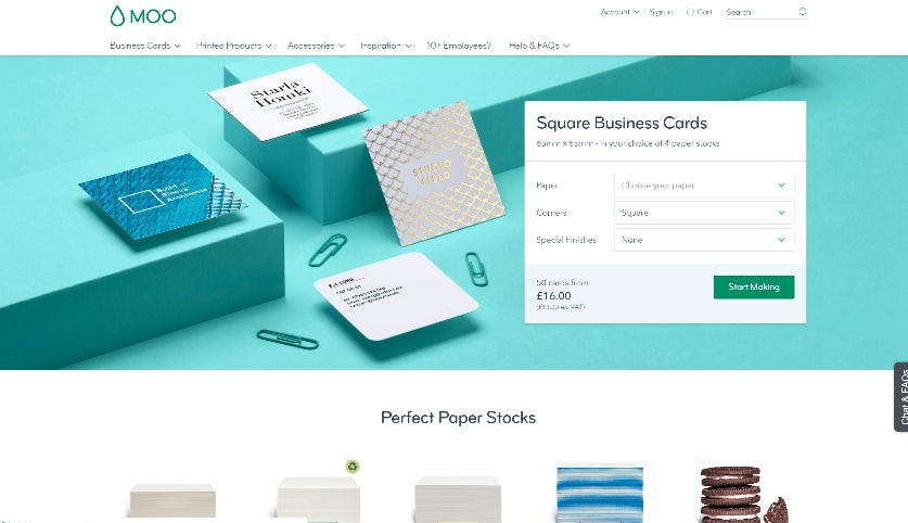
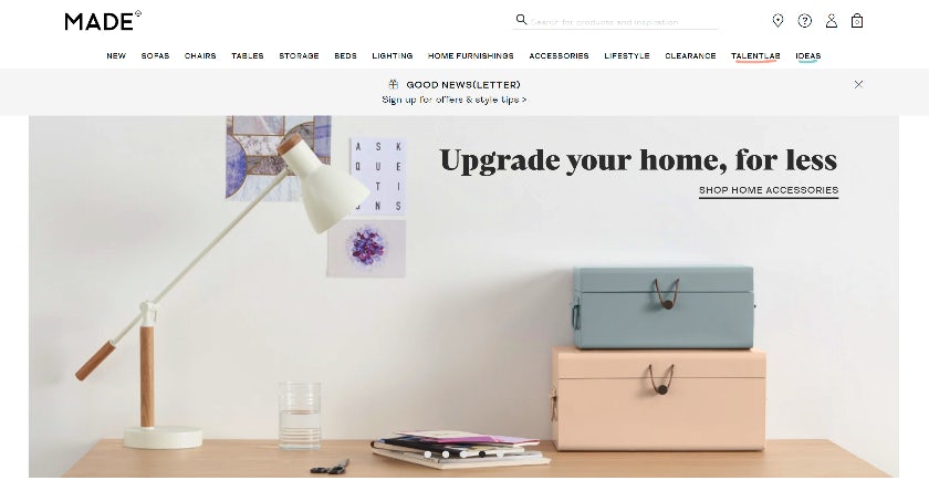
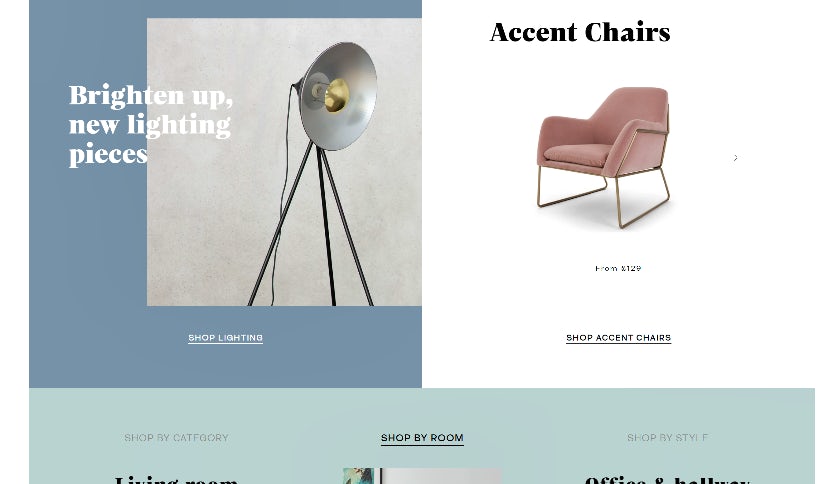
Luxury furniture retailer made.com highlights 2019’s latest furniture trends with complementary pastel shading:
