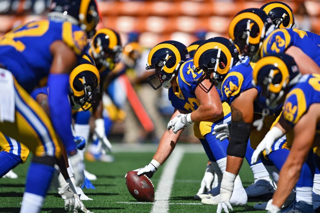
Spectacular Fails in Rebranding the Los Angeles Rams
Like the maiden voyage of the Titanic, the 2020 rebranding of Los Angeles’ Rams team is turning out to be less than ideal — and may sink the entire franchise if it’s not taken in hand pronto. Franchise COO Kevin Demoff has so far kept a cool head and a closed mouth about the whole situation, but dedicated fans and even casual followers of the team are not happy with the outcome so far. It’s fodder for late night TV quipsters, radio jock talks, and newspaper sports columns. If you look on the bright side, you could say it was so bad that it’s good. But, so far, nobody’s looking on any bright side in this sports and marketing debacle.
It is generally agreed upon in the marketing industry that rebranding a product, or in this case a sports team, is meant to give it or them a new image, a better look, and more street cred or just plain old popularity. This is achieved through a combination of artistic skill, intelligent planning, hard work, inspiration, and expertise. None of that, apparently, was thought essential when the first draft cap was leaked to the media — the colors were universally condemned as hideous, and the whole thing looked like a cross between the AFC and the NFC during a drunken brawl. In other words, it looked bad and it made the sports media, usually the friendliest and most supportive writers around, feel bad and write bad things about it. Not the sterling debut an expensive and thoroughgoing company rebranding is looking for, wouldn’t you say?
Here are a few, but by no means all, of the mistakes the franchise management made with their rebranding efforts. Fans of the team will undoubtedly be able to think of many others.
If it ain’t broke . . .
The whole idea of rebranding for 2020 was a pipe dream from the get-go. First of all, the team was already doing well on the field and in the media. Their helmet was already iconic and recognized around the world — of what earthly use would a redesign be? It would just confuse the spectators and viewers. The new, so-called, rebranded helmet has messed things around so that the font is nearly unreadable and the fabled horns on the side look more like contorted rake handles.
RIngling Brothers called; they want their uniform colors back . . .
Mr. Demoff may be many things — an excellent businessman, astute picker of players, and loyal to his sporting instincts — but he is NOT the person to put in charge of altering the team uniform colors in any way. The new colors are not only muddy and disappointing, but they match about as well as polka dot on plaid.
Tradition!
So what did the fans, the people who buy the tickets and concessions and merchandise and keep the team afloat, what did THEY want for new colors? Simple, really; they didn’t want any new colors. Polls conducted everywhere from local bars to newspaper offices indicated they would be happy for a return to the traditional blue and white. And when they didn’t get it, they complained loudly.
Only time will tell if the team can survive their inept rebranding. In the meantime, how about airing some reruns on ESPN?
