To encourage people to make recurrent purchases from your website, you need to ensure a quality user experience
Subscription e-commerce is booming because of several factors. Convenience and reducing the need for engagement on behalf of the buyer both play a critical role. McKinsey research shows that 15% of online shoppers have signed up for one or more subscriptions. According to the same source, the subscription e-commerce market has grown by over 100% since 2011.
To encourage people to make recurrent purchases from your website, you need to ensure a quality user experience. Everything matters – from website design and performance to marketing and customer service. To ensure the success of this business model, you have to put emphasis on the following key essentials.
Define your niche and focus on product presentation
Some of the most popular subscription box services occupy innovative niches that lack sufficient competition. This is one of the prerequisites for setting up a sustainable e-commerce business.
You can’t expect to win every single customer out there. This is why you need a niche and the more specific you make it, the better.
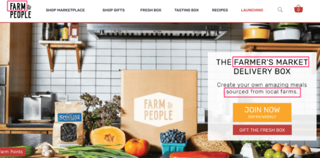
Here’s a simple example – Farm to People is a subscription e-commerce website that has a very narrow focus. The subscription boxes feature locally grown and raised produce to ensure sustainability, quality food production and the growth of local businesses. Potential clients know what they’re getting into as soon as they open the homepage.

Do your research to identify a market and a specific product that has the potential to ensure recurrent purchases. Once you have the business model idea in place, put all of the e-commerce website design emphasis on that product.
Most subscription e-commerce websites feature spectacular presentations that take away the impersonal feel of online shopping. Subscription boxes come with the surprise and delight of tearing the cardboard open to see what’s inside. This excitement should begin with the online experience. The goal can be accomplished both through carefully created visuals and through the development of the right functionalities for your e-commerce website.
Choose the Right Platform
The subscription e-commerce website platform is the backbone of the entire project. If you pick the right architecture, you can easily build on it to ensure a smooth experience, a high level of engagement and customer satisfaction.
One of the easiest options that many service providers opt for is a pre-built functionality for recurring payments. This means that customers can subscribe to receive a package every single month. The payment is processed automatically, leaving the customer free from having to think about renewing the order periodically.
BusterBox is an example of a website using such functionality. The monthly box of puppy goodies features one, six and 12-month plans. Once a buyer chooses a subscription duration, a recurrent payment will take place automatically. The Card Carrying Books & Gifts website employs a similar method.
The main pros of pre-built recurrent payments are convenience, security and simplicity. There’s no risk of the customer forgetting to make their monthly purchase. On the downside, the lack of recurrent payments ensures faster revenue, longer initial customer retention and a faster break-even point.
Custom e-commerce development comes as an alternative to pre-built modules and functionalities. It allows for more freedom and flexibility in terms of idea realization. If you have some complex functionalities and subscription policies in mind, custom platform development would be a better choice.
Make Your Website Conversion-Focused
No matter how great your marketing and targeting efforts are, only 4% your website visitors are ready to buy. Thus, conversion-focused website design and content will be needed to affect those on the fence and the ones simply engaging in a bit of digital window shopping.
Focus on understanding the buyer’s journey – from researching to exploring and eventually subscribing. What types of content does the buyer consume during every stage of their journey?
Here’s an example revolving around the dog treat subscription box mentioned above.
The first stage is awareness. A dog owner wants to find out how to improve their pup’s diet and give them healthier treats. Consideration comes next – they reach content like an e-book on organic dog nutrition. Finally, they have to make a decision about subscribing. To encourage this step, the website can offer a discount coupon or a free gift with their first order.
Eventually, you can continue developing offers and highlighting them through the website’s design and content to ensure the recurrent interest of long-term customers.
Know That Your Customers Are on the Move
Is your subscription e-commerce website readily accessible through a mobile device like a smartphone or a tablet? Making sure that the platform’s design is responsive is one of the prerequisites for building the perfect customer experience.
Mobile e-commerce sales are expected to go up from $1.36 trillion in 2017 to $3.56 trillion in 2021. While mobile represented 52.4% of all online purchases in 2016, it’s expected to reach 72.9% in 2021.
If you’re thinking about the future of your subscription-based business model, you have to focus the development efforts on mobile design, including the creation of your own app.
When planning mobile development, think about the integration of key features like delivery status monitoring, tap to call customer service, real-time notifications and hamburger menus. A simple and readily accessible automatic subscription option should also be displayed prominently.
A Few Additional Tips and Suggestions
Website development and marketing efforts should go hand-in-hand to ensure the popularity of your brand and a simple, satisfactory customer experience.

Think about what it would take to impress a person having a short attention span to the point of winning them over and turning them into a customer.
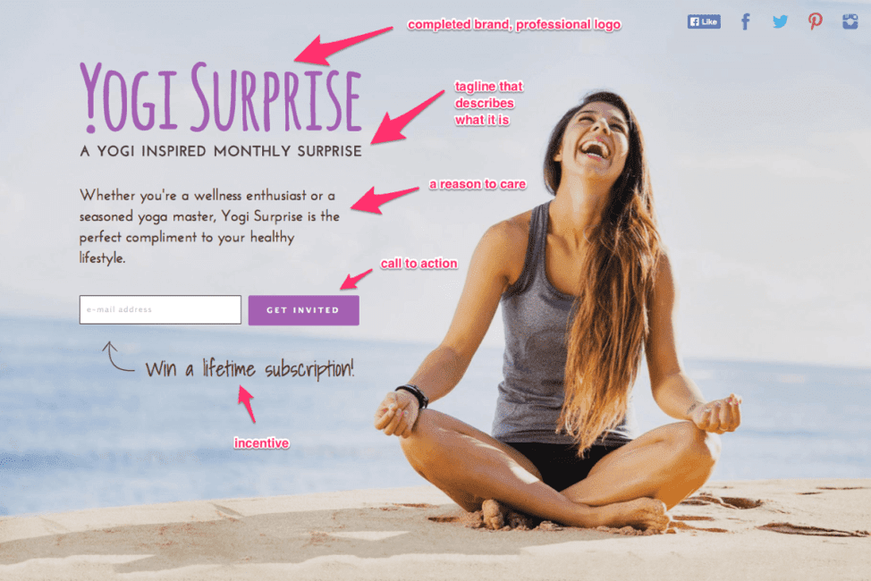
- A great teaser page can be used for this purpose. A teaser page is very similar to the landing page but it caters to the unique needs of subscription-based businesses. Why should people care and sign up for a subscription box? Is it easy to enroll for the periodic delivery? Is there a clear and easy to follow call to action?
- Profound use of imagery is needed to help potential clients determine what the business is all about and whether they should care or eventually become interested.
- You should also think about traditional marketing opportunities like sending out newsletters. For the purpose, the design should feature an incentive for people to give out their email. This is yet another example of how development and marketing can work together to ensure the best possible outcome.
Once you generate buzz and fine-tune your marketing efforts, you’ll be left with ensuring a spectacular customer experience. The quality of your website and the work of your marketing team will get people to buy. In order to make these customers return, however, you’ll have to dazzle them with attention to detail, personalization, and timely assistance.
