Landing pictures are arguably the most important elements of any digital marketing campaign and building a high converting landing page requires extensive testing
There are countless resources on the science behind conducting split tests. However, the problem most marketers face doesn’t seem to be with knowing how to run a split test. It seems to be with split testing the right variables. It is easy to exhaust your testing budget by focusing on the wrong elements.
Here are some of the elements that will have the biggest impact on your campaign. After running a number of split tests, you will determine which landing page elements have the strongest impact on your ROI. However, keep in mind that the elements that affect your campaign the most may be different. Make sure to adjust your testing hierarchy accordingly.
Length of your copy
The written content on your landing page plays an important role in your conversion rate. Your core message isn’t the only thing that matters. It also depends on how long it takes for you to deliver your message.
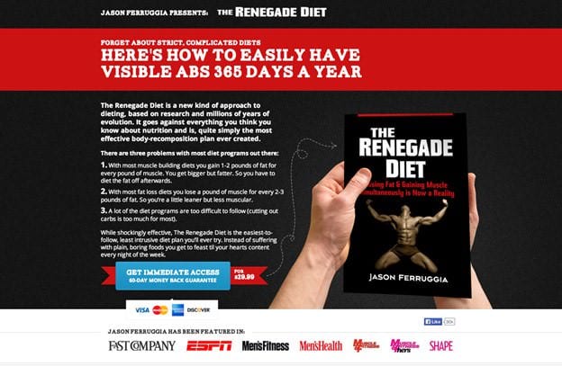
In 2015, I read Tim Ash’s Book on landing page optimization. As one of the leading experts on landing pages and split testing, most people take what he said very seriously. However, there is one piece of wisdom in his book that I found doesn’t always hold true, at least in my own split-tests. The Renegade Diet Book sales page is an example of a case where marketers found a much longer landing page worked better.
Ash and many other experts routinely advise marketers to use very short landing pages. Short form landing pages seem to work better for most campaigns, but there are going to always be exceptions. Also, even if short form landing pages tend to work better overall, it is possible to make them too short. The best rule of thumb is to use as much content as it takes to succinctly convince your prospective customer to buy your product or service. A good example of this school of thought is Neville Medhora who has helped companies like AppSumo optimize the content in their marketing emails and landing pages. When talking about copywriting, Medhora wrote, “be interesting! Even if you have something interesting to say, your delivery can make people read, or run.”
It is a good idea to test different links of your landing page copy. For some campaigns, visitors may be a lot more skeptical. You may need a longer form landing page to encourage them to make a purchase. The difficulty of converting them may also play a role.
Different visuals
Visuals play a very important role on any landing page. A study from Xerox found that people are 80% more likely to read content with strong, captivating images.
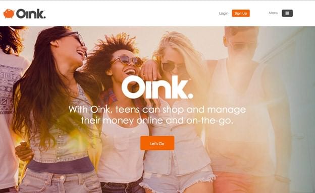
You will have difficulty conveying a strong impression of your offer without strong images. You also will have a hard time engaging your visitors enough to keep them on your site. Many sites like Oink use full page background images to capture the visitor’s attention along with a contrasting color call to action to drive click-throughs.
However, choosing images that are too eye-catching can backfire. They may draw attention away from your call-to-action, which will only hurt your conversion rates.
Test different image types and sizes to find out how people react to each. Stock image services like Burst and StockSnap.io are great places to start. You can also use services like Canva photo editing to personalize images for your brand and audience.
You will need to test different images and see how they impact your conversion rate and bounce rate. To make life a lot easier, use services like the GetResponse landing page generator which provides easy to edit content and text, responsive design elements and AB testing.
Trust elements
Every visitor is going to have a certain level of reluctance you need to overcome to convert them. It often stems from doubts about the quality of your offer or value to their business.
Adding testimonials, badges from your local Chamber of Commerce, social media proof or other trust elements can have a strong impact on your conversions. Unfortunately, too many marketers believe that adding any trust element to their landing page will be a guaranteed conversion first.
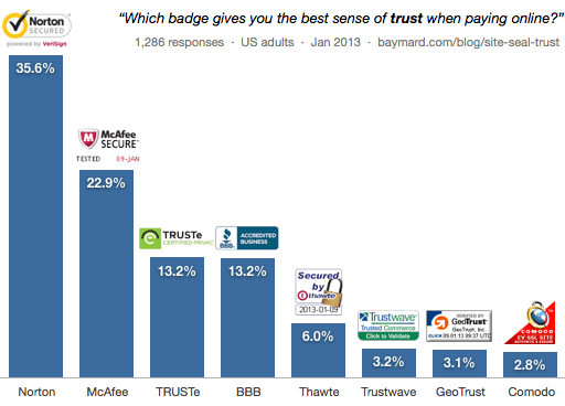
However, some tests have found that adding certain trust elements actually caused conversions to drop. It is difficult to understand why in every case, but it could be because the trust elements didn’t appear sincere or focused on the wrong concerns. For example, if a visitor is being asked to purchase on a given landing page then you may theorize having trust badges that show the page as secure will increase conversion rates. A survey conducted by Baymard Institute showed that which trust badge that is being used matters greatly in whether conversions increase or decrease. A combined 58.5% of the survey respondents said they trust Norton and McAfee Secure badges when making a purchase online, while only 2.8% of respondents would trust the Comodo Secure badge when making a purchase.
Trust elements like social proof can also be incredibly effective at increasing conversion rates. When people see that others have made a purchase or even just shown interest in a product or service they are more likely to do the same. Services like Proof can show web visitors recent interactions on your site such as purchases, email signups or contact requests.
This is why it is important to test the presence of different test elements. You should try testing a version of your landing page without any trust elements. You should try testing a version of your landing page without any at all. You can also test three or four variations with different types of trust elements.
These three split testing examples are just the icing on the cake, but they should be a good start to seeing increases in your landing page conversions. What split tests are you using?


