By Richard D. Harroch and Don Keller
Startup companies often prepare an “investor pitch deck,” which is a slide presentation summary of the company, its team members, the company’s products and technology, and other key information. The investor pitch deck is often used by the startup when trying to raise seed, angel, or venture capital financing.
Raising capital for your startup can be challenging, so it’s key to nail your pitch deck and avoid the common mistakes startups often make when preparing them. In this article, we review the most common mistakes as well as provide links to relevant articles and sample pitch decks to help you prepare the strongest investor pitch deck possible.
Mistake #1: Not Preparing the Investor Deck with the Format and Content That Investors Expect
Investors expect the investor pitch deck to cover the following topics, roughly in this order:
- Company Overview
- Mission/Vision of the Company
- The Team
- The Problem
- The Solution
- The Market Opportunity
- The Product
- The Customers
- The Technology
- The Competition
- Traction
- Business Model
- The Marketing Plan
- Financials
- The Ask
For an in-depth discussion of what an investor pitch deck should contain, see How to Create a Great Investor Pitch Deck for Startups Seeking Financing.
Mistake #2: Not Having a “Company Overview” Slide Right at the Beginning
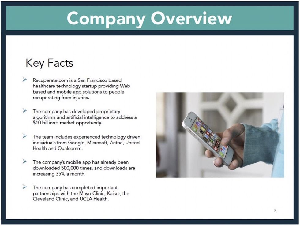
It’s very helpful if the page after the cover page of the investor pitch deck is a “Company Overview,” in which in you summarize in bullet points your business, the problem it solves, where you are located, the experience of the management team, and any key traction you have already established. It gives investors the big picture right away, so they know what to expect.
Here is an example of an effective “Company Overview” slide:

Mistake #3: Not Articulating How Big the Market Opportunity Is for the Company
Investors want to invest in big opportunities with large addressable markets. The pitch deck has to convince investors that there is a real and significant market where the company can capture a meaningful stake. Make sure to show that the addressable market is really the company’s total addressable market.
Mistake #4: Not Showing What Traction the Company Has Already Obtained
It’s helpful for investors to see a slide called “Traction” showing the progress the company has made so far. The “Traction” slide can include information about any of the following:
- Early customers or pilot programs
- Revenues or other key financial metrics
- Strategic partnerships
- Press and PR
- Testimonials
- Progress on product development
Investors want to see that there is already some existing traction and usually avoid investing in just an “idea.”
Mistake #5: Making the Pitch Deck More Than 15 or 20 Slides Long
Investors have short attention spans, so don’t present them with a pitch deck longer than 15 or 20 slides. If you can’t fit everything into that, consider producing an appendix or a separate document. For example, if you want to show detailed financial forecasts, that can be included in a separate document (and present only high-level financials in the pitch deck itself).
Mistake #6: Having an Unprofessional Look and Feel
Here are some common mistakes that can make your deck look unprofessional or outdated:
- Poor layout
- Low-quality graphics
- Inconsistent font sizes throughout the pages
- Poor titles for each slide (stick with the conventional titles listed under Mistake #1 above)
- Inconsistent header title style throughout the slides
- An outdated date on the cover of the pitch deck
- Messy or confusing charts
Avoid cramming too much detail or text into each slide, as you can always supplement the information in your live presentation. A slide should ideally have no more than 3 to 5 bullet points. Venture capitalists receive thousands of pitch decks/pitches a year, so they can’t afford the time involved in reviewing overly long or wordy pitch decks.