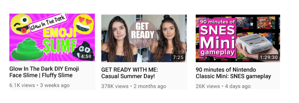
It’s weird when you think of it now, but in the early days of YouTube, the option to upload a custom thumbnail didn’t exist. And even when they were introduced, implementing one was not widely seen as crucial to the success of a video. But now, with 400 hours of video uploaded to YouTube every single minute, an effective thumbnail can be the difference between your content’s success or failure.
In this post, I’ll explain the seven steps you need to create compelling YouTube video thumbnails, which will help deliver increased viewership, engagement, and subscribers
But before we get to that, some context:
Why Compelling YouTube Thumbnails Are So Important
Along with a title, your video thumbnail will usually be the first thing people see when they come across your video on YouTube, either in search or in other areas of the site (where it might be offered up for suggestion). A thumbnail acts as a miniature marketing poster, and an effective thumbnail draws a viewer’s eye to your content and compels them to click through to watch. You’ve got a split-second to do it, or they’ll move on to something else.
In Youtube’s own words, thumbnails require an “art director’s eye for branding and shouldn’t be an afterthought.” Thumbnails and titles work together as an important part of your video’s metadata, and help build anticipation of your content, while accurately representing what it’s all about.
What it boils down to is this: When your title and thumbnail encourages a viewer to click through and watch a video – especially if they watch all of it – that tells YouTube that your content is delivering on what it promises. The longer people watch your videos, the more likely YouTube will surface your content versus that of the competition. If they immediately click away – because your title and thumbnail are misleading, then you’ll see the opposite.
90% of the best-performing videos on YouTube use custom thumbnails, so designing and uploading one that will maximize the impact of your video is crucial.
Here are some tips to help you do just that:
1. Have an idea before you shoot
As obvious as it is that you’ll plan the sequence, shots, script, etc. of a video before you shoot it, make the potential thumbnail a part of that process, too.
Think about what the thumbnail might be before you hit record and, if it’s pertinent, look for and grab that shot (video screenshot or still photo) – or a few potential options – during filming.
If the content of your video isn’t naturally visually compelling (meaning that you can’t get that perfect thumbnail shot), a visually dynamic thumbnail, perhaps even posed, can be the key to getting people to click and watch.
2. Consider how your thumbnail will look at different sizes

Thumbnails show up in different sizes and formats all across YouTube and outside of the platform, and on different devices, so it’s important that your thumbnail looks good whether it is big or small.
One easy way to test this before you upload is to zoom in and out of your thumbnail after you’ve finished putting it together. Does it appear to pop off the page whether it’s large or small, on desktop and on mobile?
By the way, when you create your thumbnails, YouTube recommends a resolution of 1280 x 720 pixels. The file size needs to be under 2MB.
3. Use visually compelling imagery

As I mentioned in the introduction, you only have a split-second to help a viewer decide whether to watch your video or not, and your thumbnail will play a big part in that decision.
Thumbnails that consist of visually compelling imagery, that are well-framed and have good competition, are always going to stand you in good stead.
In addition, think about how you’ll incorporate color and branding (hues that contrast against the white of YouTube’s background work well) and what emotion you want to illicit in people to encourage them to click (happiness, curiosity, anger, etc). Where the latter is concerned, featuring a close-up face is a good way to tease the mood of a video.

Thumbnails which use a text overlay are also popular. Think about how the composition of text, colors used, and font choice will engage viewers, and whether the expectation that the thumbnail generates matches what the video actually delivers.
Give viewers a sneak preview without being click-baity.
4. Ensure your thumbnail stands out against others

From a branding standpoint, this one’s really important – if the thumbnails of your competitors jump off the page more than yours when they’re returned in search, those videos are going to be watched more.
Here’s where a quick spy on the competition will come in handy – perform a search on YouTube for specific videos or channels similar to the topic of those that you plan to film, study the existing thumbnails, and think about how you can build yours to get noticed when yours competes directly.
The examples above, believe it not, were the first results to appear when I searched “lift weights to lose weight.” There’s a real mixed bag of thumbnails there, and I’d say none of them really hit it out of the park.
Depending on the topic and niche of your videos, there’s ample opportunity to convincingly outdo existing competitors in the thumbnail game; to make your video the must-click content in search results.
5. Consistent thumbnails can boost branding and views
While the main imagery of each video thumbnail should be able to stand alone, consistency can also help in building brand awareness and helping viewers viewers to identify your videos within search, recommendations, or their subscription feeds.
If necessary, go back and update old videos with new, refreshed thumbnails. As well as delivering a consistent look and feel to your channel, you may also help to boost views on older content – the new thumbnail making it a more attractive proposition, especially to uploads from an era where high-quality thumbnails weren’t an important consideration for creators.
6. Pair great thumbnails with catchy video titles
As much as this post is about making compelling thumbnail images, I can’t neglect to stress how important it is to pair your thumbnail with a catchy, accurate title – not misleading or clickbaity.
Like thumbnails, the best titles accurately represent the content, but they can also be creative and tease what viewers will see if they click.
YouTube recommends that you keep titles concise (60 characters), with the most important information up front, and to double-check that your titles don’t get cut off in suggested videos, search results and mobile.
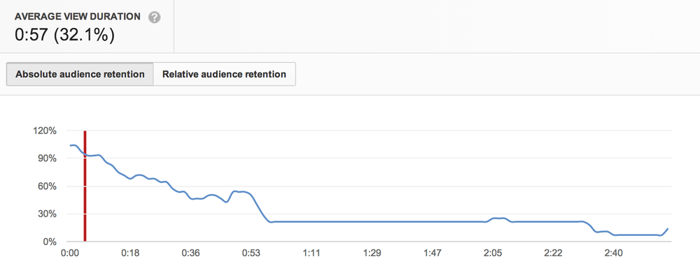
7. Use YouTube Analytics to see monitor performance

image credit: MWP Media
The Audience Retention report within YouTube Analytics can help reveal if your thumbnails and titles are delivering on expectation, by showing you if viewers watch your videos the whole way through or click off soon after they begin playing.
High audience retention means that you’re doing a good job – your titles and thumbnails accurately represent the content and viewers are happy – whereas poor results mean that you should consider re-jigging titles and thumbnails to see if you can improve viewer retention.
If your thumbnails and titles are really way off the mark, viewers might even voice their displeasure in the video comments!
As well as A/B testing thumbnails on YouTube over time, another method to discover which thumbnails most resonate with your audience is to promote the video with Facebook ads.
Use at least two different thumbnails with an element in each changed, and see which performs best.
Over to you
How much do you think about YouTube thumbnails and the impact they’ll have on your videos’ attractiveness and the chances of it being watched? Will you be putting any of the tips above into practice?
This post was first published on Andrew Macarthy’s blog.


Comments are closed.