It’s true that big brands spend millions on marketing. But smaller businesses can succeed by understanding today’s shopper.
Driving traffic to your online store is one thing. Turning a decent percentage of visitors into buyers is another. That’s why businesses should always make sure the site is shoppable before spending a dime on advertising.
A conversion-worthy website focuses on key elements that work together. Call them “essentials.” What follows are seven essential elements for ecommerce success.
7 Conversion Essentials
Great design. Yes, looks matter. Visitors are more apt to navigate a well-designed page than an ugly one. Making a good first impression is crucial — no matter which page they land on. Keep in mind that the logo and core navigation anchor the design, and everything else should fit nicely within the outer shell of any page.
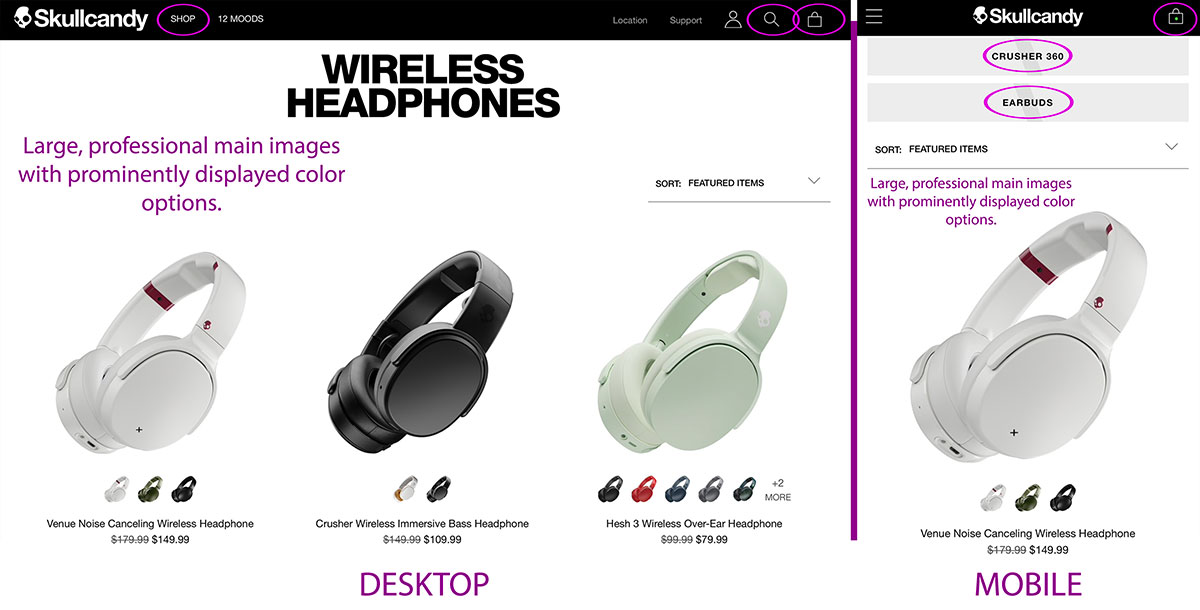
Simple navigation and search. It doesn’t matter if you sell a dozen products or thousands, the easier it is for people to find what they want, the more likely they will buy.
Skullcandy makes it simple to find a set of headphones. This site’s category pages display large images and available colors, saving unnecessary clicks.

Skullcandy focuses on its products via a simple, modern design.
Compelling content. This includes photos, videos, descriptions, highlights, customer reviews, and anything else about the product. Accurate descriptions that evoke emotion entice shoppers to click that all-important call-to-action button.
Value proposition. This is the perceived worth each product. Describe the pain point(s) it solves and explain the benefits of buying from your company. People want to justify purchases, and the real value — not price — plays a big role.
For example, Amazon lists more than 1,000 iPad Pro cases with 4-star plus ratings that cost $25 or less. What would prompt someone to purchase a $60 case instead? Zugu makes the value clear by featuring its stylus holder, 10 angle options, and a rugged, sleek design. It also calls attention to its warranty. Plus, the case has received more than 5,000 5-star reviews on Amazon.
Zugu uses images and highlights to focus on the best features of its tablet cases. Pain points solved include restrictive angles and no storage for a stylus.
Real customer reviews. We are much more willing to buy things if other shoppers say we should. We also want to know the problems our peers have had with a product and how the company responds to complaints. No product is perfect for everyone. So don’t delete negative reviews. Authenticity goes a long way in the quest to build loyal relationships.
Awards, reviews, trust badges. Shoppers listen to what experts have to say. Display seals, press mentions, and influencer statements, along with links to the details of each.
Molekule’s air purifier received an Edison Award and was listed as one of 2017’s best inventions by both Time and Popular Science. We often think of trust badges to verify a site’s security or accreditations. But recognition from reputable publications also instills trust and helps validate the purchase, with or without customer reviews.
Molekule uses awards and recognition to instill trust, which helps sell its product.
Streamlined checkout. Some shoppers spend a lot of time deciding what they’ll buy. Don’t slow them down at checkout. Keep this last step as simple as possible by asking for little and leaving them with no questions about what to do next.
Zugu kicks off the checkout process asking for an email address. The option to sign in is secondary, making it clear — without textual explanation — that an account is not required. Notice that the site’s full navigation is removed. This eliminates distractions. Lastly, the shopping cart contents are displayed with an “Edit Cart” link.
Zugu presents a streamlined checkout that’s easy to use. An “Edit Cart” link allows shoppers to make changes to quantities. Otherwise, the checkout contains no other navigation elements.
Fix Conversion First
If you’ve been envious of competitors’ marketing budgets and abilities, keep in mind that they, too, have to convert traffic. A not-so-pretty, confusing site will rarely convert well. Today’s shoppers won’t waste time trying to figure things out. First, fix all the little (or big) things that are getting in the way of conversions. Then you can look to fund marketing campaigns.