Take a look at some of the best personalization examples to help shape your web personalization strategy
In our last few posts we discussed that despite personalization being demanded by consumers, brands are facing some significant blockers when it comes to implementing full-scale personalization campaigns. We also discussed how the solution to the problem was to start with ‘essential personalizations’, which work around the blockers rather than try to solve them outright, but still deliver significant value.
In order to achieve the above, essential personalizations:
- Require only the simplest integration with current systems, often just requiring the addition of one line of code.
- Are tried and tested by businesses in many sectors and have already proven their value.
- Enable the quickest return on investment, helping validate personalization for business and secure further investment.
- Require a minimal skill set to implement and present a simple and structured way for a team to gain experience.
- Can be easily understood and supported by a wide range of teams in a business.
There is still a framework required to determine the essential personalisations that are best for your business, but this is typically a lighter and much quicker approach than a full personalization discovery. It consists of:
- Understanding your customer needs.
- Identifying the Essential Personalisation opportunities across your web estate that can help meet customer needs.
- Prioritizing personalization solutions and test them.
Enough talk about how they work, let’s see essential personalizations in action.
Secret Escapes
SecretEscapes.com change the experience users received when they land on the website, depending on the keyword typed by the user and the paid ad clicked in the search engine that delivered them to the Secret Escapes site.
For example, say someone uses a spa-related keyword in Google and then clicks on a Secret Escapes ad in the results:
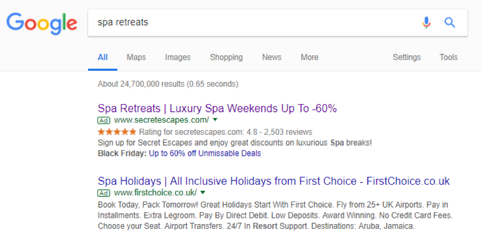
When this user arrives on the Secret Escapes landing page, the copy and imagery is updated to reflect their intent.
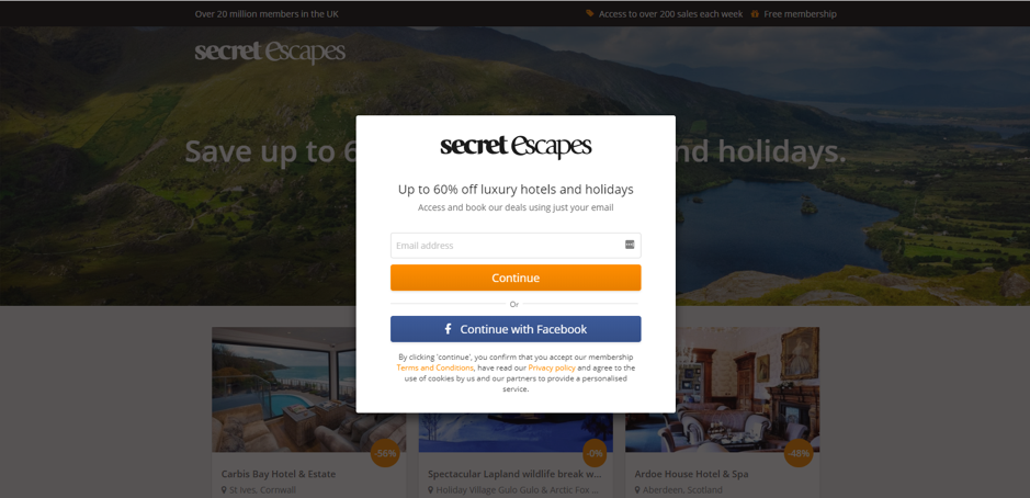
Here is what the standard un-personalized page looks like:
And here is what it looks like with the personalized background image (of a spa) and personalized headline (“Luxury spa breaks” replaced “Luxury hotels”):
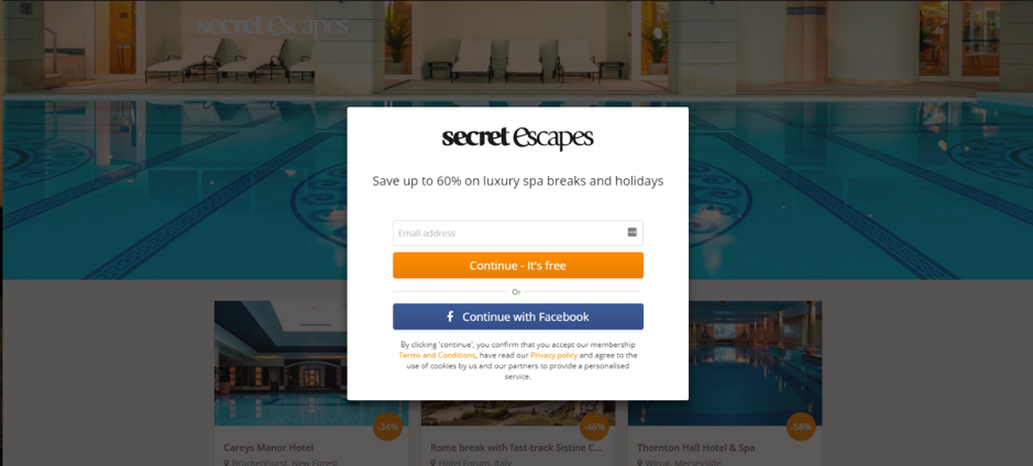
This personalization led to a 26% increase in sign-ups.
What’s great about this personalization is that updating content based on PPC search term is relatively easy since information about the paid search ad group and campaign is available in the referring URL query string:

URL has been truncated for demonstration purposes
This is a tried and tested personalization technique that can add significant value for a lot of brands.
“With so much data lying around about our customers and their behavior, we now have a great opportunity to optimize their experience by providing more relevant sales and information.” – Tom Evans, then CRO Specialist at Secret Escapes.
Wineware
Wineware.co.uk is a UK wine accessories retailer that gets a lot of non-UK traffic. Visitors from overseas used to convert at a much lower rate than domestic visitors and this represented a personalization opportunity to address the problem.
With the help of digital marketing agency, Fresh Egg, the retailer implemented personalized pop-up banners for international visitors, that included the flag of their country, a reassurance message around delivery and an option to call with any queries:
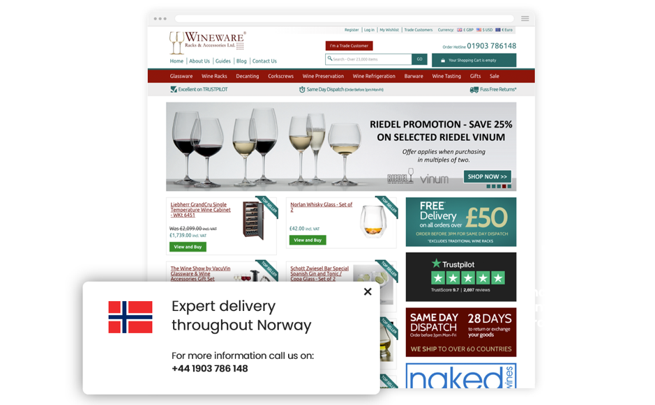
This personalization method was simple to set up and led to a 19% increase in the number of orders from overseas visitors.
This very same technique has been tried and tested by www.rattandirect.co.uk and www.saltrock.com, both of whom have seen a positive impact on conversion rates.
“We’re now extremely happy we started personalizing our site, as the results have been excellent and to be honest, we’ve been surprised by the number of additional sales achieved”. – Lynsey Wellman, Owner at Wineware.
Bras N Things
Brasnthings.com is an Australian-based fashion retailer that wanted to better cross-sell and up-sell their products. They tested replacing their self-managed recommendations widget with a data-driven algorithmic one, powered by a personalization tool. The new personalized recommendations appeared on the homepage and on product pages:
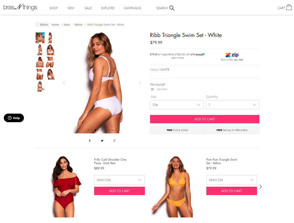
These smart product recommendations led to a 9.6% increase in average order value and 6.1% increase in conversions.
“By plugging product recommendation technology into our website, we have delivered real improvements to our customer experience. We can now ensure that we’re targeting the right customers with relevant content at the right point in their journey.” – Sven Lindell, then Chief Digital Officer at Bras N Things.
Other essential personalizations
In addition to the above techniques, there are a host of other personalization options available to both e-commerce and lead-gen websites. These include:
Shopping cart abandonment emails
Emailing users when they’ve added products to their basket, but not completed the checkout, often offering some additional incentive to return.
Personalized email newsletters
Utilizing user website browsing info (among other possible data sources), such content viewed or products purchased, to provide an email newsletter personalized to users interests.
Exit intent messaging
When a user demonstrates browsing behaviour that suggests they’re going to leave the site, a message is shown encouraging them to stay, often including some additional incentive.
Personal offer messages
Using browsing behaviour info to show personalized promotions or offers to users as they navigate the site, often via pop-ups.
Social proof urgency messaging
For example, “Five other people are looking at this hotel room offer right now”.
User selection remembering
For example, defaulting to a map view display of options rather than a list view for users who have demonstrated a preference for this display option in previous interactions.
Back in stock alerts
Allowing users to request an alert (email, push, SMS etc) when products come back into stock.
Price drop alerts
Allowing users to request an alert when a product drops in price or drops by a certain amount.
Post-purchase replenishment
Prominently displaying products that users are likely to need to buy again based on estimated use rates and/or lifespan (e.g. hair products, batteries, socks). This also works for alerts on contract products that often need renewing after a certain time, such as insurance or phone contracts.