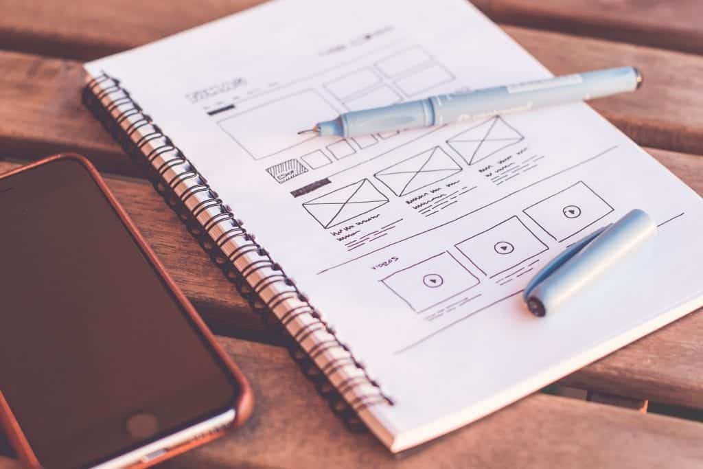
While effective website design has not died off, there are a lot of mistakes made even by professionals with honest intentions. As such, there are people wondering if effective web design is possible to achieve and maintain. It is, but it takes work. Your website is the one element that provides 24/7 advocacy for services, information, or products that you offer. A website can also be your best platform for offering thought leadership, as well as providing an anchor for online branding.
Your website can make a powerful and positive impression on visitors, or it can fizzle in seconds. So make your website design count! It’s not impossible for designers to overlook the small things that lead to online success. It’s the small mistakes that can sink an online business. These are the mistakes less noticeable.
1. Get the Meaning Across
The first and biggest mistake in effective website design is when visitors fail to grasp a website’s meaning. If visitors cannot immediately figure out the “why” of a website, they are off to the next adventure. Make it easy for visitors by placing the company’s name and its products and services above-the-fold. An offering of the website’s product should also appear above-the fold.
2. Have a Fast Website
Website loading speed is essential if you want to inspire people to spend time on your site. Any loading time beyond three seconds can be a death knell. That may sound a bit graphic and raise a few hairs on the back of your neck, but it happens to be a fact. People are on the move, and if they cannot quickly determine if your site is the right destination, they will quickly move on.
3. Have a Responsive Design
3. Responsive design is also critical. Websites must perform equally well whether the user is on a desktop or mobile device. The design is such that pages on website will render equally well regardless of the device visitors use.
4. Have an Intuitive Design
Does your website design and layout complement a customer’s intuitive nature? This refers to simplicity of navigation. A website owner should know their customers and what they want to accomplish on the site. Know these things for each page. Content, of course, will read from left to right and from top to bottom. A navigation menu should also appear on each page along with a link back to the home page and other important pages. On the other hand, do not overdo the menus and navigation options.
5. Have a Simplified Design
Some website owners forget that text should be easy to read and written in the language of their readers. Color contrast is also important. Experts suggest using no more than three typefaces and backgrounds that offer high contrast color combination
Wrapping It Up In Brand
Your website is the place where fonts, colors, readability, usability and ease of navigation all work to tell the world about your products, information, or services. It is all about branding and delivering the right, consistent, message. The right branding builds trust and reinforces your company’s values and messaging. Your website is your brand. Your brand reveals itself through your website and every social media asset that your company owns.
Off-page and on-page SEO are critical elements that can lead to online success, or failure. Consider that websites that appear high on the list in ranking are on top of every important ranking factor. The best offense is to work with the digital marketing professionals who can bring your website assets back to life. There are simply too many moving parts for the typical individual to monitor and master. It is critical to nail it down the first time around. Otherwise, you may not get a second chance.