Around 87% of online shoppers abandon their carts during the checkout if the process is too long or complicated
Without going through the checkout process, your customers will not be able to complete their transaction on your e-commerce website. The checkout process starts when a customer hits the “Buy Now” button or is on the “Shopping Cart” page and clicks the “Proceed to Payment” option.
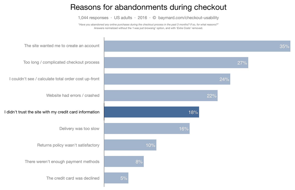
Around 87% of online shoppers abandon their carts during the checkout if the process is too long or complicated, suggests data from Splitit.com. This means that an e-commerce site could really lose out if the UI/UX on the checkout page is poor.
Attracting visitors to your e-commerce website, offering them a superior user experience and making them buy from you are all challenging aspects in themselves. But keeping your customers interested in buying while they provide their personal and payment details on your checkout page is an even greater challenge.
The average card abandonment rate, based on 33 studies is 68.63%, according to MarTech.Zone in an eCommerce consumer behavior survey.
So, if you think you have a unique product and an aggressive marketing strategy that can successfully bring customers to your website, you need to make sure that your checkout process is fit for purpose so your hard work isn’t undone at the final hurdle.

Despite an insightful piece on Bluestout.com that says customers are drinking while shopping, which could be a factor in some cart abandonment, we can also link a number of serious reasons for this behaviour. Here are some of the factors that could be causing your customers to leave your site before completing their purchase:
Lack of trust
No matter how high the quality your products and services are, if your website fails to build trust with your visitors, it is going to cause issues. Looking at building trust throughout the customer journey – such as with social proof – could help ensure people feel safe shopping with you and get them through the checkout process.
Not only will trust building help encourage more checkout completions, it is likely to result in return customers, so it is well worth ensuring you build trust with new e-commerce customers.
After all, trust is what keeps a business going. In an e-commerce scenario, trust is when your customers feel that their crucial data is safe and secured with you. They also want safety assurance for their purchase.
Truth be told, no customer wants to talk about lost packages, a damaged or incorrect product being delivered, or leaked data. Any such instance can really affect your e-commerce business, especially if these instances are happening to a number of customers. Dealing with negative issues well – especially on a public forum like social media – can help improve customer sentiment.
Confusing process
Some e-commerce businesses fail to keep their browsing, sign-up and checkout processes simple. Simplicity really is best when it comes to designing the layout of your webpage – especially your checkout page.
If you add too many elements on a single page without having a proper layout plan, it can confuse your visitors and actively encourage them to leave without completing a purchase. It will also likely discourage them from returning in the future.
Online shoppers have a very limited attention span. If your checkout process is complex, there is a good chance that they’ll get partway through and then give up. Simplify the process as much as you can, keeping it short and concise while still providing all the possible options for delivery and payment.
It is a good idea customize the experience of a customer based on their behavior, history and browsing trends. This will enable you to create a seamless experience that the customer feels comfortable with.
You should also remove all distractions from the checkout page, as they can impact the customer’s decision. Things like popup messages from chatbots, advertisements, recommendations and sidebar menus should all be banished from the checkout process.

Lack of payment options
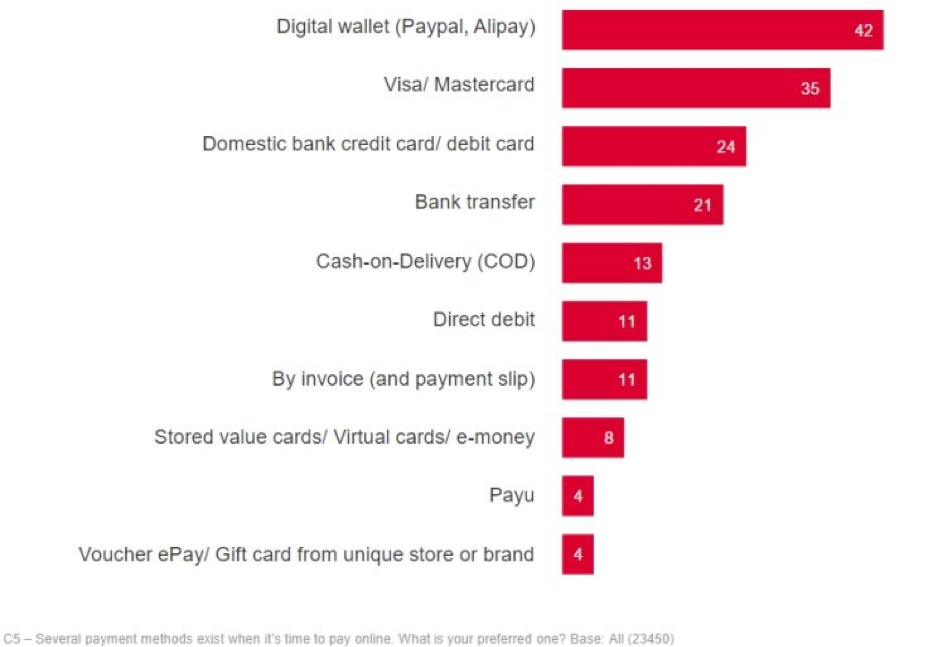
If you don’t offer the payment option your customer is looking for, they’ll likely abandon the checkout process. Most customers are pretty choosy when it comes to payment method, whether it’s because of personal preference or for security reasons.
They will complete the checkout process only if they have the option to pay through their preferred payment method, which means you should explore what other payment methods, such as PayPal, you can offer to help improve trust and suit your customers’ preferences.
Having other popular payment options available at the checkout process of your e-commerce website could make a big difference, even if they are only used occasionally. As well as displaying them at the checkout, make sure your website displays the payment options available elsewhere, such as on your FAQs page.
Despite the fact that PayPal and credit cards are usually the most popular payment methods, you should try to enable payment through e-wallets, as well, that make payments quicker and easier. You might include want to include pay on delivery (PoD) or pay through card on delivery options.
Price of product
Today’s buyer is an empowered buyer. They are empowered by the options available on the internet. They compare the price of same product on different sites multiple times before making a buying decision, all while having that product in their shopping cart on your website.
If they find a better deal elsewhere or come across a discount voucher for another retailer, they’re unlikely to return to your site. This is where triggered emails or pop-ups could help retain a customer and get them through the checkout process.
You can either send an email, if they have signed in to your site, offering them a discount because they have left something in their basket or create a pop-up providing a discount that is activated when they go to leave the site.
On top of this, most customers don’t want to pay shipping costs and having to do so can put them off. When other major shopping platforms and local retail stores promise free shipping, they don’t want to buy from a place that charges for delivery.
An insightful blog by BargainFox reveals that 47% of shoppers indicated they’d abandon a purchase if they found out there wasn’t free shipping.
Feeling unsafe
Negative reviews, incomprehensible refund and exchange policies, error messages on your website, and unprotected payment gateways are some of the factors that make a customer feel unsafe when shopping with you.
This is why it is vital to create user-friendly policies and implement security choices that put your customers first. Listen to what your customers have to say and make changes based on negative reviews.
E-commerce is a technical and complicated sector that often has to face technical glitches and slowdowns. You will need to remove those often-occurring issues from your website to make your customers feel safe.
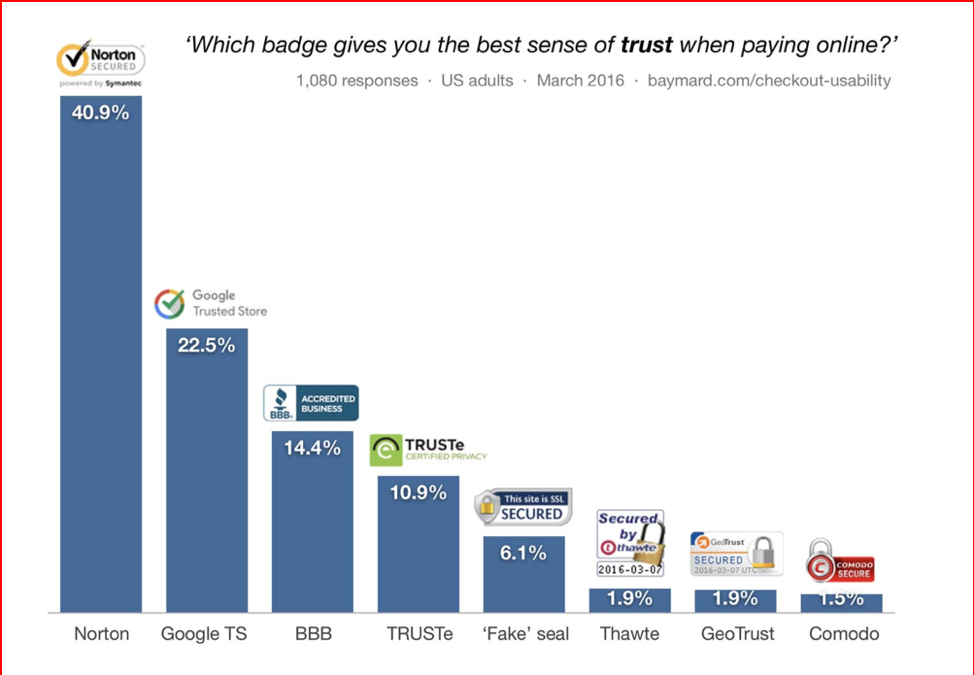
You need to implement the best and latest data security and anti-hacking measures, specifically, in your checkout process, because it is this part of your website where users provide their information. Obtain certifications, accreditations and badges and put them on your website to make your customers feel safe buying from you. Elaborate on what you do with their information through your privacy policy and T&Cs.
In addition to that, you will need to have a clear and convenient return and refund policies so your customers don’t have any hesitation in completing the checkout process at your website.
No mobile-optimization
The number of purchases being made via mobile is growing, which optimizing your e-commerce site for mobile is vital. Failing to offer your customers an easy purchasing experience on their mobile device is likely to lead to cart abandonment – if they get to the checkout process in the first place.
Even if customers don’t buy via their mobile, they are likely to browse through this channel first before ultimately checking out via desktop. However, they probably won’t return to your site if you don’t offer a good mobile experience to start with.
You need to make sure that your website looks great and works smoothly across mobile devices, browsers and platforms, adopting a mobile-first approach.
Double check the usability and functionality of your checkout processes from user-friendliness and data security point of view. The layout of the checkout page should work well for the screen format and resolution of all handheld devices.
Final thoughts
You should always be open to introducing new website development practices with an aim to make your checkout page more user-friendly and more secured. For this, you will need to keep an eye on the rapidly evolving e-commerce best practices.
Smith Willas is a freelance writer, blogger, and digital media journalist. He has a management degree in Supply Chain & Operations Management and Marketing and boasts a wide-ranging background in digital media.
