The ability to compare products that fulfill similar needs helps shoppers make educated decisions on the fly. This feature can be vital for stores that sell, as examples, tools, electronics, and appliances. Ultimately, comparison charts allow consumers to see clearly if a higher priced product is a better value based on specifications and features.

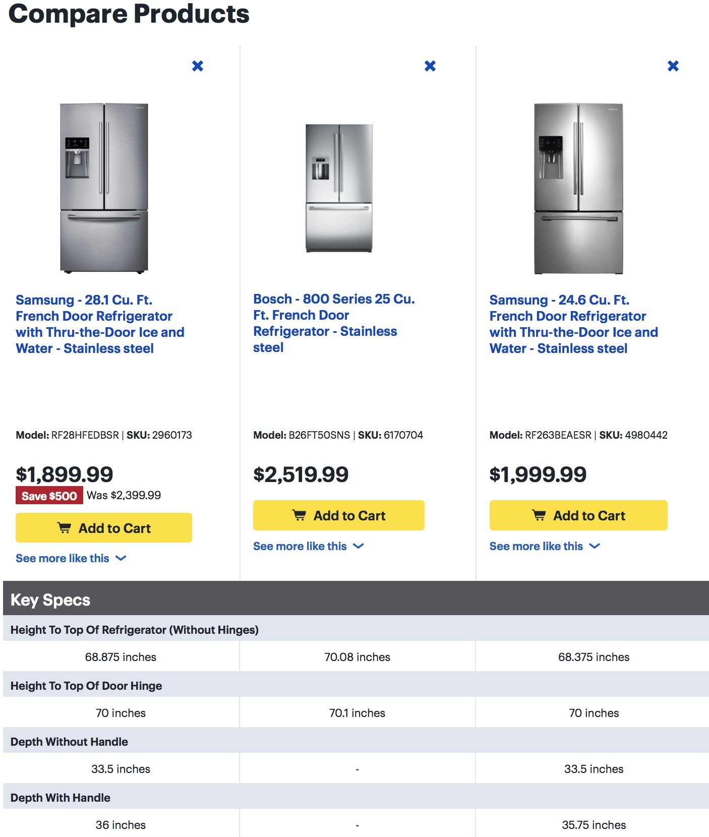
Comparison charts, such as this one from Best Buy, help shoppers see how products stack up against each other.
Typically, comparison tools require shoppers to select the items they want to see side-by-side, usually by checking boxes. But a better option could be to eliminate that extra step and offer pre-populated comparison charts based on the store’s most popular products or by expert recommendations.
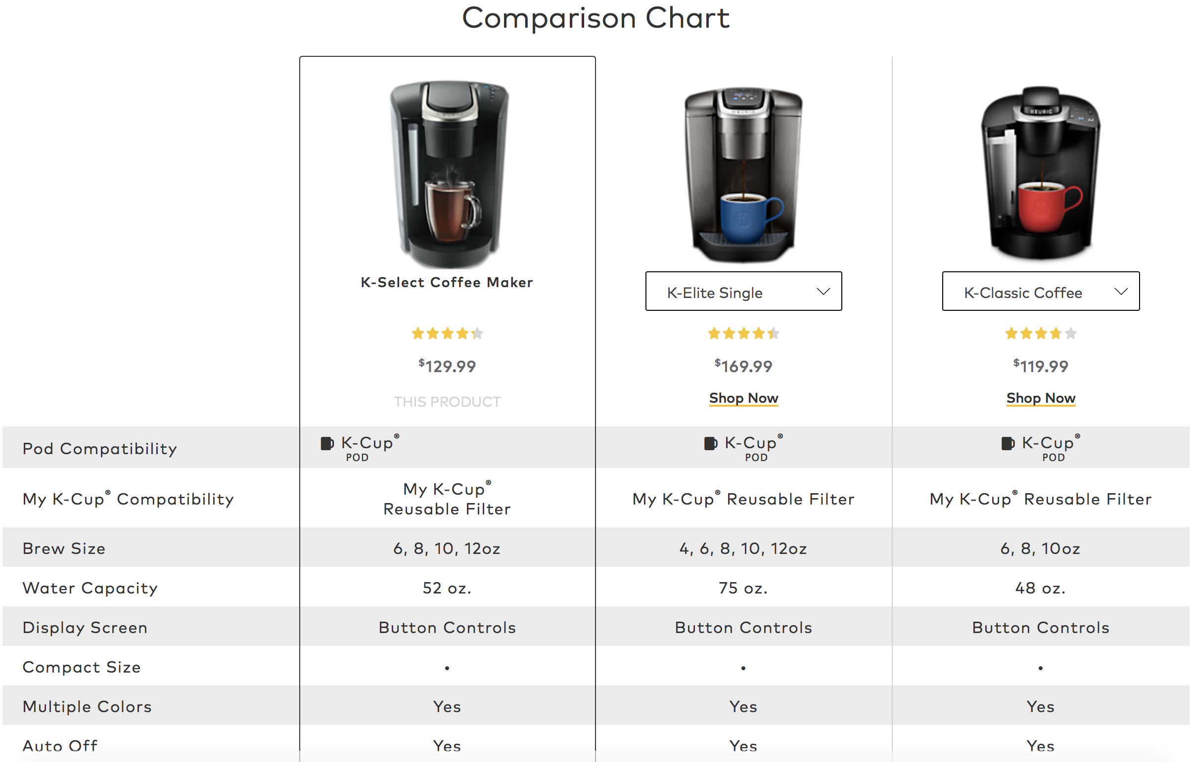
By not forcing shoppers to guess which items to compare, merchants make the shopping experience less frustrating. Keurig, for example, auto-populates a three-product comparison chart on each page of its coffee makers. Shoppers can select other brewers to compare using simple pull-down menus.

Keurig’s coffee maker product pages include a comparison chart. No guesswork is required.
Displaying comparisons automatically has additional selling benefits. It’s a productive way to display related items and helps encourage people to upgrade their intended order.
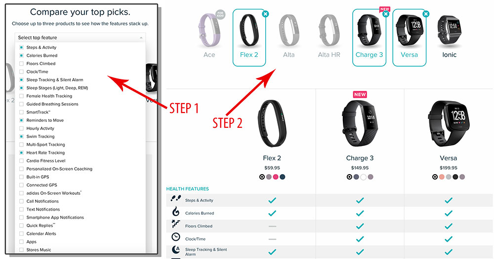
While Fitbit does require user input, it has simplified the comparison experience by first asking shoppers to check off the features they need. Then it prompts them to select up to three devices.

Fitbit integrates filtered search in its comparison tool so shoppers only see the models that have the features they want.
The Center Option
When considering the display order of compared products, place your most preferred product in the center, even if it’s more expensive.
In 2011, Dr. Paul Rodway, senior lecturer at the University of Chester, in England, led a series of experiments — such as rotating photographs and showing identical socks — to see which ones most people preferred. Consistently, his subjects chose those placed closest to the center, despite varying tastes and demographics. Several studies since have reinforced that the “Center Stage Effect” is real. It’s proof that most of us are drawn to things that are located in the middle.
There is a strategy to determine the best option to center, though. Most subscription-based services offer three tiers: a basic plan at a nominal cost, a mid-range plan that includes most or all features one would need, and a high-end plan typically suited for big business. In most cases, the mid-range plan converts the highest.
In the Fitbit example above, the trackers are initially lined up in order of price. Since most people will click them from left to right, the final comparison chart will most often show the mid-priced item in the center.
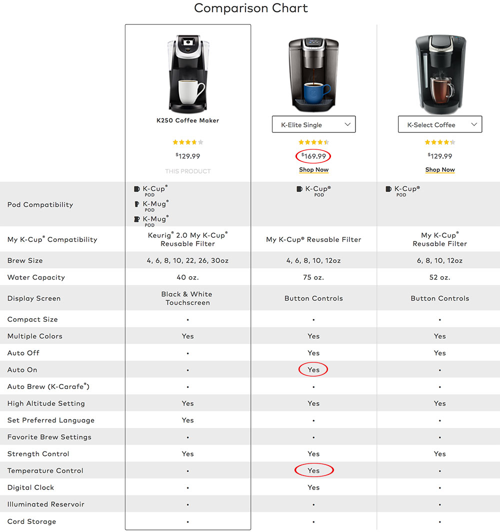
For some products, though, lining up solely by price doesn’t always make sense, especially when key features are the driving force behind a purchase. Keurig understands this and instead centers one of its most expensive machines, the K-Elite, in the compare section on every brewer product page. While this machine only works with one type of pod and only brews up to 12 ounces at a time, it has two key features the others do not: Auto On and Temperature Control.

The higher priced K-Elite plays center stage on Keurig’s product pages.
Overall, strategically center the best products based on features, price, popularity, and the rate of return.
Formatting
Simple and clean formatting of product comparisons is a must. Comparisons are neither a replica nor a replacement for detailed product descriptions. They should be quicker to read than full details and shouldn’t include lengthy technical specs. Tables typically work best, even if you have to stack products.
When comparing products, keep these pointers in mind.
- Use simple words and keep each feature description concise. Consider asterisks or links for further details.
- List similar features first, followed by unique or exclusive ones.
- Use products that have clear differences so shoppers see the benefit of paying more.
- Take time to understand what the deciding factors are. This can vary on the audience.
- Use bulleted lists for product features. They are much easier to digest.
- When comparing similar products by different brands, stress the importance of one brand over another.
More Conversions
Auto-populated comparison tools take the guesswork out of which model or brand to buy, resulting in higher conversions. They also build customer loyalty, as shoppers spend less time finding the right product. Thus the tools drive one-time sales and improve customer service.