Landing pages are kind of important for customer acquisition. For many businesses, it’s where the conversions happen. Indeed, without an effective landing page, you’re as good as leaving money on the table. The landing page is the money maker, the cash cow, the wealth creator.
That old adage “first impressions count” is super true here.
The problem with creating high-converting landing pages, though, is that there’s no silver bullet as such. Maybe you’ve already tried and found that your conversions are down. While we’re going to cover everything you need to do regarding this topic – from tweaking your headlines to picking images – the actual creativity is all on you. We’ll give you pointers, but it’s up to you to put them into action.
That said, once you’re up and running, it’s just a matter of performing A/B tests until you land on the magic formula that brings in those conversions. We’ll give you all the tools you need to make a start, and then it’s up to you to take things from there.
But first …
The Difference Between a Landing Page and a Homepage
Marketers often get confused between a landing page and a homepage and assume that they’re one and the same. Sometimes they are, but most of the time they’re not.
Look at it like this: If your homepage is there to welcome visitors to your website before pointing them to where they need to go next (a product page, for example), then it’s not a landing page. On the other hand, if your homepage exists simply to convert site visitors, then it is a landing page.
Put simply, a landing page exists solely to convert site visitors. For this reason, many marketers promote their landing page(s) via Google AdWords or PPC. Often, the landing page will act as a lead magnet or even an actual sales page.
Many times, you’ll see affiliate marketers create one-page websites designed to capture email addresses. This is a landing page that has a specific goal in mind: to convert leads into actual subscribers. Because there are no other pages on the website, there are zero distractions. The site visitor either converts or bails out. And they’ll only convert if the landing page is optimized for mega conversions.
Learn More:
How to Create a High-Converting Landing Page in 2019
Because a landing page is designed exclusively to boost conversions, there are certain elements that it needs. It is crucial that you get these elements absolutely right, otherwise your conversions will be down.
Create an Eye-Catching Headline
A killer headline is the very first thing that a site visitor sees when they arrive on your landing page. It’s what sparks their initial interest and keeps them on the page for at least longer than two seconds. It’s what entices them to look further because it’s hooked them and spoken to them directly. It’s told them that this company has what they need/want.
Writing a headline is a bit of a science, yet although it consists of just a few words, it’s so easy to get wrong. To help you out, here are the elements of a strong headline:
- It needs to inform the site visitor what this product is all about.
- It needs to be crystal clear, so get straight to the point and don’t be vague.
- It needs to be relevant. In other words, it has to deliver on the promise set out by the ad that brought people to your landing page. If your headline has literally nothing in common with the ad, or if it fails to deliver on the promises outlined, the unhappy visitor will leave your page.
- It needs empathy. What’s your prospects’ biggest problem? Show them that you understand!
Here’s an example of a landing page that brings everything discussed together:
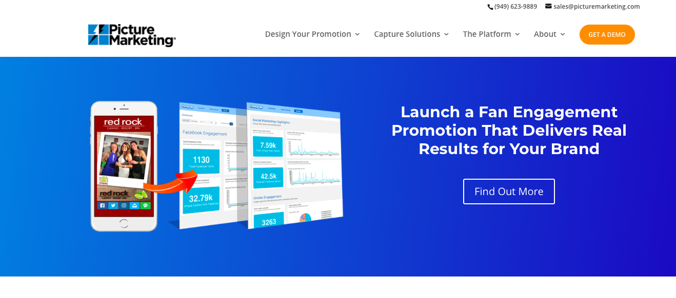
It’s short, sweet, direct and it taps into what site visitors want the most – real results for their brand.
You can also experiment with sub-headlines where you expand on the main headline. You could add, for example, two or three extra sentences of copy that reinforce your claim. This is not always suitable, but it can work especially well when you don’t have a strong image to back up your claim.
Here’s an example of a landing page headline and sub-headline:
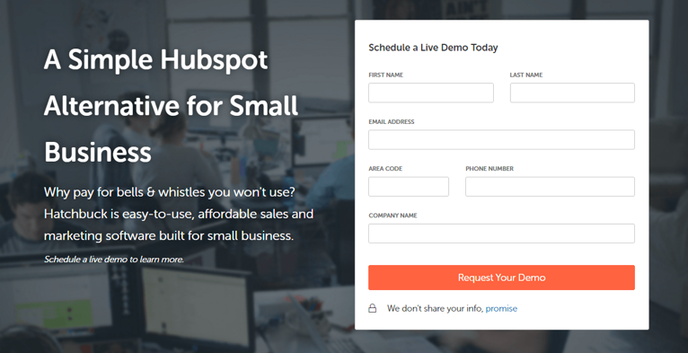
Your sub-headline also needs to be persuasive and it can go into a bit more detail than your main headline.
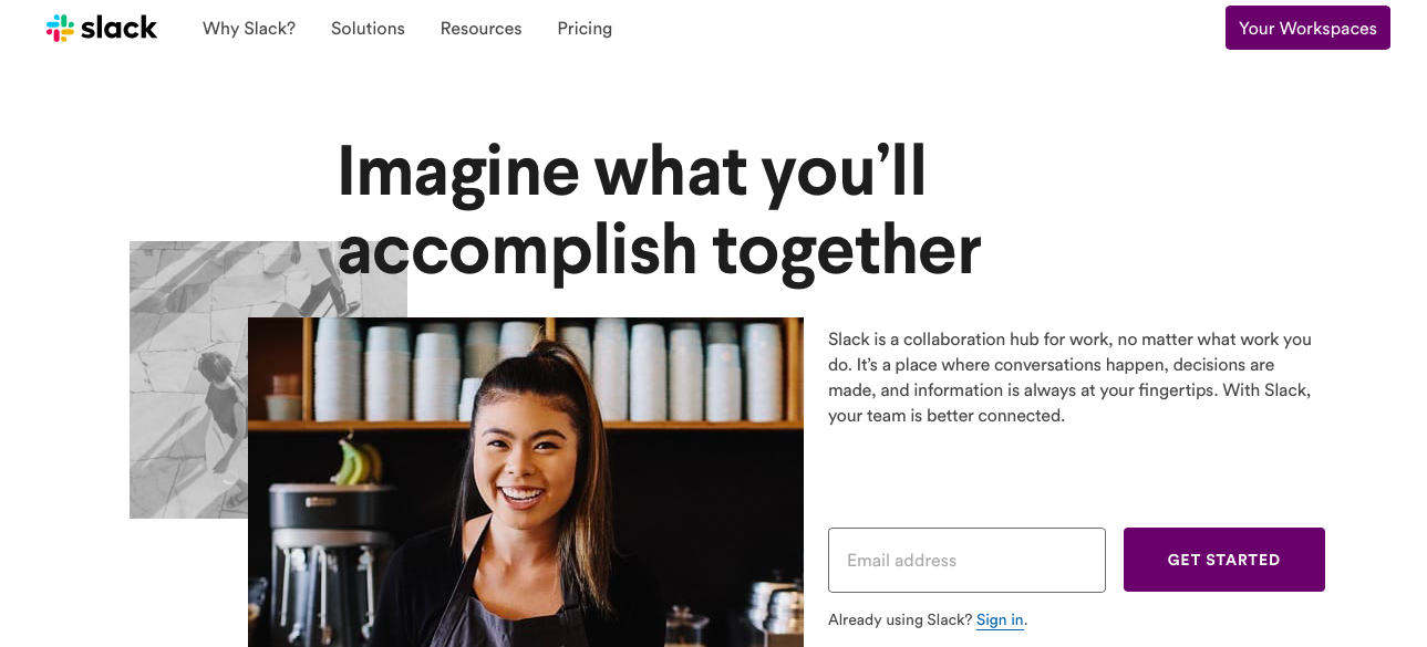
Here’s an example of Slack’s landing page with sub-headline:
Use Pictures Effectively
A landing page is nothing without images. Images convey emotion and show people what your product looks like or even how it works.
Images also break up text and add a crucial visual dimension to your landing page, as this image from an eye-tracking study shows:
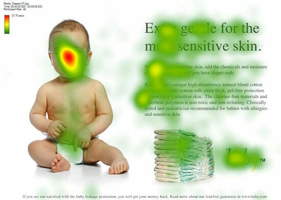
Indeed, stats have shown that the human brain process images 60,000 times faster than text. This means that the things that instantly catch their attention are your headline and your main picture. When you nail them both and combine them effectively, you’ve got a winner.
Let’s take a look at a variation on Slack’s landing page:
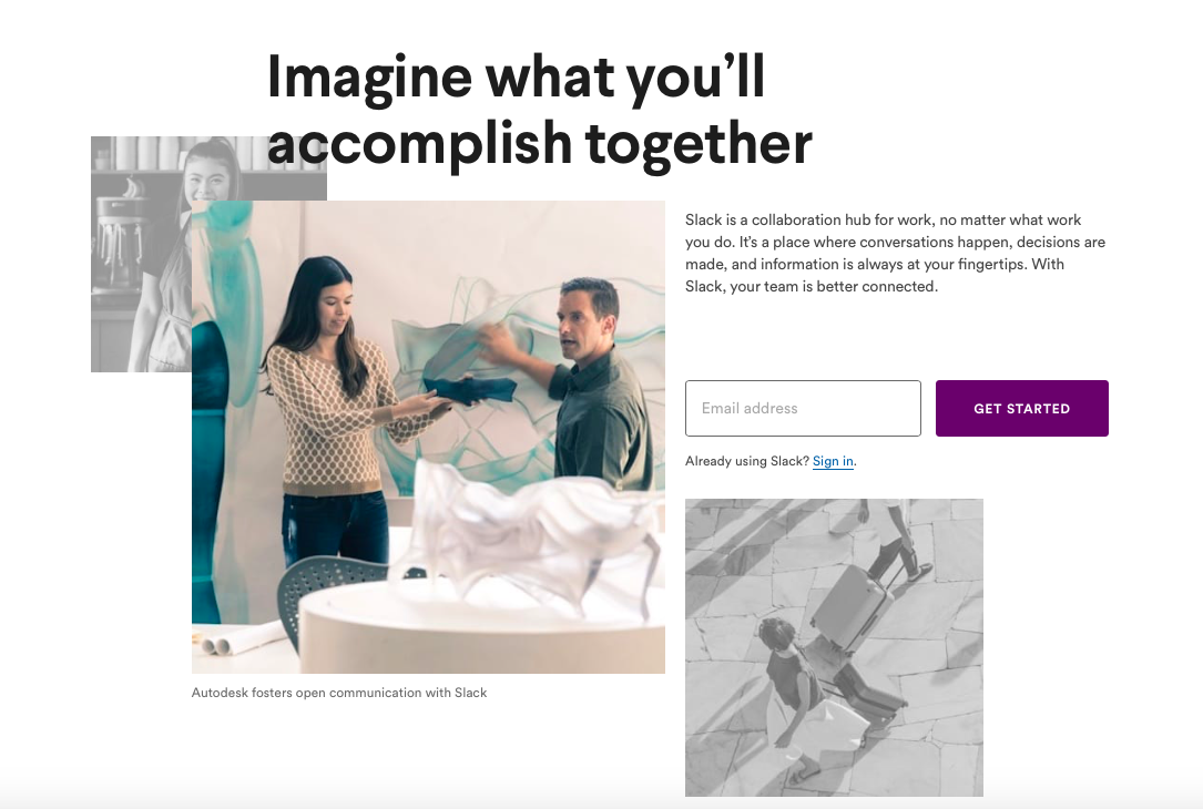
What we are seeing here is teamwork. The headline suggests that we accomplish more when we work together, while the picture shows two people working together to get things done.
Pictures are more emotive than words, so it’s really important that you tell some things but show the rest. Combined, the headline and the image get across the importance of teamwork and how the Slack app will help businesses out.
The image that Slack uses is also:
- Large
- Relevant to their service
- Attention-grabbing
- High-quality
In terms of relevance, Slack hasn’t actually chosen an image that shows people using their app. Figuring that would be less emotive, they’ve instead gone with a metaphorical image that shows teamwork. And that’s totally cool and still relevant – and it really works.
On the other hand, you might want to go with an image that actually shows people using your product or service. Or you might decide to try both and perform A/Bt tests to see which works best.
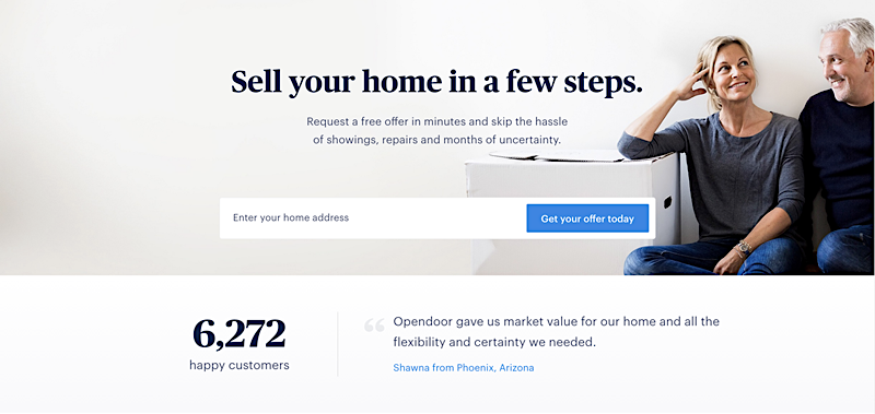
Here’s a great example from Opendoor using an image on their landing page of a happy couple. Rather than a tupical picture of a “sold” sign on the front yard, this one, instead, capitalizes on the emotions of relief and happiness that you’ve successfully and easily sold your house.
You might also decide to use screenshots that show exactly how to use your service if it’s a tad complicated. This is an especially good idea for SaaS businesses. If you go down this route, just make sure to keep your images as fun and eye-catching as possible. Screenshots won’t work if they’re too mundane. They’re well worth it, though, because customers need to know what they stand to gain from using your service. If it’s way too complex, they might decide not to bother at all.
Make a Clear Offer
Ever been talking to a salesperson on the phone and had no clue what they were even offering you? It’s a frustrating waste of time. And it’s the same when a prospect lands on your page and can’t decipher what you’re offering.
Put simply, your landing page needs to contain a very clear offer. It could be the case that your headline and sub-headline takes care of that, but on the other hand, you might need to create a separate section for your offer.
Whatever you decide, you need to be super clear because everything on your landing page will be geared towards presenting this offer as powerfully as possible. For example, while Slack’s image of two people working together says absolutely nothing about their offer, when combined with all the other elements – image plus headline, sub-headline and simplicity/relevance – it says a lot.
So while you’re working on your copy, always focus on brevity and clarity. Use straightforward language that your target audience understands. Don’t leave people second guessing. If you write something like “we’re everything you need” in your headline, the reader might be asking, “what is everything I need?” In this case, you should create bullet points that tells the reader everything they need – and how you can provide that for them.
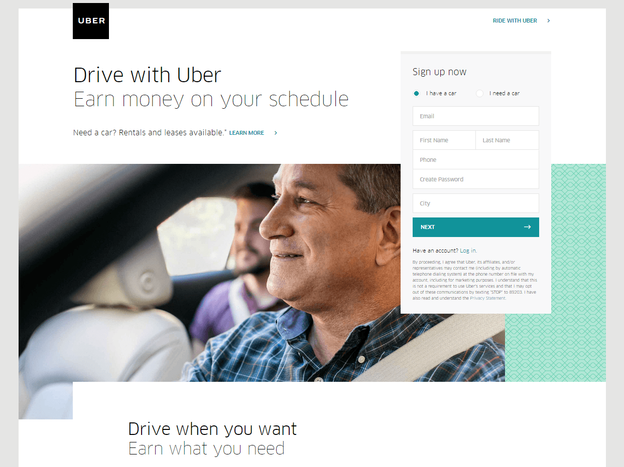
This landing page from Uber very clearly and succinctly explains their offer – earn money on your schedule, drive when you want, and earn what you need (and a CTA that says “sign up now”):
Learn More:
Nail the Body Copy
The body copy is arguably the trickiest bit to get right because it has to reinforce the benefits outlined in your headline as persuasively and compellingly as possible. The ultimate aim is to keep people on the page until they arrive at your call to action. To put it simply: you need to write content that converts.
To be good at landing page copy, you need to be good at writing, marketing and persuading people. But good copy doesn’t start and end there. There are other things to consider, such as the amount of words needed. If you use too few, prospects might not have enough information or might feel as though they don’t trust you enough yet. If you use too many words, you might overwhelm them and lose your clarity.
There are no set rule for how many words you can use. Instead, it’s a good idea to use as many as needed to get your point across. If you’ve got a complex product or service, make sure you list all the key details, without which the prospect would be left feeling unsure.
On the other hand, if you’re an affiliate marketer who’s offering an e-book in exchange for an email address, you probably don’t need too many words. You’ll still need to cover the benefits, though.
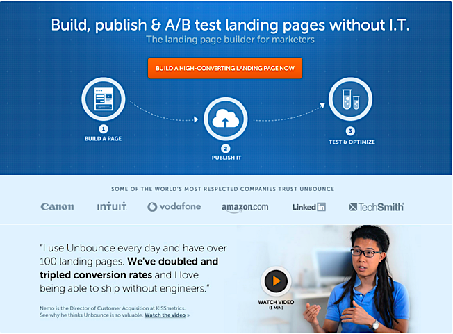
The body copy of this landing page from Unbounce nails it in just two sentences – the pain point is dealing with 100+ landing pages, and the relief-inspiring solution is being able to do your work without having to rely on engineers (and then, bonus, tripling conversions!):
Here are a couple of neat tricks for your copy:
Mention Pain
No one wants to feel pain. It’s human nature to do whatever is within our power to avoid it.
A common copywriting trick is to remind people of what they stand to lose if they don’t take you up on your offer. Loss aversion is stronger than the thought of what we’ll gain. If you can show what people stand to gain and what they’ll stand to lose, you’re onto a winner.
That said, you don’t want to go overboard! Show pain but then quickly show why your product is the remedy.
Show Pleasure
As well as making the reader feel a tad worried, you also need to make them feel good. In other words, you need to tap into the pleasure-seeking parts of the brain.
You can this with your images (you could, for example, show people having loads of fun using your product), but you can also do it with your copy. How? By showing what what your product represents. For example, if your product will create freedom for the prospect, write that. If your prospect will bring relief, write that.
Use strong, emotive words that make the reader feel great about you and your product/service.
Learn More:
Finish with a Flourish – The Call to Action
The call to action generally comes at the end of your body copy. It’s placed at the bottom of your landing page and its sole purpose is to tell the prospect exactly what they should do next. There can be no confusion – you need to be direct with the language of your CTA.
Because the CTA is the money shot, it’s of the utmost importance that you get everything right about it. For example, let’s consider the position of the CTA. It’s typically at the foot of the landing page because you’ve already warmed the prospect up with your copy. If you were to place the CTA too soon, the prospect might not be ready,
You should also isolate it from all other elements so that it’s super obvious that this is a CTA. Consider turning it into a button, too. After all, it’s human nature to see a button and click on it.
In terms of what color you should use, it’s always a good ides to use contrasting colors for the CTA and the background. Black and white, for example, work really well. That said, black and white can also be a bit mundane. It’s a good idea to use colors that “pop” and ensure that the CTA stands out.
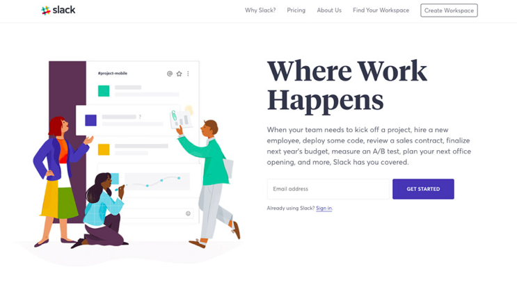
For example, you might want to go with a purple button on a white background, like Slack did – not only does it stand out, but it uses its brand colors:
Then there’s the CTA copy itself. Using first person language like “claim my free e-book now” creates an important sense of ownership, while “Sign Up for Free” is as direct as you can get. Plus, it highlights the fact that the site visitor doesn’t have to spend any cash for this. “Free” is always a great word that can boost conversions.
Dive Deeper: How to Create Better-Converting In-Content Calls to Action (CTAs)
Conclusion
Because the landing page is key to your conversions, it’s really important that you get this right. Keep going through this article with a fine-toothed comb and use the tips to create the landing page that your prospects find irresistible. You’ll need to keep tweaking and testing as you go along, so make sure to perform A/B tests, too.
