July 14, 2017
In PPC we strive to put the right message in front of the right user at the right moment. This is essentially our formula for success. We’re fully aware that irrelevant ads will be ignored and possibly even judged for being so off-base.
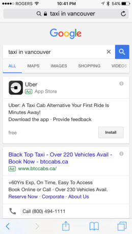
Exhibit A: I recently traveled to Vancouver. Going into this international trip, I knew that Uber and Vancouver weren’t quite on speaking terms. Fast forward a day or two and I googled “taxi in Vancouver” to explore my taxi options while standing in the bustling hub of downtown Vancouver and this was my SERP.

That top result is, ironically, not the right message, I was not the right person, and that was definitely not the right time.
We know what relevancy and logic look like. And we know that relevancy and logic are critical for a conversion and for success. So why do we forget this mantra when we evaluate and optimize landing pages?
Way back in the day (August 2016), I wrote about the pertinence of landing pages being dedicated and committed to their duty to convert your users in It’s Not Enough to Be Relevant – Your Landing Page Has to be Dedicated, but I may have deprived you all of a critical facet of that duty: relevance based in logic and relationships! So today I’m going to share a few of my favorite ways to approach mental relevance and ensure that your landing pages nurture the relationships that your PPC ads spark.
No Shouting
No one likes harsh communication. Harsh communication is an indicator of conflict. Most folks seek pleasurable feelings and thus avoid conflict quite naturally in order to avoid the substantial mental activity and uncomfortable feelings. Despite what some of us would like to believe, exuberance and glee can easily be perceived as harsh and over the top.
Find a happy medium on the spectrum.

Be calm and confident. Be bold and humble. Be educated and curious.
Be the solution and mimic your users with their language and decibel. We, humans, love other humans that are similar to us. Why? Because we’re all extremely egocentric on a subconscious level and we really just like interacting with similar versions of ourselves. Pay attention to how your users speak to you on a regular basis and mimic their energy and vocabulary.
Remember to be nice. Step out of your bubble and go talk to a sales guy to see how he maintains his pitch. Good salesmen will have you wrapped in a completely casual and fluid conversation before you even realize that you’re in the funnel. Good landing page copy will do the same thing.
It’s Not About You
It really isn’t. I can’t say this enough. Yes, the whole landing page is designed and exists to sell a product or service somewhere down the line. There is a goal to accomplish and at some point you have to talk about what it that goal is and what it consists of right? Yes!
Do it in a way that once again focuses on your user. As I mentioned, we love absorbing information about ourselves (this is why we love online personality quizzes as well). Pique your user’s interest within seconds by speaking to them about their problems. “I understand” goes a long way.
Imagine, you’re seeking a solution to a problem: you’ve mastered the peanut butter sandwich but you want to step it up a notch and add some flair. So your sympathetic friend hears of your quandary and tells you about this red pepper-based spread that he absolutely loves combining with peanut butter so he’s certain you’ll love it too. But you aren’t a huge fan of peppers and he didn’t care so now you’re both disappointed. What if, instead, he approaches you and tells you that a month ago he had the same problem, but now he’s addicted to a chocolate hazelnut spread that makes peanut butter sandwiches taste like a Reese’s? It’s the perfect blend of salty and sweet and you’re much more likely to entertain the option. Even better, you’re more likely to try it, like it, and call off the search.
Why is it more effective? Because right out of the gate he has evoked the message “I understand your pain. I get it.” I know. Touchy feely right? But we all have pain points and problems we want to be solved and if you start your copy and landing page with a simple and basic “I understand where you’re coming from” you indirectly answer almost every qualifying question the user was concerned about. “What does this product do? Who does it work for? Does it work well?”
Then tell your users how you can solve their problem. Top it all off by telling them what their life could be like with you in it. Because once again, it’s all about them, not you.
Find the pain point. Say ‘I understand’. Tell them how you solve that pain point by painting a… Click To Tweet
Don’t Erroneously Skip Steps
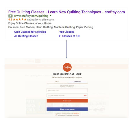
This one is critical and is constantly violated by best practices in our CRO arena. Take a look at the “experience” pictured below.

I googled “quilting classes” which can indicate several intentions: I could be looking for what quilting classes typically teach, I could be looking for quilting classes around me, or I could be looking for quilting classes online. Also, note that the ad is strongly emphasizing “free” which indirectly tells me that this experience is going to be a seamless cakewalk with no cost to me. Score!
I click on the ad, catch a glimpse of the landing page, and then pop! There it is: an overlay that’s screaming “CONVERT! GIVE ME YOUR INFORMATION!” I’m not ready to convert! I’m not ready for that commitment. I know nothing about this site or this brand.
To parallel this, just imagine introducing yourself to someone at a bar and they respond with “Will you marry me?” It’s illogical. Despite our interests and personalities, we all seek out superficial information at the least before we give anyone anything.
Don’t worry. Pop-ups and registration gates are not the only egregious offenders. Forms are quite the offender as well. I’m going to level with you guys because I hear this way too often. Moving your form higher onto your page or always placing your form above the fold does NOT guarantee that your conversion rates will improve.
In most cases, it does the exact opposite and torches conversion rates because users were presented with a commitment before they knew enough information to make a decision. Then when they were ready to make a decision, the conversion option was far away and just out of ease of reach. To compound issues, once they’ve seen your form or conversion option, it’s no longer new and exciting to their brain and it’s much easier to ignore.
We all have different thresholds that determine how much information we need before we commit to things. Determine how much information your users need or want before they convert, hand it over, then follow-up with a gentle ask and your well-informed users will be much more likely to walk into a commitment with you.
Final Thoughts
It’s all about relationships folks! Every interaction we create via PPC ads is an opportunity to nurture that user into a full-blown, advocating returner. First impressions are heavily weighted in all aspects of life and that includes your landing pages. So remember: no shouting, it’s not about you, and don’t erroneously skips steps and you’ll be on your way to delighted users in no time!
Give me a shout on the Twitter machine (@katewilcoxkcco) and tell me how you create relationships with your users on your landing pages 😉