As a small business owner, you want your company to be easily recognizable. One way to achieve this goal is to select the right font for your company’s logo.
Unfortunately, most business owners do not fully understand why choosing the right font for their brand should be a priority.
To help businesses select the right fonts for their brand, Australia-based web design company Creative Canary, has compiled useful data from various sources.
Tips for Choosing the Right Font for Your Brand
Before you select a font for your brand, ask yourself what kind of image you want to communicate. This is important because there are hundreds of fonts to choose from, and each font represents something unique.
You must also consider where the font will be displayed. A font that looks ideal on screen may not work well on a large billboard.
A good idea is to preview how the font will look within the overall design. Will there be a color clash? Is the spacing good enough to make the text readable? Will it work well with the background design? These are some important questions to ask.
If you plan to use multiple fonts or typefaces, preview how they appear in conjunction with each other. Sometimes, two typefaces may clash and cause problems with the visual hierarchy.
Why Font Selection Should be Taken Seriously
In an increasingly cluttered marketplace, brand differentiation has become extremely crucial. That’s why it’s important to avoid mismatching the font with the intended brand image or target market.
A poor font choice can easily render an otherwise excellent message obsolete and defeat the whole purpose of targeted marketing. This is especially important because first impressions matter and fonts draw the initial audience attention.
To know more about how you can select the most appropriate font for your brand, check out the infographic below:
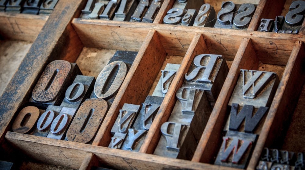
 Vintage Typescript Photo via Shutterstock
