I’m going to give this to you straight. If you’re directing your hard-won PPC, Facebook, Twitter or banner ad traffic to your homepage…
There is a better way.
Conversion happens on landing pages.
And your homepage is not one of them.
Why?
Your homepage is a hub. It’s a jump off point to the rest of your site’s content. A landing page is a destination. It’s where you want visitors to end up.
Let me show you what this looks like.
Where to Go (and How You Get There)
Picture this:
You’ve decided to go on vacation. You call up your travel agent. You tell him you’re in the mood for tropical climates, white sand beaches, and public intoxication.
I know just the place, he says.
Your travel agent, who moonlights as an Uber driver, picks up you up and you’re away. Ready to soak up that mojito-laden air.
But, instead of taking you to a resort, he drops you off at the airport. He leaves you there — with no idea where you’re going or what to do next.
See where I’m going with this?
You are the prospect and your travel agent/Uber driver is your ad.
You had an idea of what you wanted and where you wanted to go. But instead of him taking you there — you’re left in a crowded terminal with only one question:
What now?
Sure, you may meander around for a bit. You might even stumble upon a flight to a coastal city.
But, odds are, you’ll find someone else who will actually send you somewhere. Someone who will set you on the path to a beautiful and exotic land—ing page.
It’s About Awareness, Intent, and Direction
Every visitor who clicks on an ad, comes to your site or buys from you, is in a certain stage of problem awareness.
Here’s a brief a rundown on the five stages:
- Unaware – The first stage The prospect doesn’t know they have a problem. Enter Dwight. The marketer who works his nine to five, five days a week without issue or complaint.
- Problem-Aware – This stage comes after something triggers a feeling of discontent. A disconnect between desire and reality. It’s Dwight at his desk at 9:37am, realizing he feels burnt-out. He doesn’t know what he needs. He only knows he has a problem.
- Solution Aware – Vacation. He needs a vacation. The solution stage is when a prospect identifies a way to solve their problem. But, still unaware of the options. He doesn’t know where he can go to get the relaxation he needs.
- Product-Aware – Iceland? Sydney? Hawaii? The next stage is awareness of the available options. It’s a prospect knowing your solution exists and what it can do.
- Most-Aware – Dwight likes Hawaii. The final stage is when the prospect is not only aware of your solution but when it’s also the top contender.
What does this have to do with paid traffic?
Two things.
First, the awareness stage dictates what they’re looking for, why they’re looking for it and how they got there.
In a word: Intent.
Second, knowing which stage a prospect is in allows you to write targeted ad copy. It’s the copywriting adage of joining the conversation that’s already going on in their head — in action.
And it’s not only your ads. Every page on your website addresses concerns at different levels of product awareness. The goal of paid ad campaigns is to prime for conversion by moving them through these stages.
So, which would better fulfil this goal? A homepage or a landing page?
If you answered homepage. Read on.
If you answered landing page. Nice. Read on.
Why Copywriters Hate Writing Homepages
I know what some of you are thinking:
Our homepage has the product on it. By sending traffic there, we’re making visitors product-aware. Plus, it’s littered with information about our value proposition. And THAT will move them into the most-aware stage. It’s the ultimate landing page. Bazinga.
Fair point. But, remember the ultimate goal is conversion. Convincing Dwight that Hawaii is the best place to be, doesn’t mean he’s booked the ticket. Getting to the final stage of awareness is still only awareness — not action.
And although visitors are “landing” on it, I’ll say this again:
A homepage is not a landing page.
Homepages are the gateway to the rest of your site. They are for visitors at every stage of awareness. This makes writing homepage copy a bit of a doozy.
But, landing pages are purpose-built conversion-machines. They follow an optimized set of design principles. Squeezing out every sign-up, opt-in and sale possible. They do this by adhering to a staple of conversion copywriting:
The Rule of One.
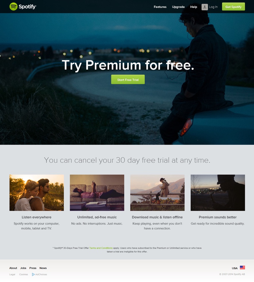
The Rule of One is to design each page with one reader and one big idea in mind. For example, Spotify’s landing page for a product-aware prospect (one-reader) with a free trial offer (one big idea):
The purpose of the Rule of One is to convert. It gives a single visitor a single path.
This is why homepages are troublesome for copywriters. A homepage is for everybody, and so, it converts nobody. Sure, you may have a CTA above the fold, smack-dab in the center. But, how many conversions do you get compared to a purpose-built landing page?
A lot less, I’d assume.
Focus Trumps Clutter
The real problem with sending visitors to your homepage is onus of responsibility. You make them responsible for navigating through your site. You make them responsible for finding your landing pages.
You make them responsible for your conversion rate.
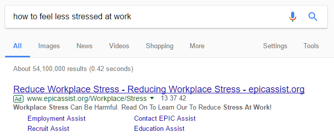
Let’s go back to Dwight. He knows he has a problem. He needs a solution — so he Googles:
And this ad comes up. What do you think he’d prefer to see when he clicks on it? A solution to his workplace woes? Or a page cluttered with links and information that may or may not be relevant?
Directing paid traffic to conversion relies on visitor expectation — join the conversation that’s already going on in their head.
If they’re in the problem stage, they’re expecting a solution. If they’re in the solution stage, they’re expecting a product.
Give it to them.
The first page they see plays a pivotal role in convincing them your offer is worth their time and attention — make it count.
There is already plenty of content out there on designing landing pages. So we won’t get into that here. But, there is one aspect of landing page design that makes it a conversion beast:
Variation.
As in, multiple, targeted and focused designs. Here’s an example: Instapage — a landing page building platform.
If anyone knows how to design landing pages, it should be them, right?
Now, here’s where you come in. You have a problem. You need landing pages. And you need them now.
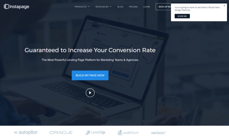
You go on the Google machine and search for “how to build landing pages”. You scroll down and click a link to Instapage’s homepage:
Immediately you see menu items, a CTA button, and a video play button. There’s also “3 Brand New Design Features” to check out. You don’t even know the old features yet.
You’re at the airport.
Why are you here? Where do you go? What’s the next step?
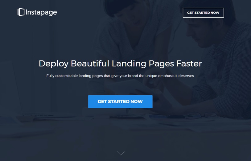
Now for comparison, here is the landing page after clicking on the PPC ad for the same search query:
See the difference?
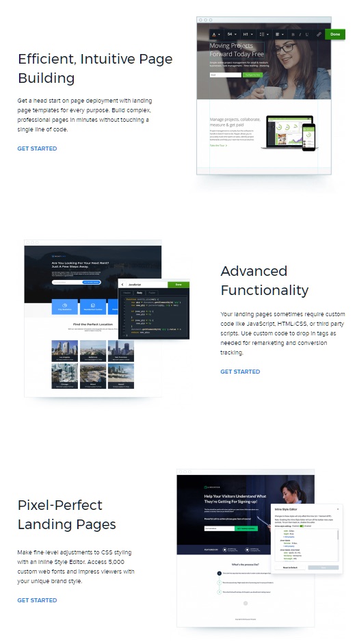
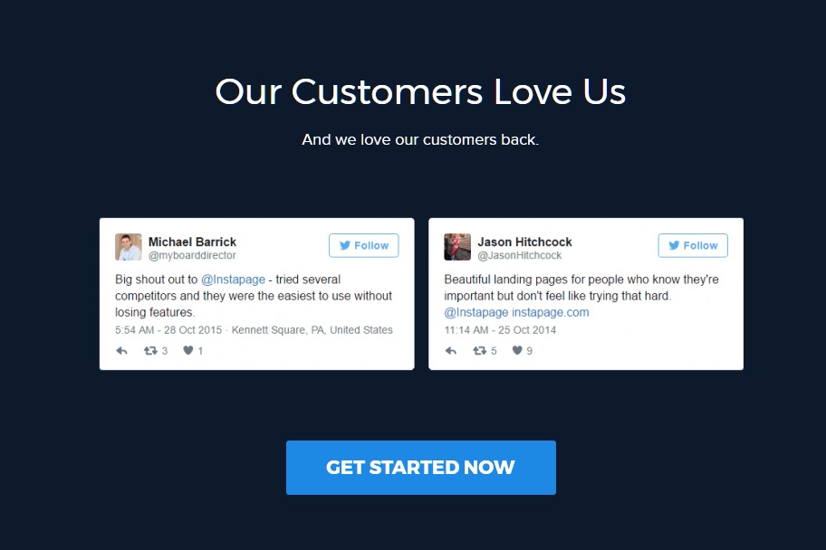
The landing page has a clear path for the visitor to “GET STARTED NOW”. Clicking either button takes you to a page with a simple signup form — and nothing else. Below the fold, you see the features most pertinent to your search query: how to build landing pages.
What’s more, every single clickable element leads to the same sign-up page as the first CTA button. Like Spotify’s landing page, it gives a single visitor a single path to conversion.
The focus is on the visitor’s intent — anticipating their needs. And by presenting the right information, they meet their expectations.
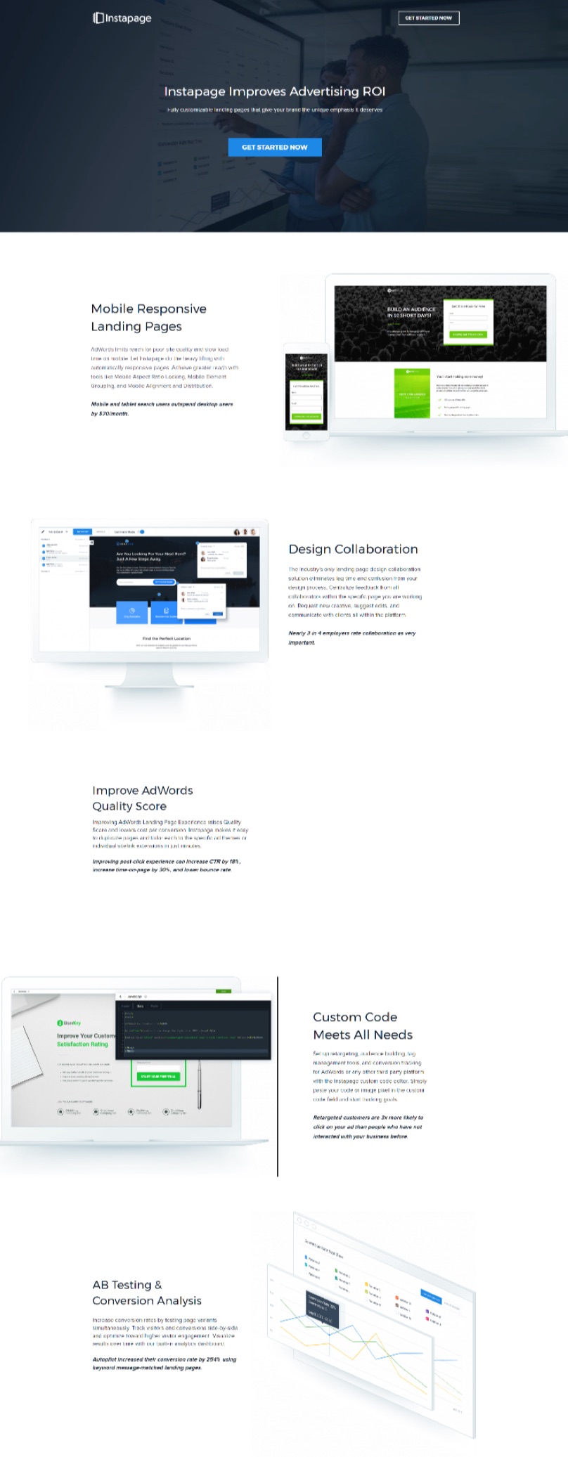
Now, let’s see the search query: “high converting landing pages”. This is the PPC ad’s landing page:
Again, above the fold there is a central focus — get started now. Below the fold are features relevant to the visitor’s intent and expectations. In comparison, the homepage now looks cluttered and directionless.
Targeted, focused, and relevant landing pages are the key to high conversions.
One company found their ad-specific landing pages outperformed their generic pages by 115%. And companies have seen a 55% increase in leads when increasing their number of landing pages from 10 to 15.
This is the beauty of directing paid traffic to landing pages. You can create them based on exactly what the visitor needs to see at their stage of awareness.
Homepages are static — There can be only one.
The Bottom Line
If you’re directing paid traffic to your homepage — you’re wasting your marketing budget.
Your homepage was never meant to be more than a central hub. A starting point. Whereas landing pages have every single element designed, tested and optimized for conversion.
You are paying money for this traffic.
If you currently have ads directed to your homepage, direct them to a relevant landing page. Go, now.
If you already direct them to a landing page, ask yourself:
- Is this the most optimized landing page for the intended reader’s stage of awareness?
- Does the landing page present information that they’d expect to see?
- If it doesn’t, can I build another landing page that would be better suited?
Remember, Dwight needs the vacation. Don’t leave him wandering through the airport.
If you show him the boarding gate — he’ll get on the plane.
About the Author: Andy Nguyen is a professional copywriter for hire. He helps B2B SaaS and marketing companies produce content their audience wants to read.
