We’re often told that the web is increasingly mobile, and that it is imperative for businesses to adapt their marketing strategies to be ‘mobile-first’ in order to capitalize on this shift in internet behavior.
But just how mobile is the web in 2017, and what does this mean for search?
SEO and performance marketing agency BrightEdge today released a new report which sheds light on this question, and on the steadily widening gap between mobile and desktop search.
I spoke to Erik Newton, VP of Customer Marketing and Head of SEO at BrightEdge, about the report’s findings, Google’s mobile-first index tests, and how SEOs can adapt their strategy to account for the increasing divergence between desktop and mobile.
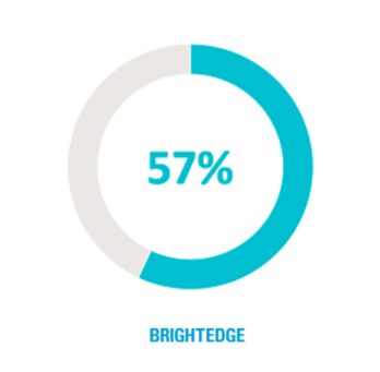
Majority mobile: 57% of web traffic is now mobile & tablet devices
In one of the key findings of the research, BrightEdge reports that 57% of web traffic now originates from mobile and tablet devices – meaning that close to 6 out of every 10 consumers are using a mobile device. Businesses who still aren’t optimizing for mobile, therefore, are ignoring a decisive majority of potential customers.
Even more noteworthy is the finding that the same query on the same search engine generates a different rank on mobile and desktop 79% of the time.
Among the top 20 ranked results, the gap is less pronounced, with 47% of queries differing between devices – but this still means that close to half of rankings differ.
And 35% – more than a third – of the time, the first page that ranked for any given domain was different between mobile and desktop SERPs.
In a press release about the research, BrightEdge commented that these figures indicate a “significant shift to a new mobile-first index”. I asked Erik Newton whether this means that BrightEdge believes Google’s mobile-first index is already being rolled out. Most SEOs believe we are still awaiting the official launch of the new index, but is BrightEdge seeing otherwise?
“We are seeing a divergence of rank and content between the two devices, and we have seen the data move in both directions over the last few months,” says Newton. “We believe that Google is testing and calibrating, as they have with other major shifts, to prepare for the separate mobile index.”
This fits with Google’s usual M.O. around big algorithm updates, but it also means that whatever strategies SEOs are planning to deploy when the mobile-first index finally rolls around, now might be the time to start testing them.
And for those who are still biding their time, they may already be losing out.
How are businesses really doing on mobile?
In the marketing industry, we’ve been talking for what feels like years, with increasing urgency, about the need for our campaigns and our web presences to be mobile-friendly. Or mobile-responsive. Or mobile-first.
But how are businesses really doing with this? Are marketers doing enough, even in 2017, to optimize for mobile?
“For most of the businesses that grew up on desktop, we see them using a desktop frame of reference,” observes Erik Newton. “We see evidence of this tendency in web design, page performance, analytics, and keyword tracking.
“We believe that Google gives the market signals to move forward and toward mobile faster. This is one of those times to push harder on mobile.
“Some of the newer companies, however, are mobile-first and even mobile-only. They are more likely to be app-based, and have always had majority mobile share.”
As we’ve seen from the figures cited in the previous section, using desktop as a frame of reference is increasingly short-sighted given the widening gap between desktop and mobile rankings. But how, then, should marketers plan their search strategy to cater to an increasing disparity between the two?
Should they go so far as to split their SEO efforts and cater to each separately? Or is there a way to kill two birds with one stone?
“The research report has some specific recommendations,” says Newton.
“One – Identify and differentiate mobile versus desktop demand.
“Two, design and optimize websites for speed and mobile-friendliness. Three, use a responsive site unless your business is app-based and large enough to build traffic through app distribution.
“Four, understand different online consumer intent signals across desktop and mobile devices. Five, produce separate mobile and desktop content that resonates on multiple device types.
“Six: focus on optimizing mobile content and mobile pages to improve conversions. Seven: track, compare, and report mobile and desktop share of traffic continuously.
“Eight, measure and optimize the page load speed of the mobile and desktop sites separately. And nine, track your organic search rank for mobile and desktop separately.
“The first challenge is to be even equally attentive to both mobile and desktop. We find that many brands are not acutely aware of the basic stat of mobile share of traffic.
“Additionally, brands can analyze the mobile share among new visitors, or non-customers, to see what kind of a different role it can play for people at different stages of the customer journey. For example, my mobile traffic is 32% higher among new visitors than overall visitors, and my mobile-blog-non-customer is 58% higher. That’s a place I should be leaning in on mobile when communicating to non-customers.
“Brands do not need to split their SEO efforts, but they do need to decide that some content efforts be mobile-first to be competitive.”
It can be difficult for brands who have traditionally catered to desktop users and who are still seeing success from a desktop-focused strategy to break away from this mindset and take a gamble on mobile. However, the figures are convincing.
What’s most evident is that it isn’t enough for SEOs and marketers to wait around for the launch of Google’s mobile-first index: it’s already being tested, and when combined with the growing proportion of mobile web traffic, brands who wait to develop a mobile-first strategy are increasingly likely to miss out.

