If you’re on social media, chances are you’re on Instagram. And if you are on the internet’s premier image-based social network, you’re attempting to get customers from it.
With Instagram Ads and organic posts, you’re trying to get them to a targeted landing page. There, they can hop into your marketing funnel by claiming your ebook, consultation or product—and make an impact on your bottom line.
But that process isn’t as easy as it sounds. Sure, some eye-catching media, punchy copy and a well-tailored value proposition will get users clicking through from your ad to your Instagram landing page.
However, generating a lead or a sale on that Instagram landing page is much harder. Optimizing the post-click experience takes specific expertise many businesses don’t have. So when your Instagram landing page isn’t converting the way you want it to, what could be the cause?
5 Reasons Your Instagram Landing Page Isn’t Converting
Could it be your CTA button? Your copy? If your landing page isn’t performing as well as you’d like, one or more of these issues could be the underlying reason. (And for elements to include on Facebook landing pages, read this article.)
1. Your Page Isn’t Skimmable
In marketing, attention is nearly impossible to hold for long. Remember, when people arrive at your Instagram landing page, they’re coming from a highly engaging social network where they spend hours per day. They want to evaluate your offer, decide if it’s for them and then get back to what they enjoy.
What they don’t want to do is suffer through blocks of text without subheads, paragraph breaks or visuals. They don’t want to drudge through all that to figure out if you have what they need.
That’s why you should follow the lead of this WordStream landing page, and clearly outline the key details of your offer:
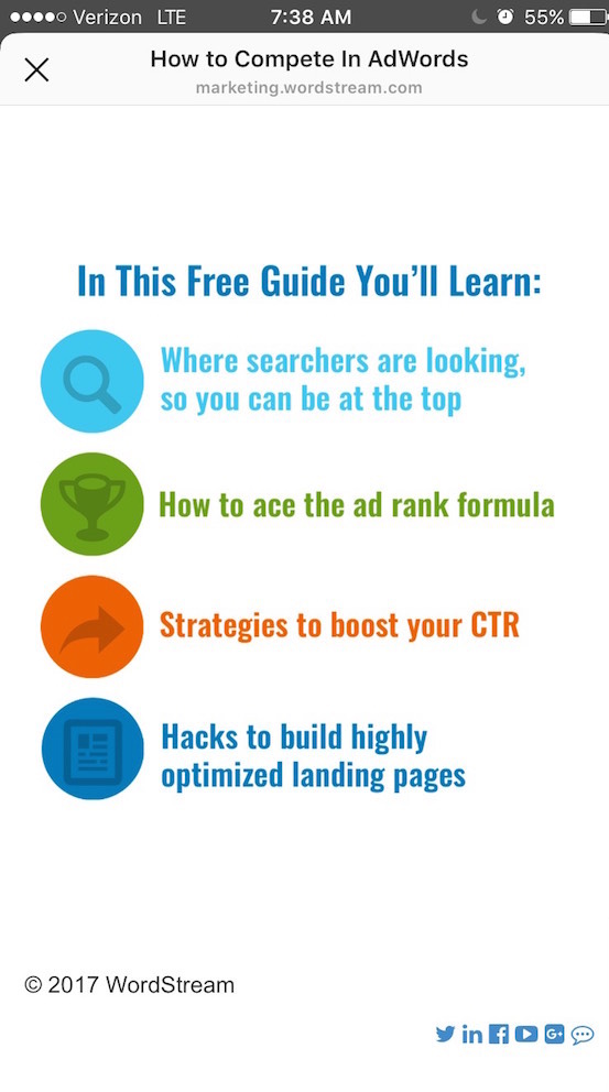
Notice that icons help break up the text so it’s easily located by the eye. Bullets can have the same effect.
And where there is copy on the page, it’s short and to-the-point. Always try to outline benefits over features, and where possible, use numerical proof to make your benefits even more tangible and persuasive. The next landing page is a great example of that.
2. You’re Using All Words & No Statistics
Copy can be powerfully persuasive, but even the best copywriters can’t beat a good statistic. Take a look at the Shopify Instagram landing page below, which attempts to get visitors to become “Shopify Partners:”
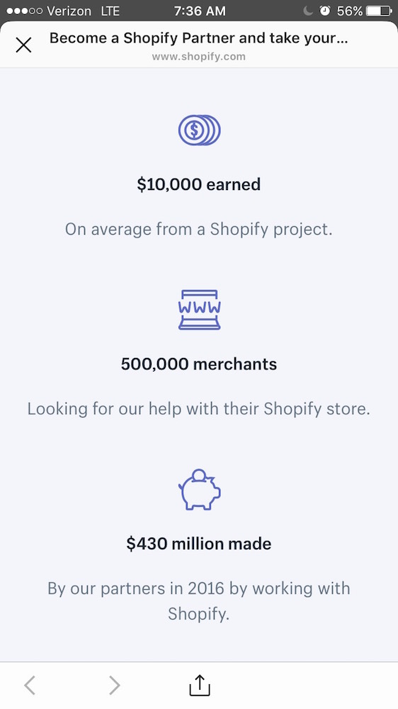
Why should a freelance marketer looking for clients sign up to become a Shopify partner?
- Because the average project generates $10,000 for partners.
- Because there are 500,000 merchants on Shopify, and any of them could be seeking your services at some point.
- Because partners earned $430 million in total during the year 2016.
Now, imagine if instead, those bullet points read something like this:
- The average project generates a substantial sum for partners.
- There are countless merchants on Shopify.
- Collectively, partners earned millions of dollars on Shopify in 2016.
Not as persuasive, is it?
If you’re looking at the second group of bullets, you’re thinking “Well what’s a ‘substantial’ sum?” That could be anywhere from a few hundred dollars to a few thousand.
You’re thinking: “How many is ‘countless’ merchants?”
You’re thinking: “How many millions of dollars did partners earn collectively? Spread out over hundreds of thousands of partners, that might not be very much per project.”

A Better Way to Manage Social
A Better Way to Manage Social
The more specific you can be, the less room for interpretation you leave the prospect on your landing page. You want them to come away knowing exactly what they stand to gain.
Another benefit to specificity is earning trust. When you throw out vague terms like “countless” and “substantial” it conveys the possibility that you’re hiding something.
And if they think you’re hiding something, there’s no chance they’ll convert. Ultimately a conversion comes down to earning trust, which is next up.
3. You’re Not Earning Trust
Everything you include on your landing page—copy, images, statistics, headlines—they’re all aimed at getting your visitor to trust you. Writing wishy-washy, vague copy or sensationalized headlines like: “Make Ten Thousand Dollars a Month From Home,” you’re not fostering that trust.
Take a look at this Instagram landing page from Ladder:
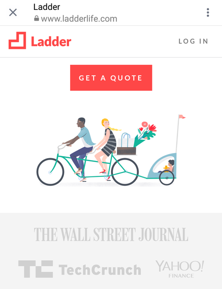
Notice how they use logos from reputable brands as trust signals. By showing the publications they’ve been mentioned in, it builds credibility in the eyes of people who are unfamiliar with the brand.
With elements like trust badges, social proof, money-back guarantees and product images, you can boost the odds people trust your offer and convert. Let’s cover that a little more in-depth.
4. Poor Social Proof
Social proof is a powerful and peculiar phenomenon. As we make our way in the world, we rarely notice how often we look to others for cues on how to behave. Things like what to wear, where to eat, how to dance—they’re all affected by our perceptions of those around us.
So it’s no surprise that when it comes to choosing which products to buy, services to use, etc., we look to others as well.
This is where social proof comes into play on your landing page. Positive reviews, glowing testimonials and quotes from satisfied customers all contribute greatly to the persuasiveness of your landing page.
Take a look at this Dice Careers app landing page:
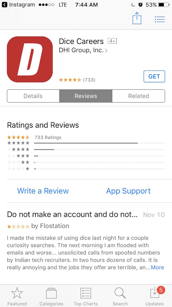
The reviews are overall positive, as indicated by the four-and-a-half star rating. However, the first testimonial is overwhelmingly poor. If possible, include on your landing page only highly positive reviews of your product to boost the odds it gets claimed.
Other forms of social proof include logos from well-known customers, as seen on this Instagram landing page from Workplace by Facebook:
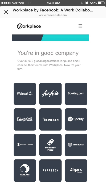
Upon seeing these logos, the visitor to this landing page thinks: Oh! If the service is good enough for industry titans like Walmart, Campbell’s, Heineken, Spotif, and Dominos, it’s certainly good enough for my business.
The more specific your social proof is, and the more well-known sources they’re from, the more convincing they will be to your prospects.
5. You’re Not Explaining Your Offer Well Enough
Losing your prospects’ trust often stems from vague promises and explanations, resulting in visitors making assumptions about your offer that never end well. If you lead them to believe it’s better than it really is with superlatives like “best” or “most powerful,” eventually they’ll find out you misled them if they claim it.
On the other hand, if your product or solution really is one of the best out there, and you fail to explain why, it’s unlikely they’ll claim it because you’re not elaborating enough.
There’s a happy medium, and it’s a landing page filled with honest, unique, benefit-centric copy and media that helps prospects better understand the offer.
Don’t simply slap an image of a person wearing a headset on your landing page because you heard that images are more compelling than words. For the most part, stock images can be a waste of space (emphasis on “for the most part”).

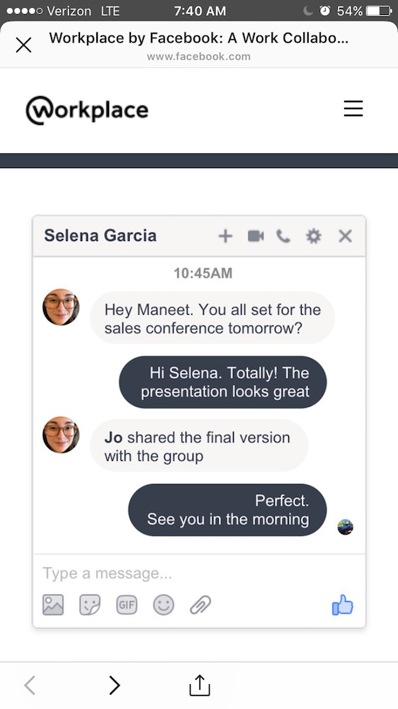
Instead, what you’ll want to include is an image that helps visitors better understand the offer. If you’re selling a product, images of all its angles are useful to see. If it’s a wearable product, an image of what it looks like on somebody is also highly useful to prospects trying to determine whether it’s worth claiming.
If your product is software or it’s a service of some sort, an image of what the software’s interface looks like, or what the service looks like as it’s performed can also be useful to display.
Here’s a great example from that same Workplace by Facebook Instagram landing page:
Optimize the Post-Click Experience
Too many marketers spend time segmenting ad campaigns, tweaking and testing ad creative. However, they treat the landing page as an afterthought. That’s a mistake because it’s true that without focused targeting your offer won’t be relevant, and without a creative ad you won’t convince users to click.
But, without a carefully crafted, persuasive Instagram landing page, you won’t convince a visitor to claim your offer. And that’s the end goal of every campaign.
Remember: the most important action happens post-click—after a user clicks your ad. Optimizing what follows (called “the post-click experience”) is the most crucial part of getting your offer claimed.