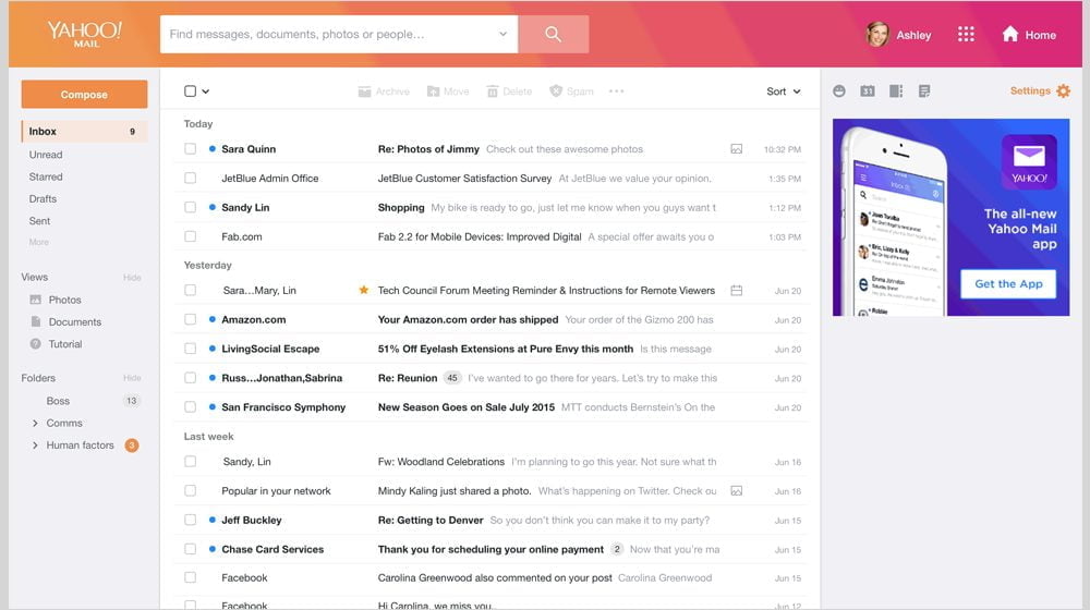
Yahoo (NASDAQ:AABA) Mail has finally gotten its much-needed and long overdue facelift.
The new Yahoo Mail redesign looks cleaner and more organized. It comes with several new features that were earlier available to just the premium Mail Plus customers. And oddly enough — or not — it resembles Gmail quite a bit.
Inside the Yahoo Mail Redesign
Features That Pack a Punch
In a blog post, Shiv Shankar, Senior Product Manager at Yahoo unveiled the brand new features.
The new and improved inbox has more spacing between items. This makes it less cluttered, but not optimal for users who receive several emails every day.
Yahoo has also improved the search option. Users can now search using a combination of name, date and keyword. For busy users, Yahoo Mail now offers the option of previewing photos and documents attached in an email. All you need to do is simply hover over the image icon.
To add a more personalized touch, Yahoo has introduced new color themes. Each theme comes with three different layout options and gives you the choice to set the interface to a light or dark mode.
You can also use Yahoo’s new emoji set from Twitter’s open source offering, and with new stationery to make mail more stylish.
Yahoo Mail Pro
Another significant change introduced by Yahoo is the launch of Yahoo Mail Pro, an ad-free version of Yahoo Mail.
An upgrade to Ad Free Mail launched a few years ago, Yahoo Mail Pro comes with priority support for desktop and mobile. It starts at $35 per year/$3.50 per month, or $10 a year/$1 a month for a mobile-only version.
Security Still a Concern
Over the years, Yahoo Mail’s popularity has witnessed a steady decline among users. The design overhaul is Yahoo’s latest attempt to woo them back.
But the company has a long way to go before it can regain the confidence of serious users. This year, Yahoo was affected by two security breaches impacting more than a billion accounts. The company has to spruce up its security features — especially to win back business and professional users.
Image: Yahoo
